The AI Image Prompt Library: 10 Production-Ready Prompts by Use Case
Ten prompts tested with hiapi's task API across five real-world use cases — e-commerce, social, avatars, product display, and editorial illustration — with the model and aspect ratio that worked.

Most prompt libraries on the web are mood boards in disguise: pretty screenshots, no model attribution, no resolution, no aspect ratio, and no way to know whether the result will hold up at small sizes or in production. This library is the opposite. Every prompt below has been run through hiapi's task API, with the model and aspect ratio noted. Drop them into your own workflow, change a noun, and you'll get something usable on the first try.
The collection is organized by the five use cases that account for the vast majority of production image work — e-commerce hero shots, social-media covers, avatars, product display, and stylized editorial illustration. Each section pairs a prompt with the tested model so you know whether to reach for cost-efficient qwen-image-2.0 ($0.025/image), the photoreal benchmark flux-1.1-pro ($0.05), the consistency-friendly Nano-Banana ($0.05), or text-rendering-friendly gpt-image-2 ($0.03 at 1K).
1. E-commerce hero shots
Listing thumbnails and lifestyle context shots — the two images every product needs. The thumbnail goes on white for the catalog; the lifestyle shot gives a paid social ad a heartbeat. Always keep the product description, lighting, and aspect ratio explicit; let the model decide the texture and color grading.
Prompt 1 — Pure-white catalog thumbnail (gpt-image-2, 1:1)
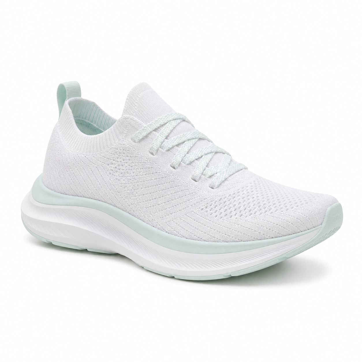
Studio product photograph of a single low-profile white knit running shoe with subtle mint
accents, centered on a pure white seamless cyclorama, soft top-down key light with a gentle
fill from camera left, contact shadow only, sharp focus on the heel cup and shoelace texture,
no logos, no text, 1:1 square crop suitable for an e-commerce listing thumbnail.
Why this works. The prompt is shaped like a brief to a photographer: one subject, one lighting setup, one crop. "Contact shadow only" prevents the floating-product look. "No logos, no text" matters more than it sounds — image models love to invent brand marks. Tested at 1:1 with gpt-image-2 for $0.03; for a higher-fidelity hero, swap in Nano-Banana-Pro at $0.17.
Prompt 2 — Lifestyle action shot (flux-1.1-pro, 4:3)
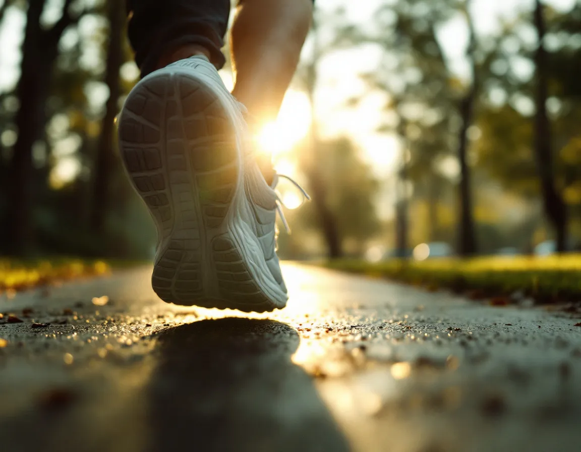
Editorial lifestyle photograph of the same white running shoe, now worn on a runner's foot
mid-stride on a damp morning sidewalk in a quiet park, golden hour rim light, shallow depth
of field f/2.0, slight motion blur on the trailing leg, faint warm fog in the background,
35mm film grain, color graded with muted greens and warm highlights, 4:3 aspect.
Why this works. flux-1.1-pro is hiapi's photorealism benchmark — it consistently delivers the analog-photography look (film grain, lens aberrations, atmospheric haze) that pure-white catalog shots lack. The "f/2.0" and "35mm film grain" anchors are doing the heavy lifting. 4:3 is the right crop for social: it doesn't get cropped to a square by Instagram and reads cleanly on LinkedIn.
2. Social media covers
The covers that hold up across LinkedIn banners, Spotify podcast art, and X header images all share one trait: typography decisions are made in the prompt, not after. gpt-image-2 is the most reliable model for rendering specific words; Nano-Banana-2 is the alternative when you need 4K output.
Prompt 3 — Podcast cover with bold typography (gpt-image-2, 1:1)
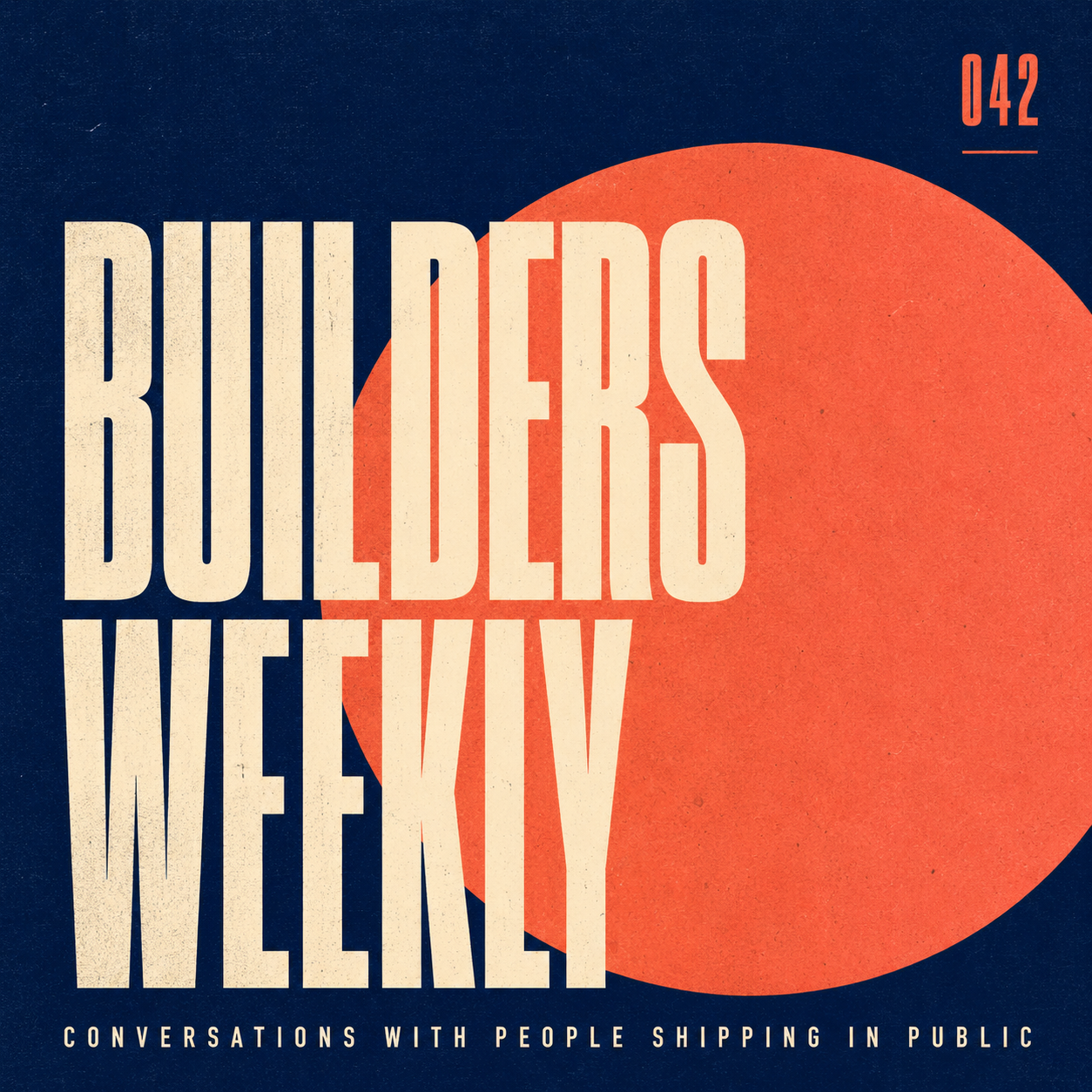
Square podcast cover: bold geometric layout, deep navy background with one large off-center
coral circle, condensed sans-serif title 'BUILDERS WEEKLY' in cream on three lines stacked
tightly, smaller all-caps tagline 'Conversations with people shipping in public' along the
bottom edge, episode number 042 micro-typed in the upper right, subtle paper grain, 1:1 aspect,
designed at Spotify cover proportions, no human faces, no logos.
Why this works. Three rules to know about typography prompts: (1) specify the casing ("all-caps"), (2) specify the layout ("three lines stacked tightly", "upper right"), (3) name the typography style ("condensed sans-serif"). Without those, the model improvises and you get serifs in a sans context. gpt-image-2 reliably renders English words up to about 4-5 lines per image.
Prompt 4 — LinkedIn banner with a headline (gpt-image-2, 16:9)
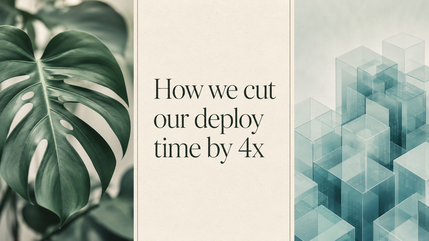
Wide LinkedIn banner: editorial collage layout, three vertical strips. Left strip a soft-focus
monstera leaf in jade green, middle strip a clean cream rectangle with the title 'How we cut
our deploy time by 4x' set in a refined serif at three lines, right strip an abstract isometric
render of stacked translucent cubes in pale teal. Thin separator lines in warm gray, subtle
paper texture, 16:9 ratio sized for LinkedIn 1584x396 proportions.
Why this works. "Three vertical strips" gives the model a hard composition grid; without it, you get a soup of overlapping elements. Calling out the LinkedIn proportions in plain English (1584x396) coexists with the 16:9 aspect ratio you send to hiapi's API, and the model takes both as design intent.
3. Avatars and character portraits
Two routes: photoreal headshots (Nano-Banana excels at consistency across multiple poses) and stylized geometric avatars (any model works; qwen-image-2.0 is the cheapest). Both need an explicit description of age, skin tone, hair, and expression — vagueness produces uncanny averages.
Prompt 5 — Professional photoreal headshot (Nano-Banana, 1:1)
![]()
Professional headshot avatar: a 32-year-old woman with shoulder-length dark brown hair, warm
olive skin, faint freckles, wearing a soft charcoal turtleneck, neutral expression with a
gentle close-mouthed smile, looking directly at camera at eye level. Lit with a single large
softbox from camera left, dark seamless gray background falling off to near-black, 50mm
portrait lens, sharp focus on the eyes, subtle skin texture preserved, 1:1 square crop
tightened to the shoulders.
Why this works. "Subtle skin texture preserved" is the single most important phrase in any portrait prompt — without it, you get the smoothed plastic look that gives AI avatars away. Nano-Banana is also the right pick when you'll need additional poses of the same person later; its character-consistency reputation isn't marketing.
Prompt 6 — Flat geometric avatar (Nano-Banana, 1:1)
![]()
Stylized avatar illustration in a flat geometric style: a young man with short black hair,
round glasses, wearing a mustard-yellow hoodie, three-quarter view, simplified facial features
built from soft circles and rounded rectangles, two-tone shadowing in deep plum on a pale
dusty rose background, thin black outline only at the silhouette, no gradients, no facial
wrinkles, 1:1 square crop, designed to read clearly at 80x80 pixels.
Why this works. "Designed to read clearly at 80x80 pixels" forces the model to commit to bold shapes instead of fine detail. The forbidden list ("no gradients, no facial wrinkles") is doing the work of an art-director note — it pushes the result toward the geometric end of the spectrum and away from the painted-portrait end models default to.
4. Product display and showcase
The middle of a product page or a feature comparison usually wants something cleaner than a hero shot: a clean overhead flat-lay, an exploded isometric diagram, a packaging mockup. flux-1.1-pro handles flat-lay photography; qwen-image-2.0 is well-suited to clean 3D-style illustrations at low cost.
Prompt 7 — Overhead flat-lay (flux-1.1-pro, 4:3)
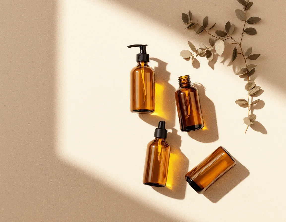
Overhead flat-lay photograph of four amber glass cosmetic bottles arranged in a square grid
on a sand-colored linen surface, generous even spacing, soft diffused daylight from above
creating soft shadows directly underneath each bottle, a single dried eucalyptus sprig in the
upper right corner for balance, no labels, no caps, sharp focus across the whole frame, 4:3
aspect, color graded warm and minimal.
Why this works. The keywords doing the work are "soft diffused daylight from above" (sets the lighting), "square grid" (sets the layout), "sharp focus across the whole frame" (prevents shallow DOF the model would otherwise add), and "no labels" (prevents invented branding). The eucalyptus sprig is a deliberate asymmetry — without it, four bottles in a square grid feel inert.
Prompt 8 — Clean isometric product render (qwen-image-2.0, 4:3)
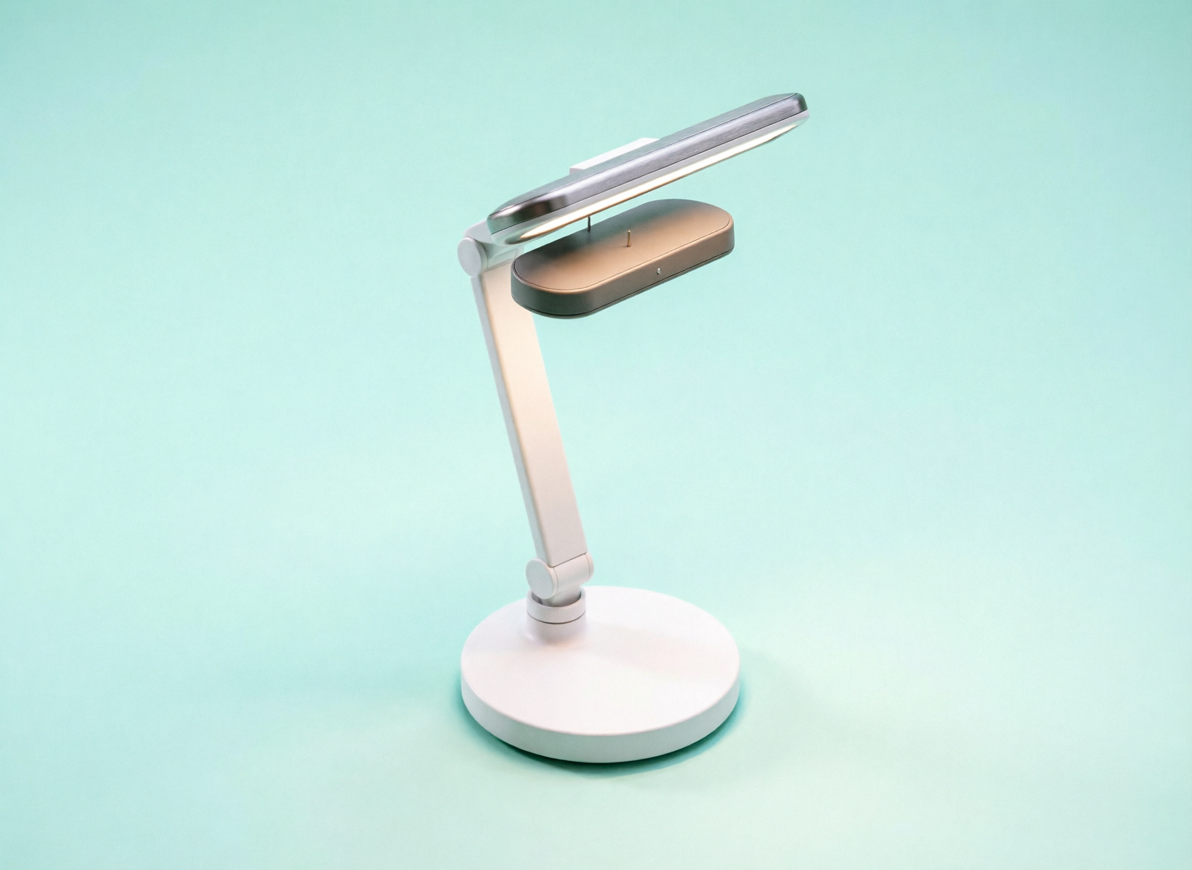
Clean isometric 3D illustration of a single smart desk lamp, exploded view showing four stacked
layers — base disc, articulated arm, head housing, LED panel — separated by thin connector
lines, on a pale mint background with a single very soft drop shadow, matte finish materials
in white and warm gray, no text, no annotations, 4:3 aspect, designed to sit cleanly on a
product specification page.
Why this works (and where it doesn't). qwen-image-2.0 at $0.025 is hiapi's most cost-efficient model and reliably nails the matte palette and clean composition. What it routinely refuses to render from a text-only prompt is a true exploded view — the result here is a clean assembled lamp rather than four separated layers, even with the parts enumerated. The honest workflow for an exploded diagram is to draw a rough layered sketch yourself, then use gpt-image-2-image-to-image to clean it up. Treat this section as the lesson it actually is: trust the model for style, lighting, and palette; sketch the structure yourself when the structure is the point of the image.
5. Stylized editorial illustration
When the article is the product — long-form essays, newsletters, conference talks — the right opener is an illustration, not a photo. Two reliable styles: mid-century editorial (flat shapes, restrained palette) and layered paper-cut. Both look distinctly hand-made and bypass the visual fatigue of stock photography.
Prompt 9 — Mid-century editorial illustration (gpt-image-2, 3:2)
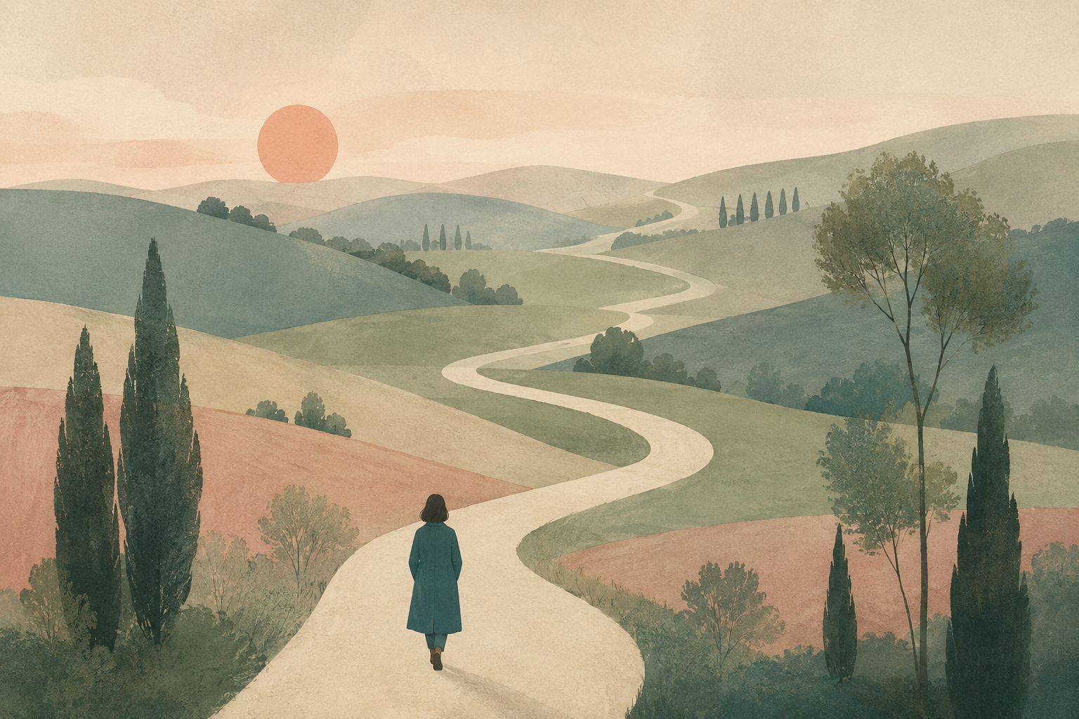
Editorial illustration for a long-form essay titled internally 'The slow web'. Composition: a
small figure in a teal coat seen from behind, walking on a winding cream-colored path that
loops through a soft pastel landscape of rolling muted hills, scattered slender trees, a low
watercolor sun. Style references mid-century editorial illustration, flat shapes, gentle paper
grain, restrained palette of teal, sage, cream and dusty rose, no outlines, no text, 3:2
landscape aspect.
Why this works. Naming a style reference ("mid-century editorial illustration") is more reliable than naming an artist — it cuts the model toward a recognizable visual tradition without copying any single person. "Restrained palette" with four named colors is a stronger constraint than "soft colors"; the model will mix exactly those four and skip the entire rest of the spectrum.
Prompt 10 — Layered paper-cut illustration (qwen-image-2.0, 1:1)
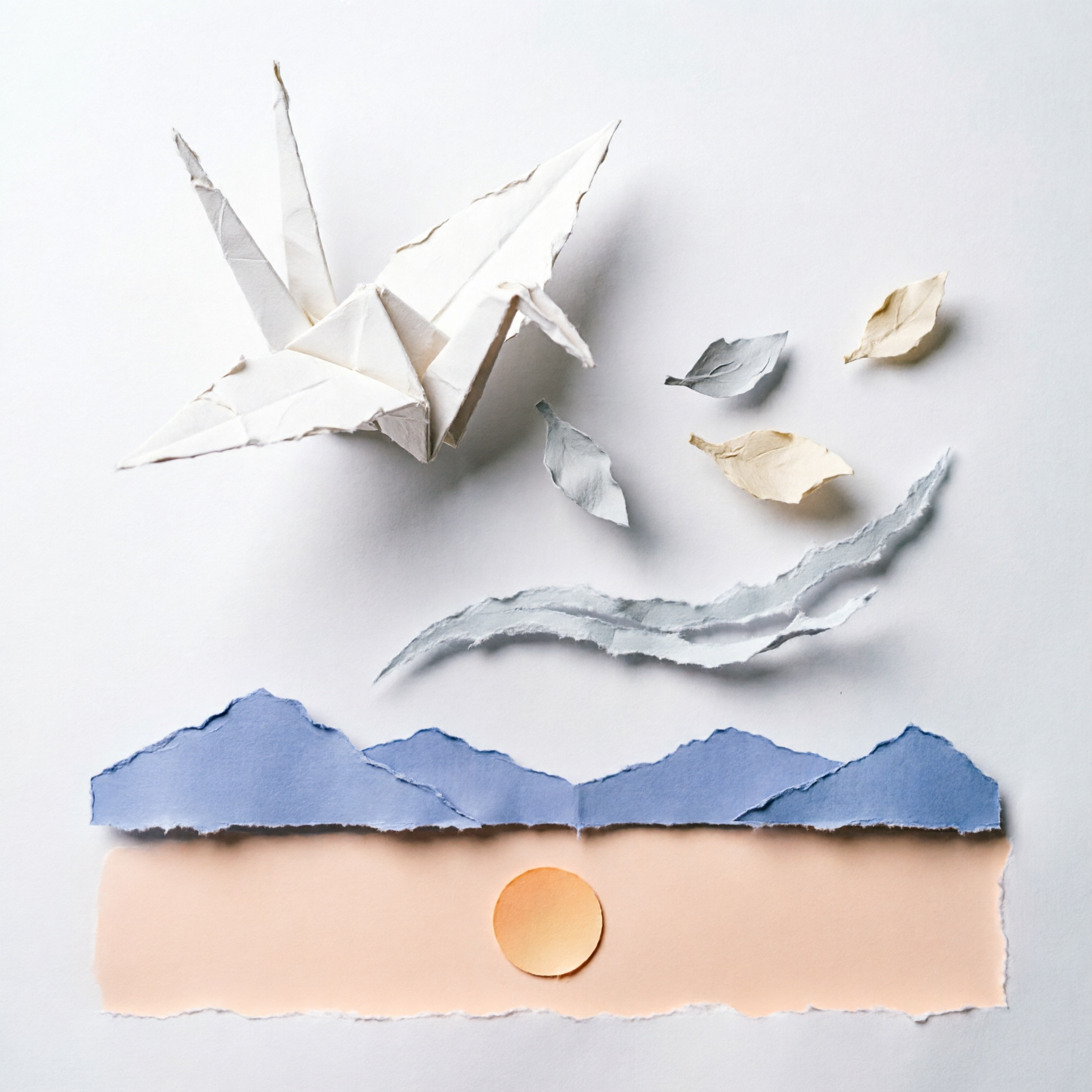
Layered paper-cut illustration of a single origami crane in flight, five distinct paper depth
planes from foreground to background — crane, drifting paper leaves, a torn arc representing
wind, distant mountains in pale indigo, and a flat sky with a single circular sun in pale
peach. Each layer has a soft cast shadow on the layer behind it, slightly rough cut edges,
matte paper texture, 1:1 aspect, balanced composition with the crane in the upper-left third.
Why this works. Specifying exactly five layers gives the paper-cut effect the depth that distinguishes it from a flat illustration. "Slightly rough cut edges" and "matte paper texture" are the two phrases that prevent the model from rendering the result as smooth digital vectors, which would erase the entire point of the style.
How to adapt these prompts
Three rules survive across every section above. Specify the aspect ratio twice — once in the API call (hiapi's aspect_ratio field) and once in the prompt text ("4:3 aspect"). The model treats both as design intent and the results align with what fits the page. Name what to exclude ("no logos", "no text", "no gradients") at least as often as what to include; the negative list does as much shaping as the positive one. Anchor the style with a tradition or technical reference, not an artist name — "mid-century editorial illustration", "35mm film grain", "isometric 3D illustration" — to get reproducible, license-clean results.
Pick the model by the job: qwen-image-2.0 for high-volume stylized work, gpt-image-2 for anything text-rendering-heavy, Nano-Banana for portrait consistency, flux-1.1-pro for photorealism. Every prompt above ran on hiapi's task API in 60-120 seconds at $0.025-$0.05 per image — cheap enough that the right move is to generate three variants of each, pick the strongest, and ship.