GPT Image 2 responds well to prompts written as compact creative briefs. Name the deliverable, describe the subject in physical terms, place the main elements, specify the light, quote any required copy, and finish with exclusions that prevent predictable mistakes.
The 15 templates below come from HiAPI's first-party generation tests. Every prompt stays beside the output it produced. Twelve cover broad production work; three additional product-ad recipes retain task-level evidence from a separate hero, social promo, and lifestyle banner test.
Use the canonical model ID gpt-image-2/text-to-image with POST https://api.hiapi.ai/v1/tasks. The templates focus on creative direction. Current parameters and route differences live in the GPT Image 2 API documentation.
A prompt structure that transfers between jobs
A reusable prompt usually has six parts:
- Deliverable: product photo, banner, infographic, icon, or illustration.
- Subject: material, color, shape, pose, condition, and important details.
- Composition: crop, angle, hierarchy, placement, and negative space.
- Light and finish: direction, softness, color temperature, lens cues, or illustration rules.
- Exact copy: required strings in straight quotes, plus position and typography.
- Exclusions: unwanted text, logos, props, people, clutter, or gradients.
Replace the bracketed variables, then remove the brackets before submitting. Keep the rest of the prompt stable until you have a reason to change the composition.
Product photography prompts
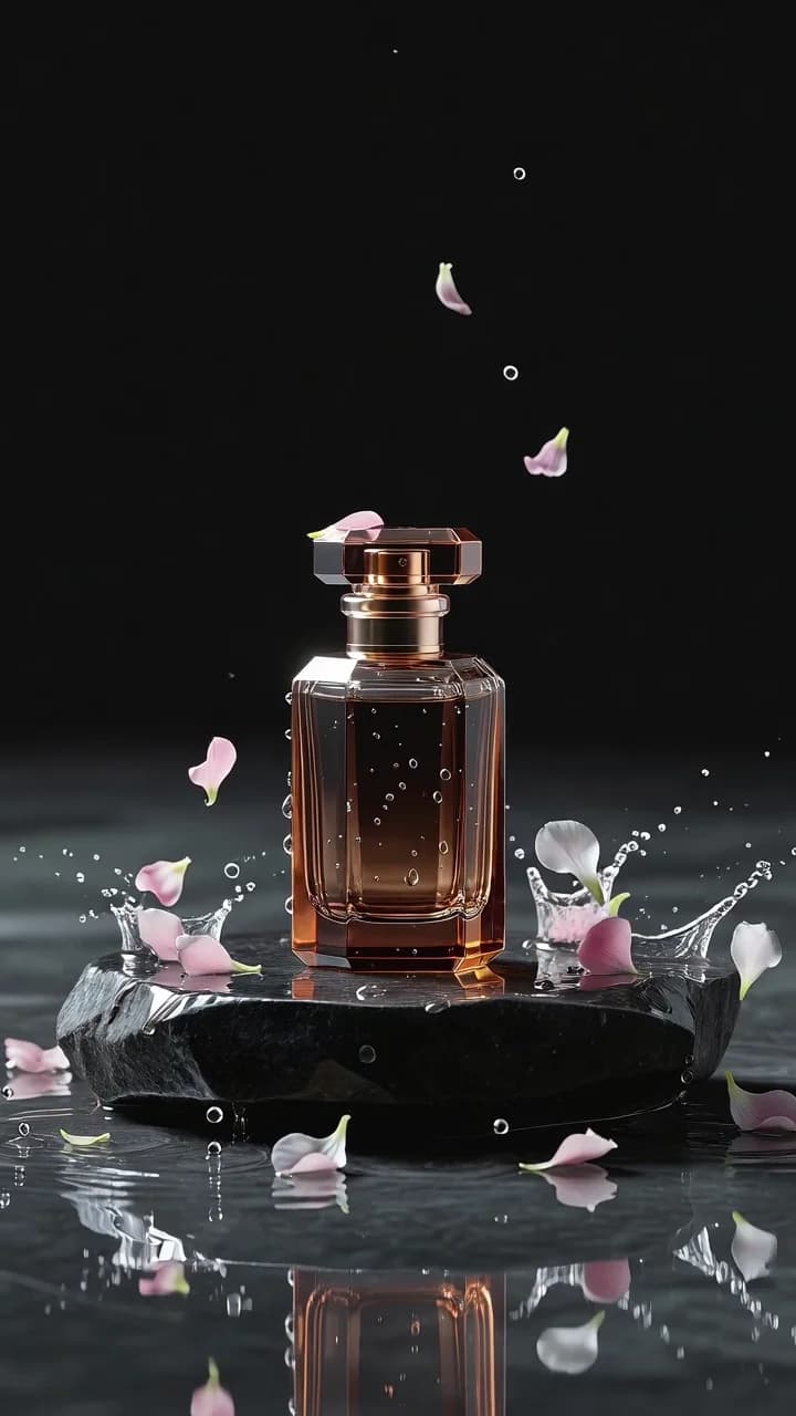
1. Catalog main image
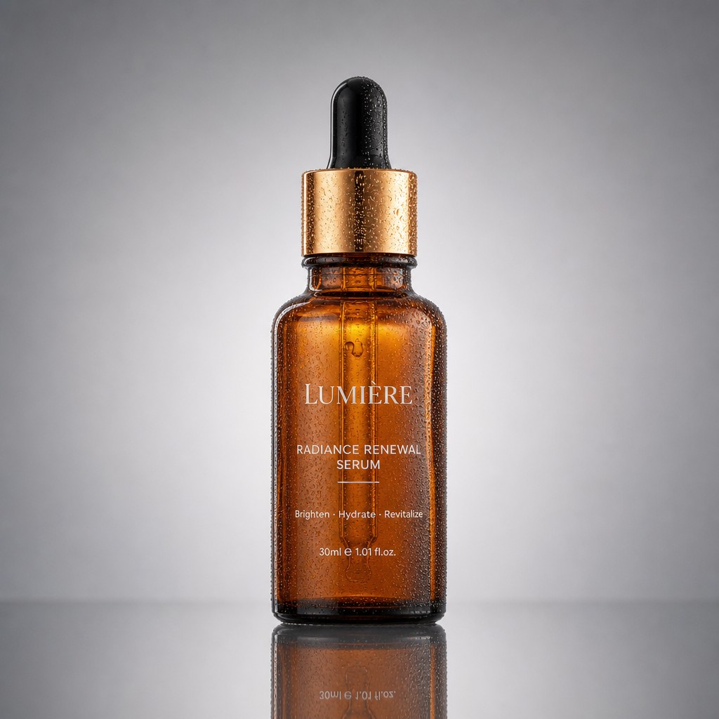
A professional high-end e-commerce product photograph of [a frosted glass perfume bottle], shot on an 85mm lens, perfectly centered on a seamless soft-grey gradient backdrop. Three-point studio lighting: a large softbox key light from the top-left creating gentle wraparound highlights, a crisp rim light defining the bottle's edges, a soft fill flattening harsh shadows. A clean realistic reflection mirrors beneath the product on a subtly glossy surface. Razor-sharp focus throughout, true-to-life color, visible glass texture and liquid translucency, tiny condensation droplets on the bottle, no props or clutter, generous symmetrical negative space, 1:1 square, catalog-grade commercial photography.
The lens, lighting setup, surface reflection, and exclusion of props give this prompt a repeatable catalog look. Replace the bottle description with a complete product specification.
2. Cozy lifestyle product shot
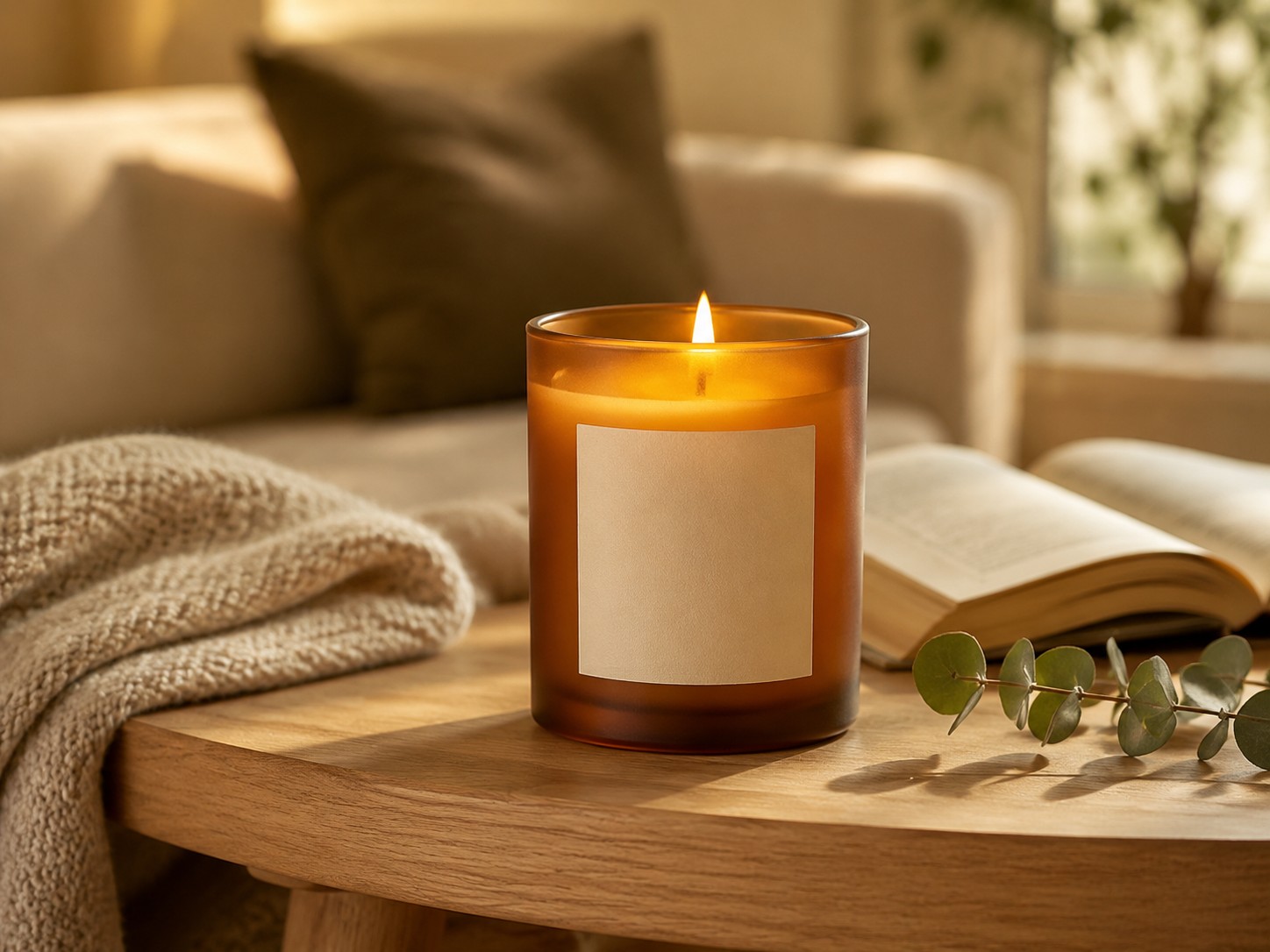
A cozy lifestyle product photograph featuring [a scented soy candle in a frosted amber glass jar with a smooth cream blank label]. The candle is lit with a small warm flame and placed as the clear hero object on a light oak side table. Nearby are a folded neutral knit blanket, an open book, and a small eucalyptus sprig, arranged subtly so they support the product without distracting from it. Warm late-afternoon window light from the side, soft natural shadows, shallow depth of field, softly blurred comfortable living room background. The candle remains sharply focused, front label visible, amber glass texture visible, warm inviting color grade, calm relaxing mood, premium home-fragrance brand aesthetic, photorealistic. No readable text, no logo, no extra candles, no messy background, no people. 4:3 horizontal composition.
The product is explicitly assigned visual priority. Supporting props communicate the category while the negative clauses limit scene drift.
3. Macro product detail
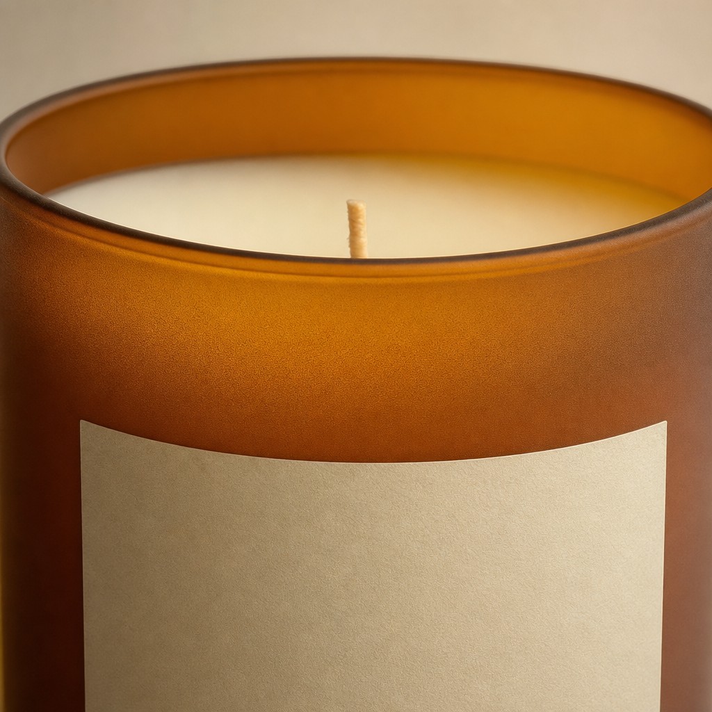
A premium macro product detail photo of [a scented candle in a frosted amber glass jar with a smooth cream blank label]. Close-up crop showing the frosted glass texture, warm amber translucency, smooth cream wax surface, and centered wick. Soft studio lighting, shallow depth of field, elegant minimal composition, no text, no logo, no props, photorealistic, 1:1.
Short prompts work well when the deliverable is familiar and the required detail is precise. Name the texture or component the close-up must prove.
Product ad and social prompts
4. Promotional poster with offer and price
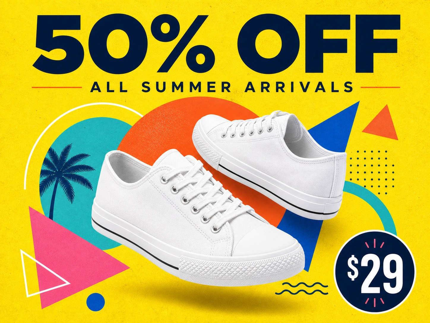
A modern high-impact promotional poster, 4:3 landscape. A bold oversized headline "50% OFF" anchored at the top in a clean geometric sans-serif with confident letter-spacing, a smaller refined subheadline "ALL SUMMER ARRIVALS" directly beneath. Central hero subject: [a pair of pure white canvas sneakers] floating at a slight dynamic angle, casting a soft natural drop shadow, framed by playful overlapping geometric shapes — circles, arcs, triangles — in complementary tones. Bright lemon-yellow background with subtle paper-grain texture. Vibrant flat-design, strong color contrast, deliberate visual hierarchy leading the eye from headline to product, balanced margins, a small circular price badge in one corner reading "$29", polished advertising layout.
Three separate quoted strings define the headline, subheadline, and price. The geometric vocabulary gives the background structure without competing with the product.
5. Product hero ad
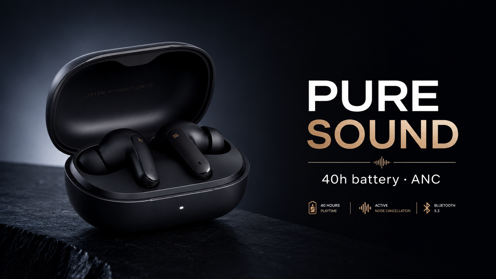
A premium advertising hero image for {PRODUCT}: a {PRODUCT} on a {BACKDROP}
with a soft rim light, on the right a bold clean headline reading "{HEADLINE}"
and a smaller line "{SUBTEXT}", high-end {CATEGORY} ad, crisp legible text,
negative space.
Test values: {PRODUCT} = matte-black wireless earbuds; {HEADLINE} = PURE SOUND; {SUBTEXT} = 40h battery · ANC; aspect_ratio: 16:9; task tk-hiapi-01KVQJT00V2TES55KBSHQTZ6NA; recorded task cost $0.03 on 2026-06-22.
Place the copy on the opposite side from the product and reserve negative space. A one-to-three-word headline is easier to review at small placement sizes.
6. Square social promo
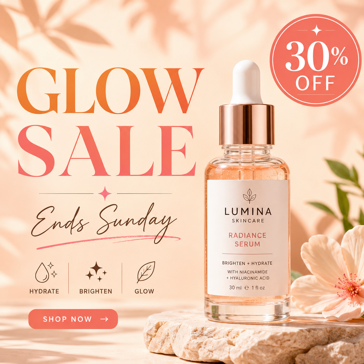
A square social media promo ad for {PRODUCT} on a {BACKGROUND}, a circular
badge reading "{BADGE}" in the top-right corner and a headline "{HEADLINE}"
with subtext "{SUBTEXT}", bright clean commercial style, legible text.
Test values: {PRODUCT} = a skincare serum bottle; {BADGE} = 30% OFF; {HEADLINE} = GLOW SALE; {SUBTEXT} = Ends Sunday; aspect_ratio: 1:1; task tk-hiapi-01KVQJWAR933TN56HPCDYPX10E; recorded task cost $0.03 on 2026-06-22.
The badge, headline, and subtext are separate strings with separate roles. Keep that separation when generating campaign variants.
7. Lifestyle benefit banner
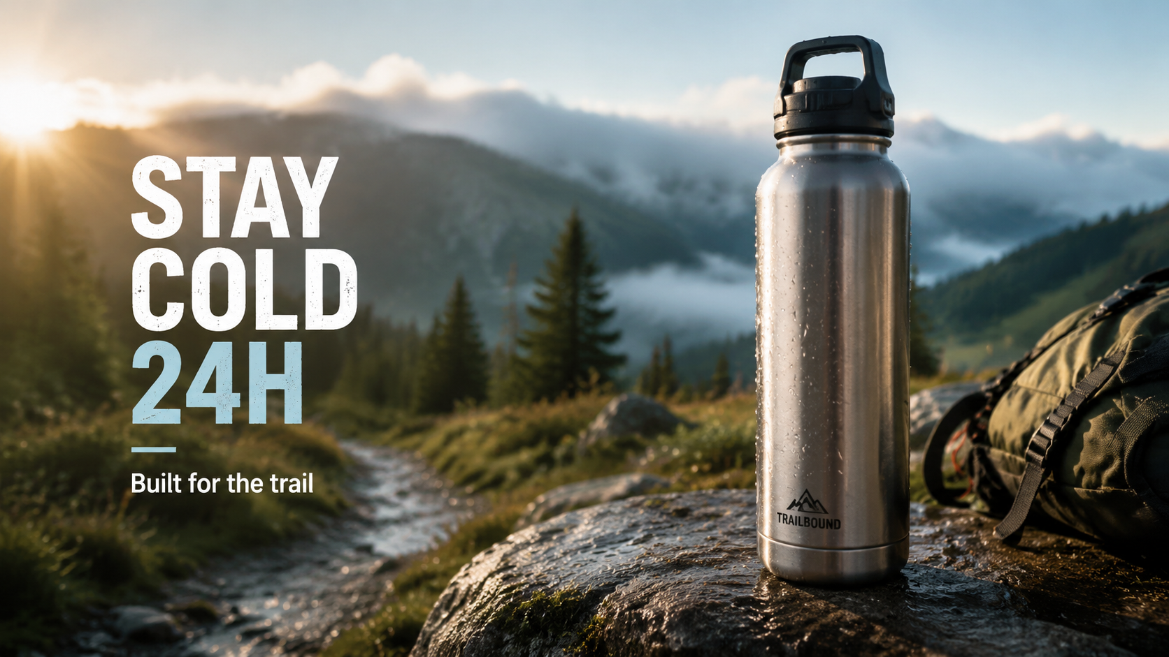
A lifestyle ad banner: {PRODUCT} in a {SCENE}, {LIGHT}, on the left a headline
reading "{HEADLINE}" and a small tagline "{TAGLINE}", {VERTICAL} advertising,
legible text, cinematic.
Test values: {PRODUCT} = a stainless-steel insulated water bottle; {SCENE} = on a rock beside a misty morning trail; {HEADLINE} = STAY COLD 24H; {TAGLINE} = Built for the trail; aspect_ratio: 16:9; task tk-hiapi-01KVQK0EK2Q23YA6HAP5697NC9; recorded task cost $0.03 on 2026-06-22.
Use this pattern when the environment demonstrates the benefit. The text position keeps the headline away from the product silhouette.
8. Editorial social cover
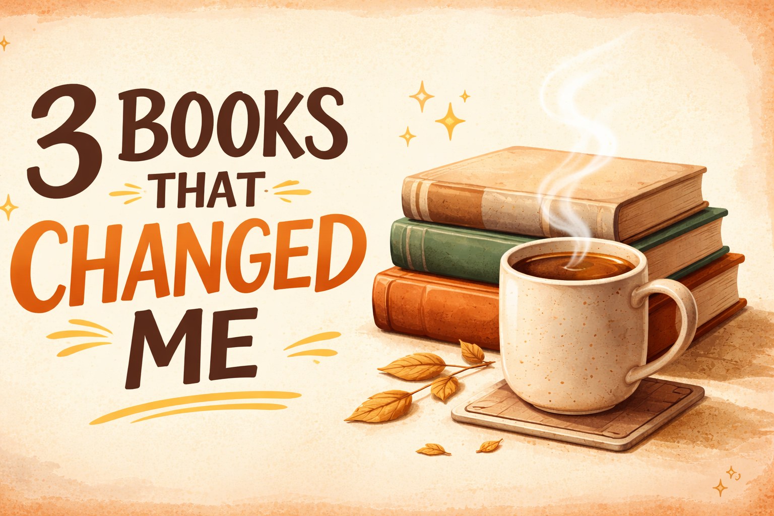
An eye-catching scroll-stopping social media cover, 16:9. A large expressive title "3 BOOKS THAT CHANGED ME" set off-center in a stylish bold typeface with the word "CHANGED" in an accent warm-orange color. Focal illustration beside the text: [a neat stack of three hardcover books with visible spines beside a steaming cup of coffee in a ceramic mug], rendered with warm inviting detail. Warm cozy tones (caramel, cream, soft brown), a subtly textured paper background with a faint light vignette, a few small hand-drawn doodles (sparkles, underline strokes) for personality, trendy editorial layout with a strong clear focal hierarchy, comfortable padding around every element, composition designed to stand out in a crowded feed.
The prompt assigns a color treatment to one word and keeps the subject beside the title. Replace the title and subject together so the visual remains semantically coherent.
Information and brand design prompts
9. Educational infographic
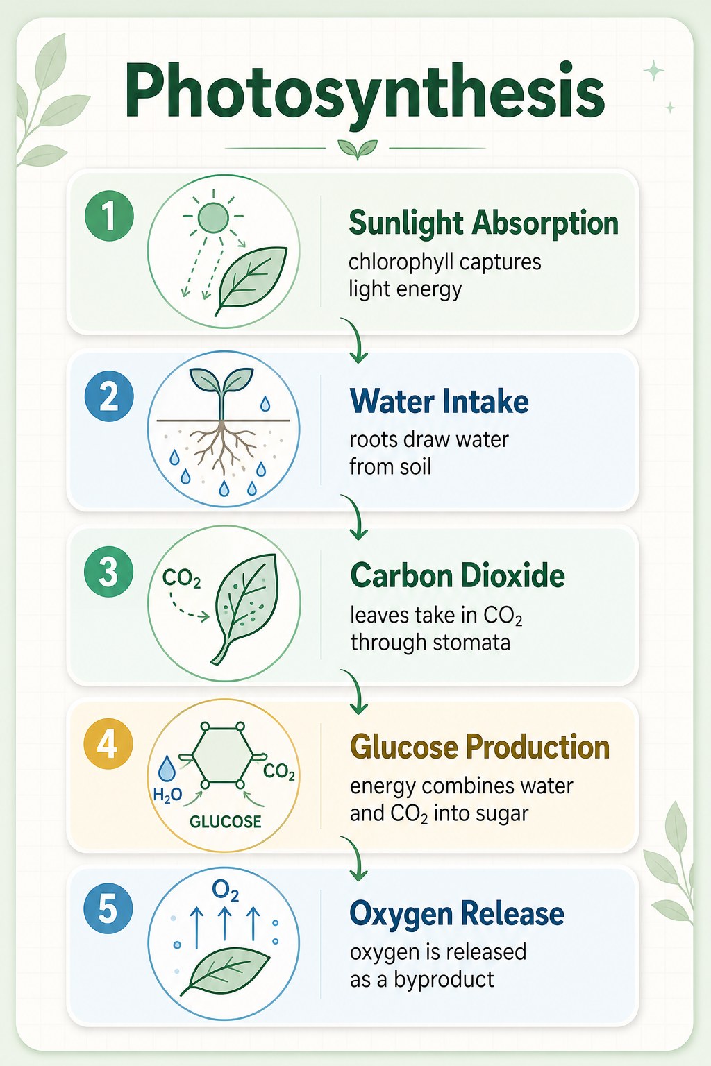
A clean professionally designed educational infographic card, bold heading "Photosynthesis" at the top. The body lays out five clearly numbered steps in a logical top-to-bottom flow connected by thin curved arrows; each step pairs a simple two-tone line icon with a concise label and a short caption: "1. Sunlight Absorption — chlorophyll captures light energy", "2. Water Intake — roots draw water from soil", "3. Carbon Dioxide — leaves take in CO2 through stomata", "4. Glucose Production — energy combines water and CO2 into sugar", "5. Oxygen Release — oxygen is released as a byproduct". Soft pastel palette (mint green, sky blue, warm cream), flat vector illustration with consistent line weights, a faint background grid, abundant white space, tidy margins, gently rounded section corners, soft drop shadows for light depth, modern science-poster aesthetic, perfectly legible typography, 3:4 portrait.
The full text and flow are specified in advance. Review factual content and every character independently of the visual quality before using an AI-generated infographic.
10. Logo concept board
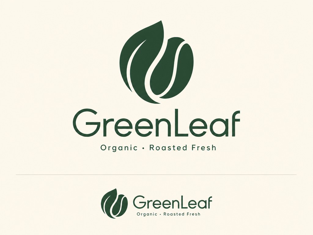
A polished minimalist logo concept on a clean presentation board for [an organic coffee brand GreenLeaf]. The primary mark elegantly merges [a single curling leaf with a coffee bean] into one cohesive symbol with smooth balanced curves and even negative space. Below it the wordmark "GreenLeaf" is set in a refined modern geometric typeface, with a small tagline "Organic · Roasted Fresh" beneath. Strict two-color palette of deep forest green and warm cream, flat vector style, crisp edges, scalable construction. The logo is shown once large and once small to imply versatility, plain neutral background, professional brand-identity aesthetic.
The presentation-board framing makes scale and hierarchy visible. Treat the result as a concept that still needs trademark review and vector rebuilding.
11. App icon
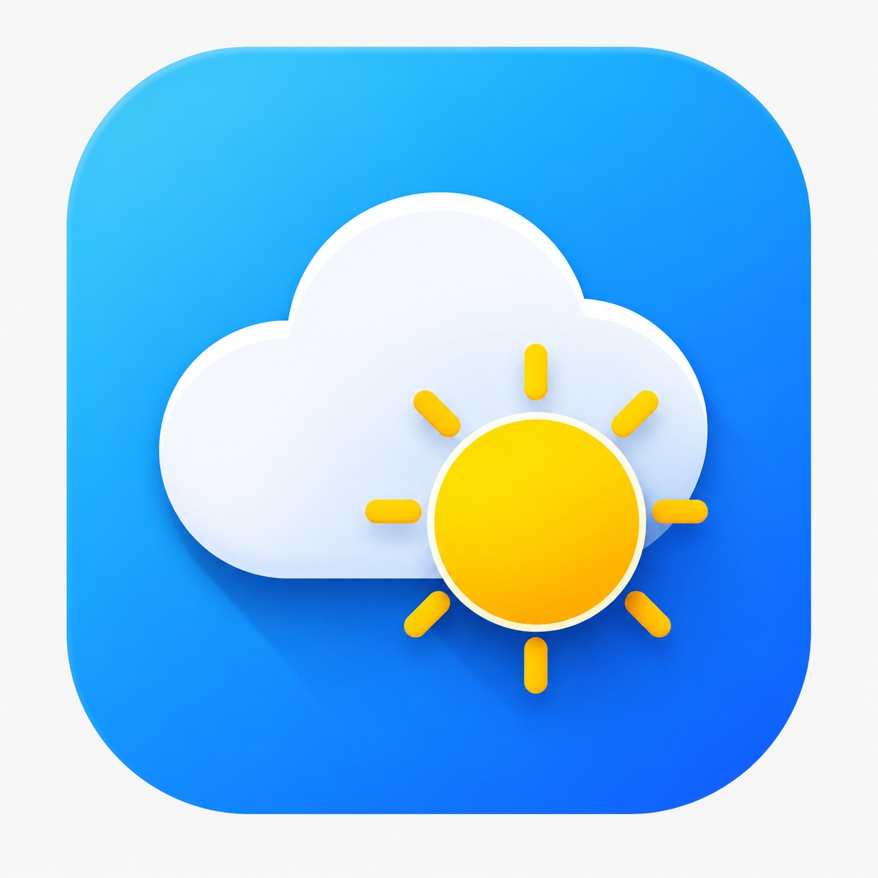
A modern polished app icon for [a weather app], on the standard rounded-square (squircle) shape. The central symbol — [a plump white cloud overlaid in front of a bright sun] — is built from bold simple geometry with clean crisp edges. Background is a smooth diagonal blue gradient (sky blue into deeper azure) with a very subtle inner glow. Flat design with a hint of layered depth: a soft long shadow cast by the cloud, a gentle highlight along its top edge. Vibrant yet tasteful color, perfectly centered with even padding, instantly recognizable and legible at small size, premium iOS-style icon aesthetic, 1:1, shown on a plain neutral background.
"Legible at small size" and "even padding" turn a broad icon request into constraints that can be reviewed in a real launcher grid.
Photography and illustration prompts
12. Food photography
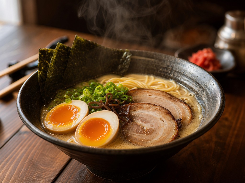
A photorealistic mouth-watering close-up of [a bowl of steaming Japanese tonkotsu ramen] on a dark walnut table. Shot on a 50mm lens at a low three-quarter angle, shallow depth of field with creamy bokeh dissolving the background. Soft natural window light rakes in from the left, catching the glossy broth, a soft-boiled egg's runny yolk, springy noodles and delicate wisps of rising steam. Rich fine texture — chopped scallions, nori sheen, chashu marbling — warm appetizing color grade, gentle highlights and soft deep shadows, a few blurred props (chopsticks, a small side dish) behind, professional food photography, 4:3.
Specific textures, ingredients, lens, angle, and light direction make this prompt adaptable to other dishes without losing the photographic setup.
13. Flat vector illustration
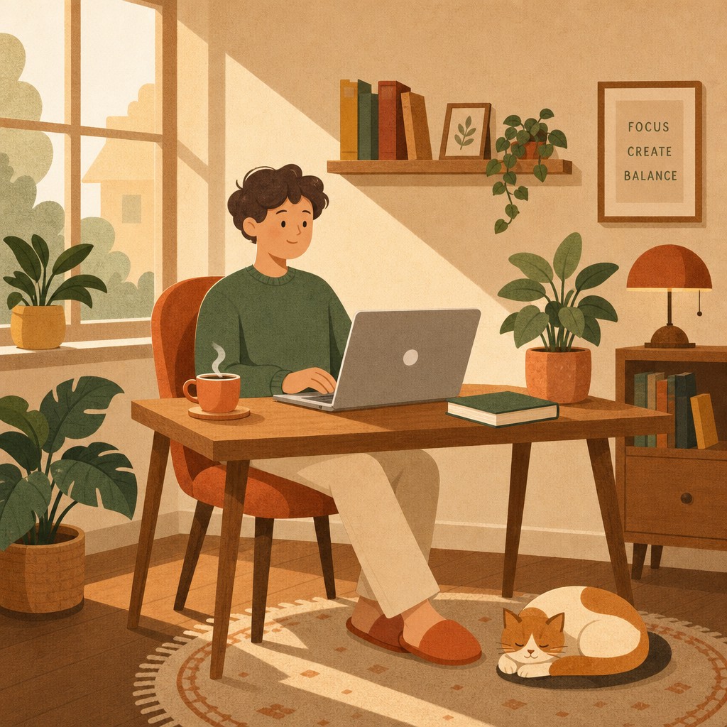
A modern flat vector illustration of [a person working remotely from a comfortable home setup]. Scene: a person relaxed in a chair at a wooden desk, an open laptop in front of them, a steaming cup of tea and a book beside the laptop, a lush potted plant nearby, a cat curled on a small rug at their feet, soft sunlight coming through a side window. Built from clean geometric shapes with consistent rounded corners, a harmonious warm flat-color palette (terracotta, mustard, sage, cream), soft elongated shadows, no gradients, simple two-dot facial features, a subtle grain texture overlay for warmth, balanced composition with comfortable breathing room, friendly inviting mood, modern editorial illustration style, 1:1.
Construction rules such as rounded geometry, no gradients, and two-dot facial features keep the visual language consistent across the scene.
14. Detailed interior scene
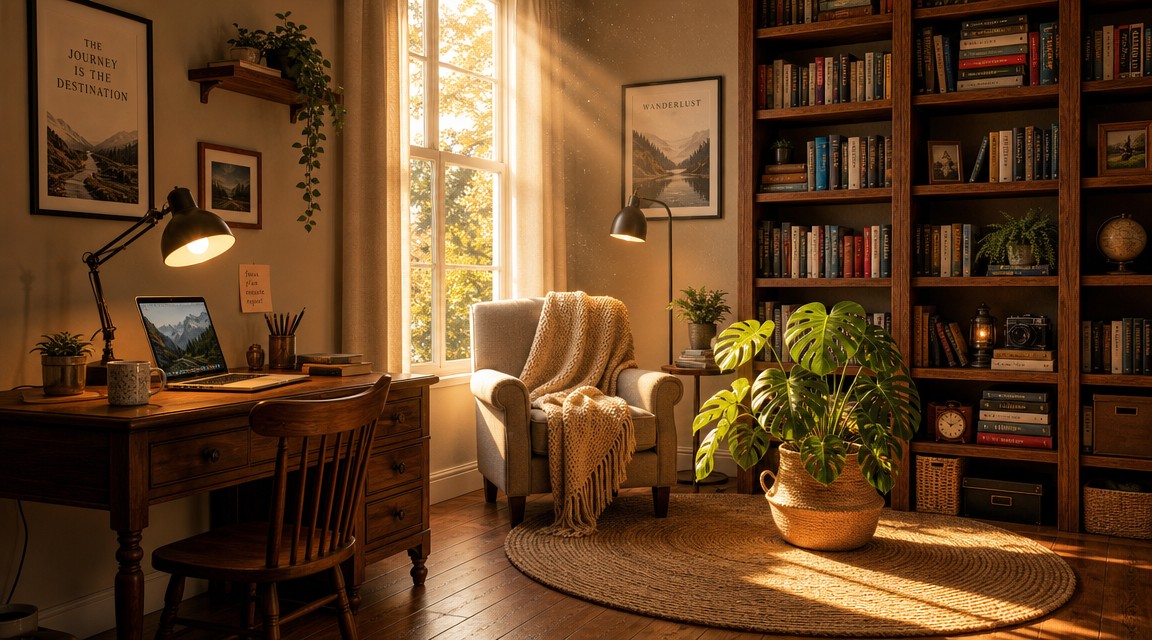
A detailed warm cozy home-studio interior, polished illustration, every element clearly placed: on the left, [a wooden desk with an open laptop, a warm-light desk lamp, and a coffee mug]; in the center, [a comfortable armchair draped with a knit throw]; on the right, [a floor-to-ceiling wooden bookshelf packed with colorful books and a few small ornaments]; on the floor, [a round woven rug with a tall monstera plant in a terracotta pot]. Late-afternoon golden sunlight streams through a tall window, long soft shadows, dust motes drifting in the light beams, warm inviting palette, rich material textures (wood grain, knit, paper), every object distinct and correctly positioned, realistic detailed illustration, 16:9.
Spatial anchors give a complex scene a reviewable layout. Reuse the left, center, right, and floor pattern when several objects must occupy distinct zones.
15. Premium text poster
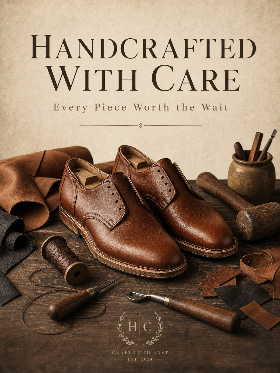
A clean premium poster, 3:4 portrait. A large English title "HANDCRAFTED WITH CARE" rendered prominently with accurate well-formed letterforms near the top in an elegant semi-serif typeface; a smaller English subtitle "Every Piece Worth the Wait" below it in a lighter weight with comfortable spacing. Central visual: [a pair of handcrafted leather shoes in progress beside scattered leather scraps, waxed thread, and craftsman tools (awl, edge beveler, small wooden mallet)], lit by warm directional workshop lighting that highlights the leather grain and casts gentle shadows. Refined earthy palette (tan, cognac, charcoal, cream), minimalist balanced layout with generous negative space, a thin decorative divider line, subtle paper texture, high-end artisanal brand aesthetic.
Typography, subject, tools, material texture, and palette all point to the same artisanal position. Inspect any additional brand-like text the model introduces before approval.
What improved the hit rate
Keep exact copy in straight quotes and give each string one job. A headline, price badge, and supporting line should have separate placement instructions. This reduces accidental merging and makes review easier.
Use concrete photographic language. "85mm lens, softbox from the top-left, crisp rim light" provides more control than a broad request for a professional image. For illustrations, replace camera language with construction rules such as consistent line weight, rounded geometry, flat color, or no gradients.
Add exclusions where failures are predictable. Product prompts often benefit from no text, no logo, no clutter, no extra products. Complex scenes benefit from spatial anchors such as on the left, in the center, and on the right.
Treat generated text as unapproved copy until a person has checked it at full size. That rule applies to posters, badges, product labels, diagrams, prices, quantities, and claims.
The standard route price snapshot checked on 2026-08-31 was $0.03 at 1K, $0.04 at 2K, and $0.06 at 4K. Confirm live pricing before budgeting because prices and routes can change.
FAQ
Are these GPT Image 2 prompts ready to copy?
Yes. Replace the bracketed or braced variables, remove their delimiters, and keep the composition and lighting instructions intact for the first test. Every displayed image is paired with the prompt retained for that output.
Which model ID should I use?
Use gpt-image-2/text-to-image. Submit it to POST /v1/tasks. These templates assume the standard route, which means the top-level route field is omitted.
Why do some templates use brackets and others use braces?
Both mark replaceable content. The broad library originally used descriptive bracketed subjects, while the three batch-ad recipes used named placeholders such as {PRODUCT} and {HEADLINE}. Remove either style before submitting the final prompt.
How should I adapt a prompt for a different aspect ratio?
Change the API aspect_ratio and update the composition language to match the destination. A square promo, wide hero, and portrait poster need different placement and negative-space rules. Check the current parameter documentation for valid resolution and aspect-ratio combinations.
Can the generated text be published directly?
Only after human review. Check spelling, punctuation, prices, units, claims, and small captions at 100% zoom. Use a controlled text layer when copy is regulated or changes frequently.
Where can I turn these prompts into a batch workflow?
The GPT Image 2 e-commerce workflow shows how to separate a fixed product specification from shot instructions, submit several variants, retain task evidence, and estimate catalog cost.
Try the closest template on the GPT Image 2 model page, approve one output, then adapt only the variables needed for the next variant.