Most "lite" image models trade away the interesting parts to hit a price point. Seedream 5.0 Lite kept them: multilingual text rendering that actually spells, real-world knowledge that fills in accurate details when you name a real place, and instruction following strict enough that "exactly three pencils" produces exactly three pencils.
This post is six copy-paste prompt recipes, one per job the model is unusually good at. Every image below is the first generation from the exact prompt shown — one take per prompt, no reruns, no cherry-picking. Across the six recipes there are 16 separate text strings that had to render correctly (a Chinese calligraphy title, four menu prices, five infographic labels, a brand name…), and Seedream 5.0 Lite got 16/16.
The 30-second setup
Seedream 5.0 Lite runs on hiapi's async task endpoint: create a task, poll it, download the result.
curl -X POST https://api.hiapi.ai/v1/tasks \
  -H "Authorization: Bearer $HIAPI_API_KEY" \
  -H "Content-Type: application/json" \
  -d '{
    "model": "seedream-5.0-lite/text-to-image",
    "input": {
      "prompt": "YOUR PROMPT HERE",
      "aspect_ratio": "16:9",
      "resolution": "2K"
    }
  }'
# → {"data": {"taskId": "..."}}

curl https://api.hiapi.ai/v1/tasks/TASK_ID \
  -H "Authorization: Bearer $HIAPI_API_KEY"
# poll until "status": "success", then download output[0].url
Two things worth knowing before your first call:
resolutionaccepts only"2K"or"4K". Send"1K"and the API returns a 400 (resolution: value must be one of '2K', '4K'). Every image in this post is 2K.- The output URL expires. Download the file as soon as the task succeeds; don't hot-link it.
In our runs, 2K generations came back in 60–80 seconds. Pricing is flat per image — see the pricing table — at $0.035 per image regardless of aspect ratio.
Recipe 1: The bilingual event poster
The job: layout + typography + two scripts in one image. This is the recipe that kills most image models, because CJK glyphs fall apart under diffusion.
A hand-drawn risograph-style poster for a fictional night market food
festival, large Chinese calligraphy title '夜市食堂' at the top, English
subtitle 'NIGHT MARKET CANTEEN' directly below it in a condensed
sans-serif, a date line 'OCT 17-19 · RIVERSIDE PIER' at the bottom, warm
lantern glow over crowded food stalls, steam rising from bamboo baskets,
limited palette of vermilion, cream and ink blue, visible print grain,
vintage poster composition
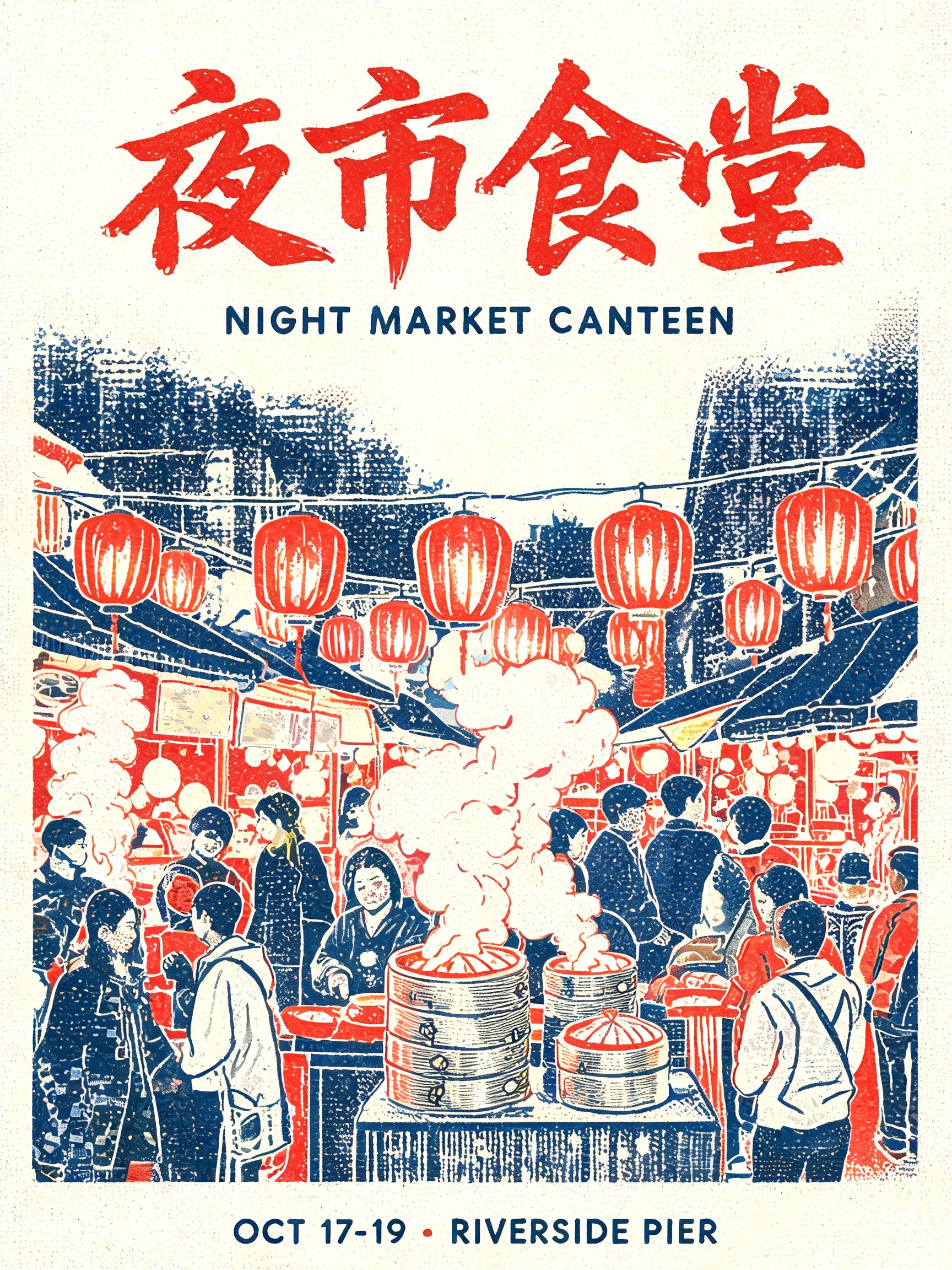
All three text blocks landed on the first take: brush-stroke calligraphy for 夜市食堂, clean letter-spaced caps for the subtitle, and the date line with the interpunct intact.
Why it works: each string is wrapped in quotes, given its own line in the prompt, and anchored to a position (top / directly below / at the bottom). The model treats quoted text as literal content to reproduce, not as scene description.
Make it yours: swap the scripts (Japanese, Korean, Arabic all follow the same pattern), keep one position anchor per string, and keep the style words after the text spec so they can't contaminate the lettering.
Recipe 2: The menu board where every price is right
Small handwritten text plus numbers — the classic "AI image" tell when it goes wrong.
A photorealistic close-up of a cafe chalkboard menu, hand-lettered chalk
text listing exactly four items with prices: 'FLAT WHITE 4.50', 'COLD
BREW 5.00', 'MATCHA LATTE 5.50', 'BUTTER CROISSANT 3.80', a small chalk
drawing of a steaming coffee cup in the lower corner, warm morning light
from a side window, shallow depth of field, wooden cafe interior softly
blurred in the background
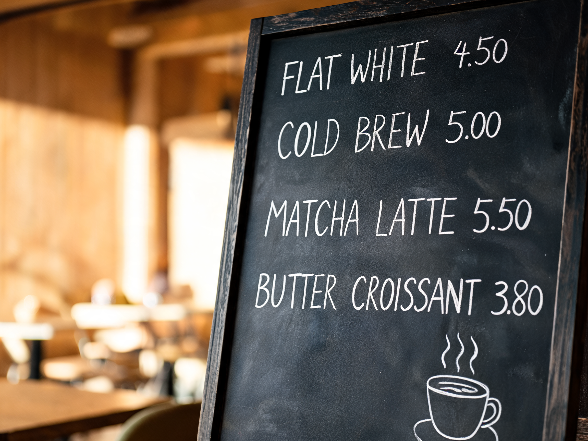
Four items, four prices, zero typos — including the decimal points, which weaker text renderers love to mangle into smudges.
Why it works: "exactly four items" caps the list so the model doesn't hallucinate a fifth entry to fill space, and each item+price pair is quoted as one unit so prices stay attached to the right line.
Make it yours: this pattern generalizes to price tags, shelf labels, storefront signage and receipts. Keep it under ~6 lines of text; past that, any diffusion model starts trading legibility for texture.
Recipe 3: The real place, drawn from what the model knows
Seedream 5.0 Lite ships with web knowledge — name a real entity plainly and it fills in details you didn't specify.
Golden hour photograph of the Sydney Opera House viewed from Mrs
Macquarie's Point, its white sail-shaped roof shells catching warm orange
light, the Sydney Harbour Bridge visible behind it to the left, a
green-and-yellow Sydney ferry crossing the harbour in the middle
distance, gentle ripples on the water, shot on a full-frame camera with
a 70mm lens, crisp architectural detail, no text
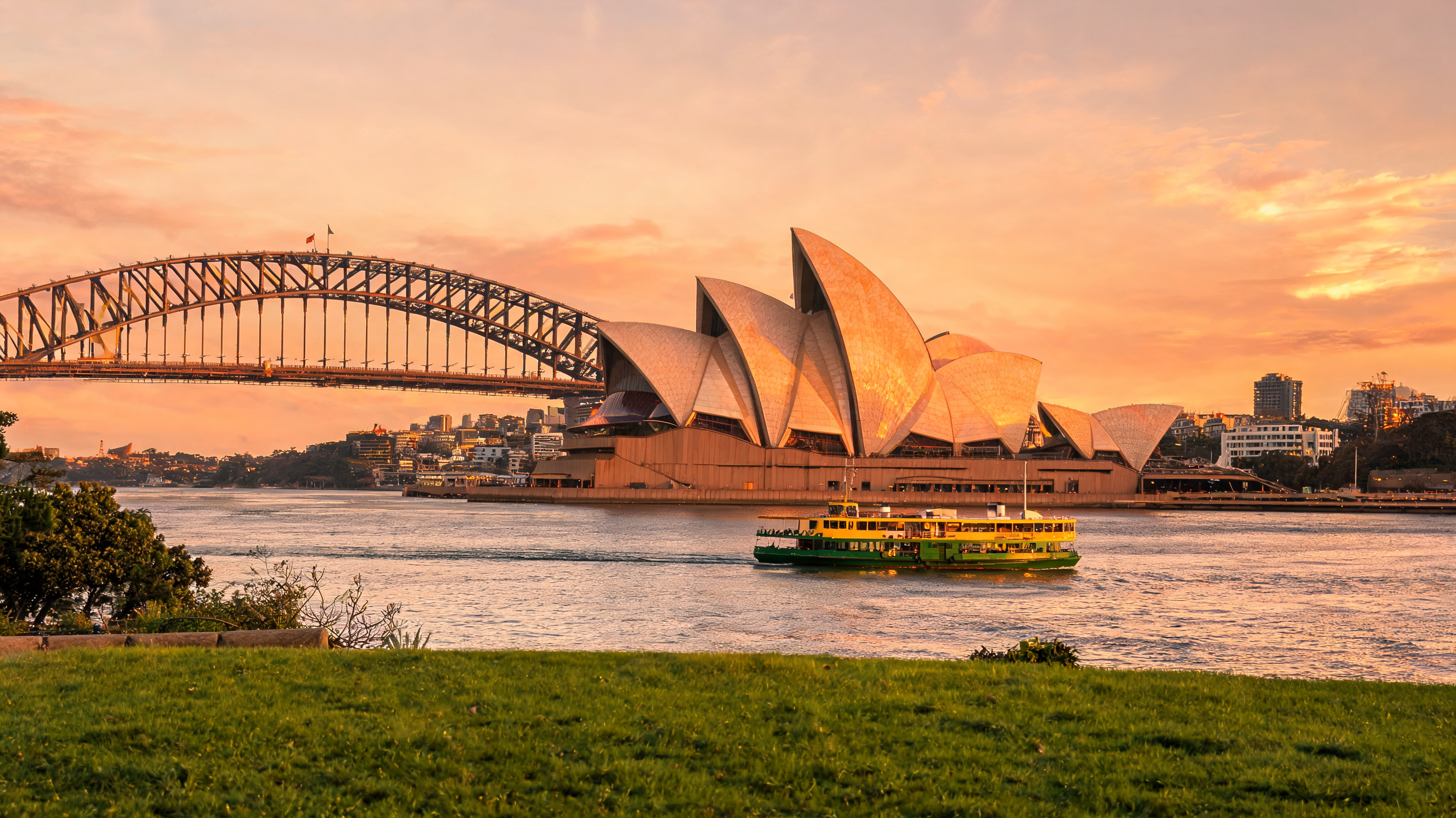
The geography checks out: from Mrs Macquarie's Point the Harbour Bridge really does sit behind and to the left of the Opera House, and Sydney's ferries really are green and yellow. We named the viewpoint; the model supplied the correct spatial relationship.
Why it works: instead of describing a landmark generically ("a famous white opera house by the water"), you name it and name the vantage point. The model's entity knowledge does the heavy lifting; your prompt only steers light, lens and mood.
Make it yours: this is the recipe for travel content, local-market landing pages and editorial headers. Add "no text" when you want a clean photographic plate — Lite otherwise likes to add signage to urban scenes.
Recipe 4: The labeled infographic
Text plus structure: a title, four numbered steps, icons, arrows, reading order.
A clean flat-design infographic titled 'HOW ESPRESSO IS MADE' at the top
in bold capitals, showing exactly four numbered steps arranged left to
right, each with a simple line icon and a short label: '1 GRIND',
'2 TAMP', '3 BREW', '4 SERVE', thin arrows connecting the steps, muted
palette of espresso brown, cream and sage green on an off-white
background, generous margins, modern editorial infographic style
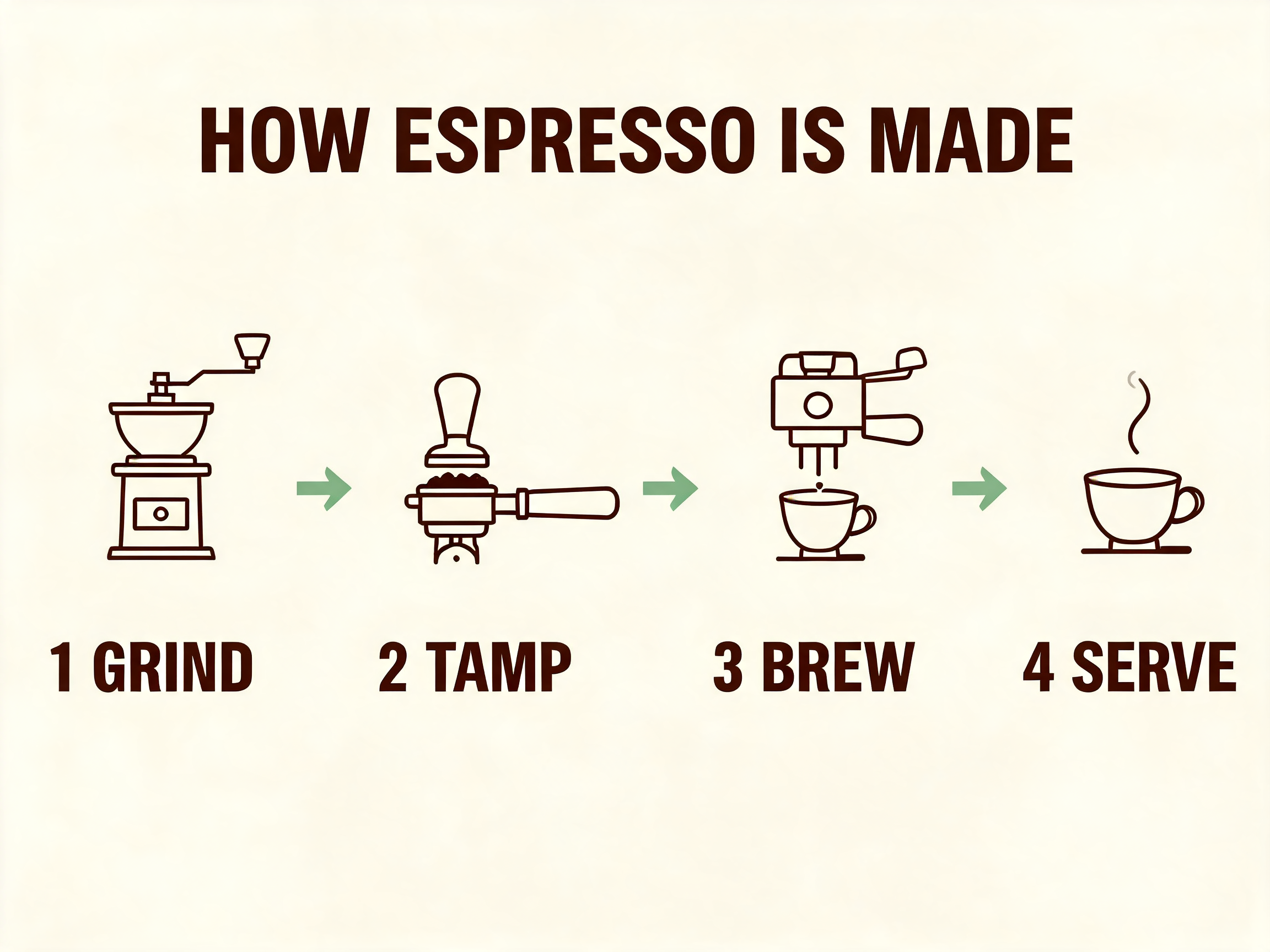
Title, all four labels, the numbering, the arrows and the left-to-right order all came out correct — this is a slide-ready diagram from a single prompt.
Why it works: the layout is specified as a countable structure ("exactly four numbered steps arranged left to right") and every label is quoted with its number baked in, so the model can't shuffle captions between icons.
Make it yours: swap in your own 3–5 step process. Keep labels to one or two words; icon + long sentence is where infographic prompts fall apart.
Recipe 5: The packaging mockup with your brand on it
Product photography with brand text — the "does this look like a real ad" test.
Studio product photograph of a matte-black cylindrical tin of loose-leaf
tea standing on a slate surface, minimalist label with the brand name
'HILLFOG' in embossed serif capitals and the words 'OOLONG No.12'
printed in smaller type below it, a single dried tea leaf lying beside
the tin, soft diffused key light from the upper left, gentle soft
shadow, muted charcoal background, premium packaging photography
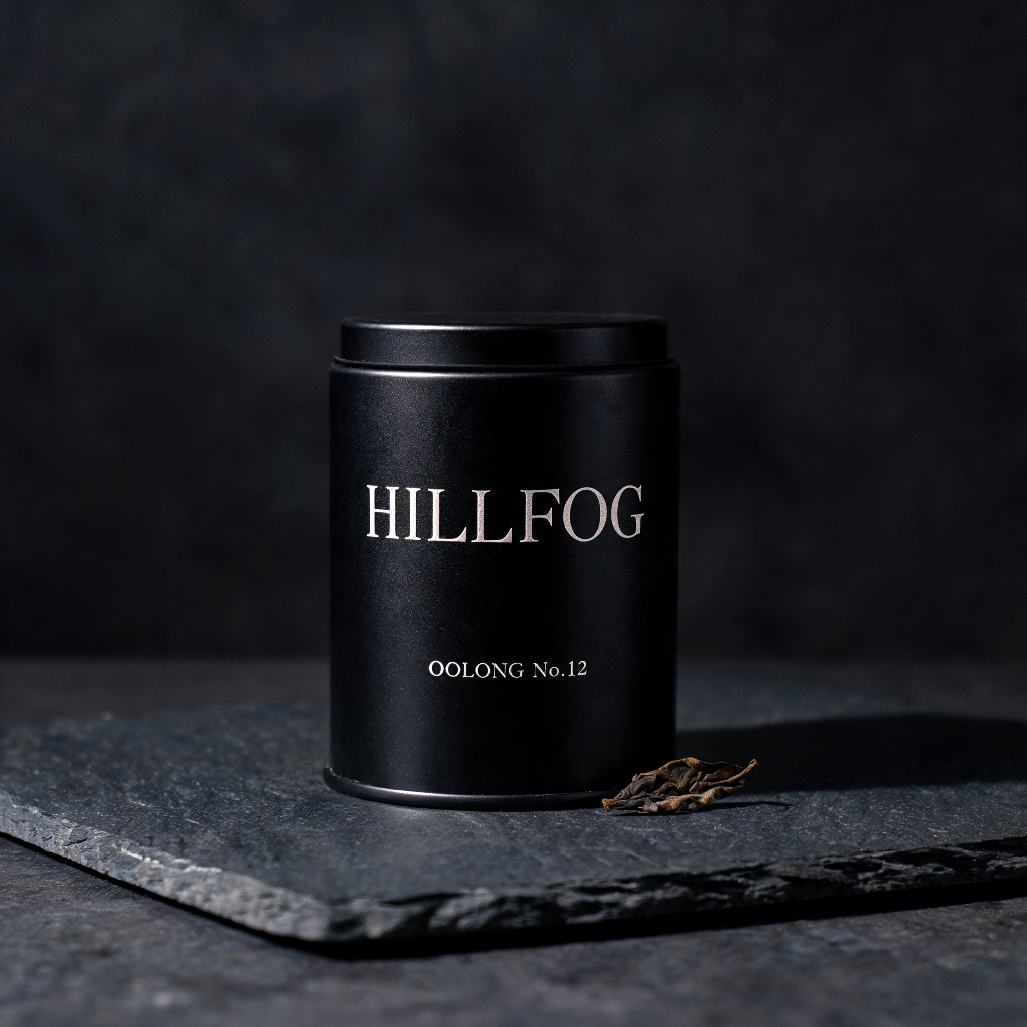
The serif brand name reads as embossed metal, the "No.12" survived with its period intact, and the lighting brief (soft key from upper left, gentle shadow) was followed literally.
Why it works: typography gets material properties ("embossed serif capitals") instead of just a font vibe, which pushes the model to integrate the text into the surface rather than floating it on top.
Make it yours: concept packaging, pitch-deck mockups, A/B visuals for a brand refresh. Two text elements — brand + variant line — is the sweet spot; save the ingredient list for your design tool.
Recipe 6: The constraint test — counts, colors, positions
No text this time. This recipe measures whether the model treats your prompt as a spec or as a mood board.
An overhead flat-lay photograph of a wooden desk: exactly three yellow
pencils lying in a neat row in the top-left corner, one open blue
hardcover notebook with blank pages in the center, a pair of round
black-framed eyeglasses resting on the notebook's right page, a white
ceramic mug of black coffee at the bottom-right corner, and nothing else
on the desk, soft even daylight, sharp focus, clean minimalist
composition, no text
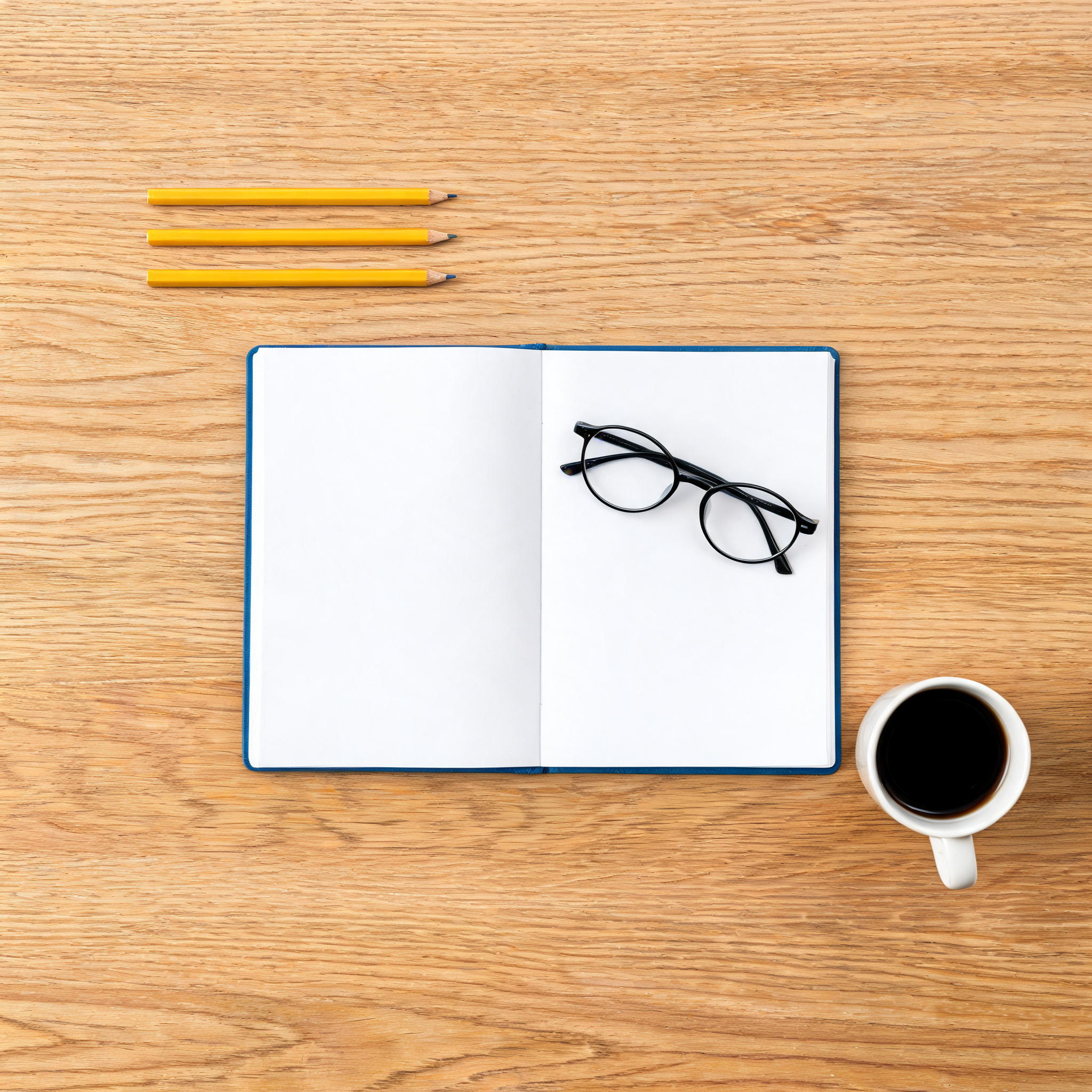
Score it yourself: three pencils (not two, not five), notebook centered, glasses on the right page specifically, mug in the bottom-right, and — the hard part — nothing else on the desk. Most models can't resist adding a plant.
Why it works: every object carries an exact count, a color and a position, and the scene is explicitly closed with "and nothing else." Open-ended prompts invite set dressing; closed specs suppress it.
Make it yours: this is the pattern for e-commerce lifestyle shots and hero images that must leave room for overlay text — put your negative space where the copy will go by not placing objects there.
The patterns behind all six
If you only remember five rules, make them these:
- Quote every string you want rendered, one string per line of the prompt, each with a position anchor ("at the top", "below it").
- Count everything countable. "Exactly four items", "three pencils" — Lite treats numbers as hard constraints.
- Name real entities plainly and let the model's web knowledge supply the details; spend your prompt tokens on light and lens instead.
- Close the scene with "and nothing else" when composition matters.
- Style words go last, after content and layout, so they can't bleed into the text spec. And remember the API quirk:
resolutionmust be"2K"or"4K".
Price check: where Lite sits
At $0.035 per image, Seedream 5.0 Lite lands next to gpt-image-2 ($0.03) and under nano-banana ($0.05) — specialist-grade text rendering at general-purpose pricing. If your workload is posters, menus, labeled diagrams or anything where the words must be right on the first take, that's a strong trade. For photoreal people or heavy stylization you may still A/B it against the alternatives, but for text-in-image jobs it earned its spot in our default rotation.
Ready to run these? Grab your key, open the Seedream 5.0 Lite model page to try the playground and see live params, and paste any recipe above into your first task call — the API docs cover polling and error handling if you're wiring it into production.