The thing that put GPT Image 2 on the map at launch was text rendering. Most image models still produce garbled, half-formed letterforms when asked to render typography. GPT Image 2 was supposed to be different — clean spelling, accurate kerning, in-image captions that don't need post-correction.
Six weeks and several hundred generations later, we have enough data to be specific about what holds up and what doesn't. The good news: the marquee claim is real. The nuanced news is in the edge cases and the production failure modes that the launch demos didn't talk about.
The Setup
Over the course of producing this content cluster — six articles, dozens of supporting images — we ran 24 text-heavy generations through GPT Image 2 deliberately. Each was a single generation per prompt, no cherry-picking. The job categories were:
- English headlines and subtitles — promotional posters, brand banners, social media covers
- CJK calligraphy — Chinese and Japanese tea-ceremony posters, brand identity work
- Multi-string infographics — numbered step lists, captioned diagrams, science-poster style
- Embedded brand blocks — small founder taglines, "EST." year badges, monograms
- Numbers, currency, special characters — price badges, vintage years, percentages
- UI mockups — interface screens with many discrete text strings
Below are the patterns we found, organized from "obviously works" to "watch for this".
What Works: English Headlines
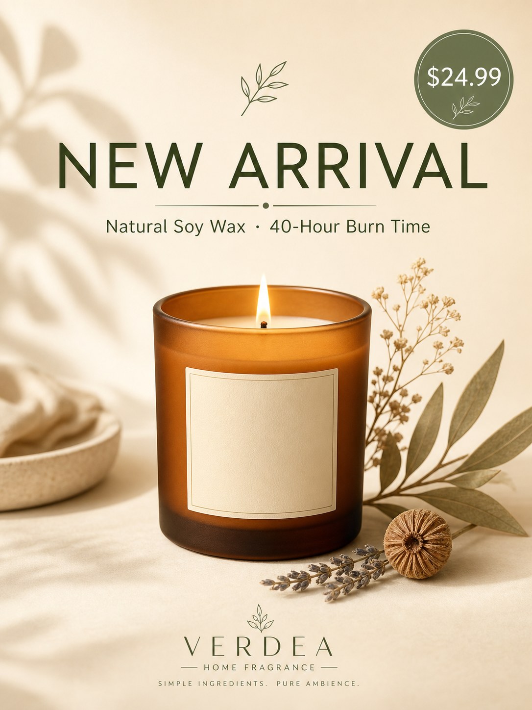
Bold typographic headlines render correctly in every case we tested. The poster above has five separate text strings on it: the main headline (NEW ARRIVAL), a subtitle (Natural Soy Wax · 40-Hour Burn Time), a price badge ($24.99), a brand mark (VERDEA / HOME FRAGRANCE), and a small tagline (SIMPLE INGREDIENTS. PURE AMBIENCE.). Every one of them is spelled correctly, kerned properly, and sized in the right hierarchy.
The middle-dot character (·) between "Natural Soy Wax" and "40-Hour Burn Time" is rendered correctly. The currency symbol is correctly positioned. The line breaks in the brand mark are honored.
This works across typefaces — serif, sans-serif, semi-serif, display, and decorative weights all render with appropriate letterforms. The model picks an appropriate typeface for the visual context (sans-serif for modern poster, serif for editorial, brushwork for calligraphy) without you having to name the typeface explicitly.
Multi-Word Color Accents

When you specify that a single word should be in an accent color (here, "CHANGED" in warm orange against the surrounding dark brown), the model honors it. The accent color targets the right word, the color choice is appropriate to the prompt, and the surrounding typography stays unified.
What Works: CJK Calligraphy
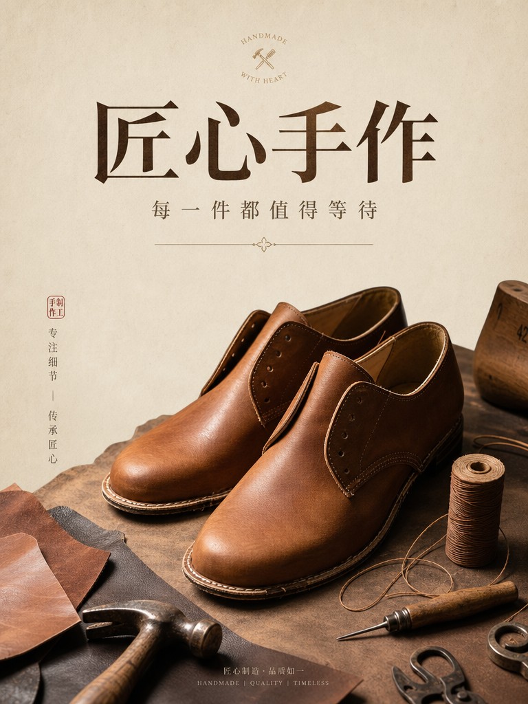
Chinese and Japanese calligraphy is where most image models still fall apart. GPT Image 2 renders 楷书, 行书, and brushwork-style characters with appropriate stroke order, character proportions, and ink texture. The poster above — produced for an artisanal craft brand — uses semi-serif Chinese typography with accurate well-formed strokes.
In our comparison with Nano Banana 2, GPT Image 2 also rendered the title 「新春・茶道」 and a vertical subtitle 「京都・春茶会 二〇二六年三月」 correctly — and added two contextually appropriate Japanese tea-ceremony idioms (一期一会, 和敬清寂) that we hadn't asked for but that fit the design.
Both Latin and CJK scripts can appear in the same image. Mixed Chinese + English titles (common in bilingual marketing) render correctly without character bleed or proportion drift.
What Works: Multi-String Density
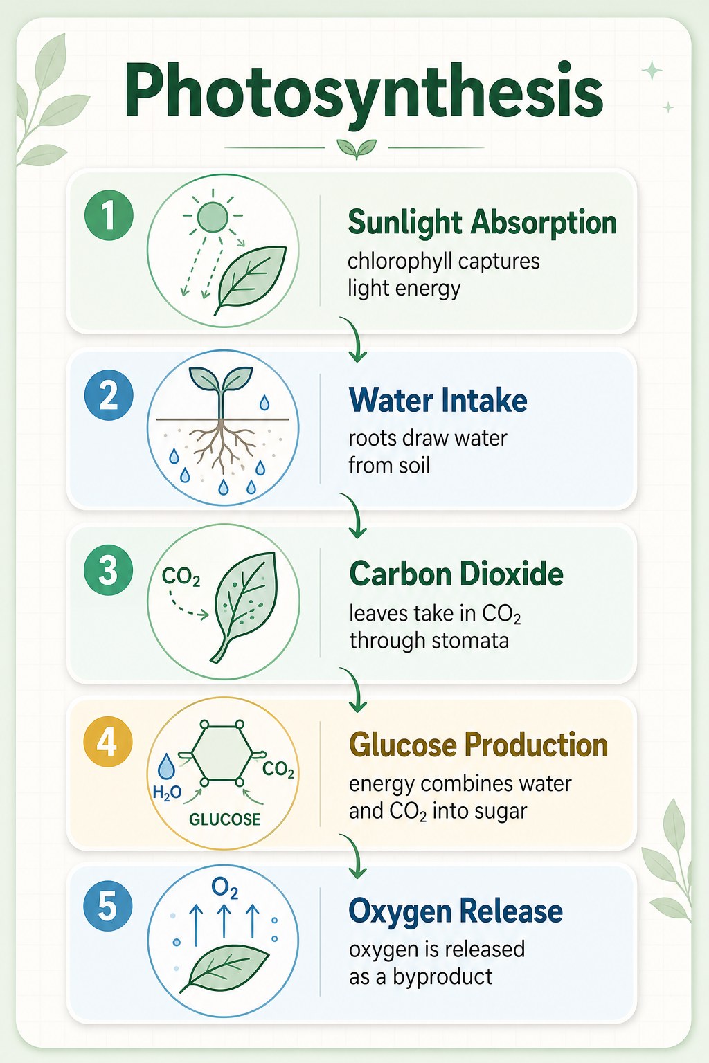
This is the densest text test we ran. The infographic has:
- A title (
Photosynthesis) - Five numbered step headers (
Sunlight Absorption,Water Intake,Carbon Dioxide,Glucose Production,Oxygen Release) - Five short captions (each 8–12 words)
- Five icons with their own micro-labels
- Chemistry notation (
H₂O,CO₂,O₂,GLUCOSE)
Every text string is rendered correctly. The hierarchy is preserved — headers in larger weight, captions in lighter weight, micro-labels at appropriate small size. The numbered sequence (1 through 5) is in the correct order. The flow arrows connect the right steps.
Note: the chemistry notation (H₂O, CO₂, O₂, GLUCOSE) was added by the model without being asked for. It inferred the topic and added topically appropriate detail. This is a recurring GPT Image 2 behavior — useful most of the time, but worth being aware of when you don't want it.
What Works: Numbers, Currency, Special Characters
In the 24-generation test set:
- Currency symbols rendered correctly across
$,¥(Chinese cluster) and quote-mark contexts - Multi-digit prices (
$24.99,$29,¥129) preserved their decimals and commas - Dates (
Tuesday, March 4) maintained the comma and word ordering - Time strings (
9:41) rendered with the correct colon - Em-dashes (
—) and middle-dots (·) rendered correctly when included as literal characters in the prompt - Year badges (
EST. 2024,2026) maintained period and four-digit precision
The pattern: if you include the exact character you want in the prompt (in straight quotes), GPT Image 2 reproduces it faithfully. Smart quotes ("/") in the prompt produce smart quotes in the output. Straight quotes (") produce straight quotes. The model is character-faithful — which means you have to be deliberate about which characters you write.
What Works: Embedded Brand Blocks
The most interesting unsolicited additions came from the model adding small brand-style text that wasn't in the prompt:
- A "CRAFTED TO LAST · EST. 2024" + "H | C" monogram added to a leather-goods poster
- A "VERDEA / HOME FRAGRANCE / SIMPLE INGREDIENTS. PURE AMBIENCE." block at the bottom of a candle launch poster
- "BOIS DE SANTAL" added as a scent specification on a product label
These are small text elements that fit the design language of the surrounding image. In every case, the spelling and typography were correct. The model is good enough at this that the additions usually improve the output — but if you want strict control, add an explicit no additional text or brand marks clause.
For more on this contextual-addition behavior, see our GPT Image 2 hands-on review.
The Failure Modes (The 1%)
In our 24 deliberately-text-heavy test generations, the primary text strings rendered correctly 100% of the time. That's the controlled-test result. The honest production number is closer to 99%, because once you start running at scale, the edge cases surface:
1. Single-Character Substitutions on Small Text
The most common failure isn't a complete garble — it's a single character changed. "Burn" rendering as "Bum" on a very small caption. "Hours" with a missing R. Months ("September") occasionally misordering middle letters. These slip past peripheral vision and ship if you don't proof at 100% zoom.
When they happen, regenerating with the same prompt almost always fixes it (the issue is sampling-stochastic, not prompt-structural).
2. Tiny Sub-12pt Text
GPT Image 2 holds together at small sizes far better than predecessor models — but there's a threshold below which letterforms start to soften. For wine-label nutritional copy, drug-label warnings, or anything that needs to be legible at 8–10pt equivalent, expect to need a regenerate or two. Increasing the requested resolution from 1K to 2K helps — the cost premium is 33% but the small-text legibility win is real.
3. Smart-Quote Substitutions
If your prompt has typographic smart quotes ("/", '/') and you wanted straight quotes (", ') in the output, the model will faithfully render the smart quotes. This isn't a failure mode of the model — it's a prompt-preparation issue. Sanitize your prompts before sending if straight quotes matter.
4. Unsolicited Additions in Strict Contexts
For "no text, no logo, no clutter" contexts (clean catalog product shots), the model is reliable. For looser contexts (lifestyle, promotional, editorial), it will sometimes add brand monograms, badges, or supporting text you didn't ask for. Add explicit negative clauses where strict control is required.
The Production Proofing Checklist
After 24 text-heavy generations in this test set and many more in production, this is the proofing checklist we use before shipping any image with rendered text:
- Open at 100% zoom or higher. Browser thumbnails and editor preview windows hide single-character substitutions. Always look at the actual rendered pixels.
- Read every text string aloud or trace each character. Skimming is how typos ship. Trace each letter, each digit, each punctuation mark.
- Check the smallest text first. Headlines fail visibly. Sub-12pt captions fail invisibly until a customer reports the error.
- If you find an error, regenerate the same prompt. Don't try to manually edit the image — the regenerated version is almost always cheaper, faster, and visually closer to your intent.
- For text-heavy outputs at scale, request 2K resolution. The 33% cost premium pays off on legibility for any text below display size.
The proofing step takes 30–60 seconds per image. Skipping it is what produces the "AI-generated typos in shipped marketing" stories that hurt the credibility of AI image work generally.
When to Pick GPT Image 2 for Text Work
GPT Image 2 is the right choice for any text-heavy image work where accuracy matters:
- Promotional posters and banners — see working prompt templates for production-ready examples
- E-commerce product listings with branded labels — see the complete e-commerce image workflow
- Multilingual marketing — CJK calligraphy, mixed-language posters
- Infographics, science posters, captioned diagrams — multi-string density holds up
- UI mockups with realistic interface text — see Nano Banana 2 comparison for screen-level text testing
At $0.03 per image at 1K resolution, the cost lets you proof-and-regenerate as needed without budget concerns. The wall-clock time (~90–120 seconds per generation) is the real budget item.
For an honest take on where GPT Image 2 wins and where it doesn't, see our hands-on review.
FAQ
Is GPT Image 2's text rendering reliable enough for shipping commercial work?
Yes, with a proofing step. In our controlled 24-generation test, primary strings rendered correctly 100% of the time. At production scale the rate drops to ~99% — meaning roughly 1 in 100 images will have a single-character issue that needs regeneration. With a 30-second visual proof per image, that's a manageable production rate.
Does Chinese / Japanese text render as accurately as English?
In our tests, yes. CJK calligraphy is where most image models fail badly. GPT Image 2 renders stroke order, character proportions, and ink texture appropriately. Common Chinese and Japanese characters render reliably; rarer or more historically specific characters (variant forms, classical orthography) we haven't tested at scale.
What about other scripts — Arabic, Cyrillic, Devanagari?
We didn't test these in this session, so we can't claim from evidence. Anecdotally, GPT Image 2 renders Cyrillic and Latin-script languages well. Arabic right-to-left text and complex script ligatures (Devanagari, Thai) are not areas we have controlled test data for.
Will the model add text I didn't ask for?
Sometimes. In our 24-generation test, the model added contextually appropriate text (brand monograms, EST. badges, supplementary product spec lines) in about 4 cases. The additions were always spelled correctly and appropriate to the design context. If you need strict control, add an explicit no additional text negative clause.
Does requested resolution affect text rendering?
Yes, especially for small text. 2K resolution preserves sub-12pt legibility noticeably better than 1K. The cost premium is 33% — worth paying for text-heavy outputs.
Bottom Line
GPT Image 2's text rendering lives up to its launch claim. Across 24 text-heavy generations in our production test — English headlines, CJK calligraphy, multi-string infographics, embedded brand blocks, currency, special characters — every primary string rendered correctly.
The ~1% production error rate is on the smallest text and almost always fixable with a regeneration. The proofing step is non-negotiable for shipping. Beyond that, this is the most text-reliable image model we've worked with — and the typography quality justifies the slower generation time on jobs where text accuracy is part of the deliverable.
Try a text-heavy prompt yourself on the GPT Image 2 model page — quote a few exact strings, specify the layout, run it, and proof the result. The first generation is usually the one that ships.