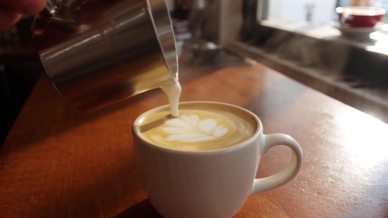
GPT Image 2 是 OpenAI 在 2026 年 4 月发布的次代图像生成模型,画面质量和文字渲染都很强(中文字符准确率约 99%)。但很多人卡在同一个地方:模型够好,自己不会写提示词,随手写一句出来的图总是差点意思。
模板就是解决这个问题的。 下面 10 个 GPT Image 2 提示词模板,把构图、光影、配色、画面比例这些「专业活」都提前写死了,只在 [方括号] 里留了变量。你要做的只是把方括号换成自己的内容,剩下的交给模板——出图风格稳定、可复现,不用每次靠运气。
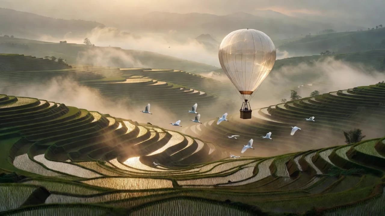
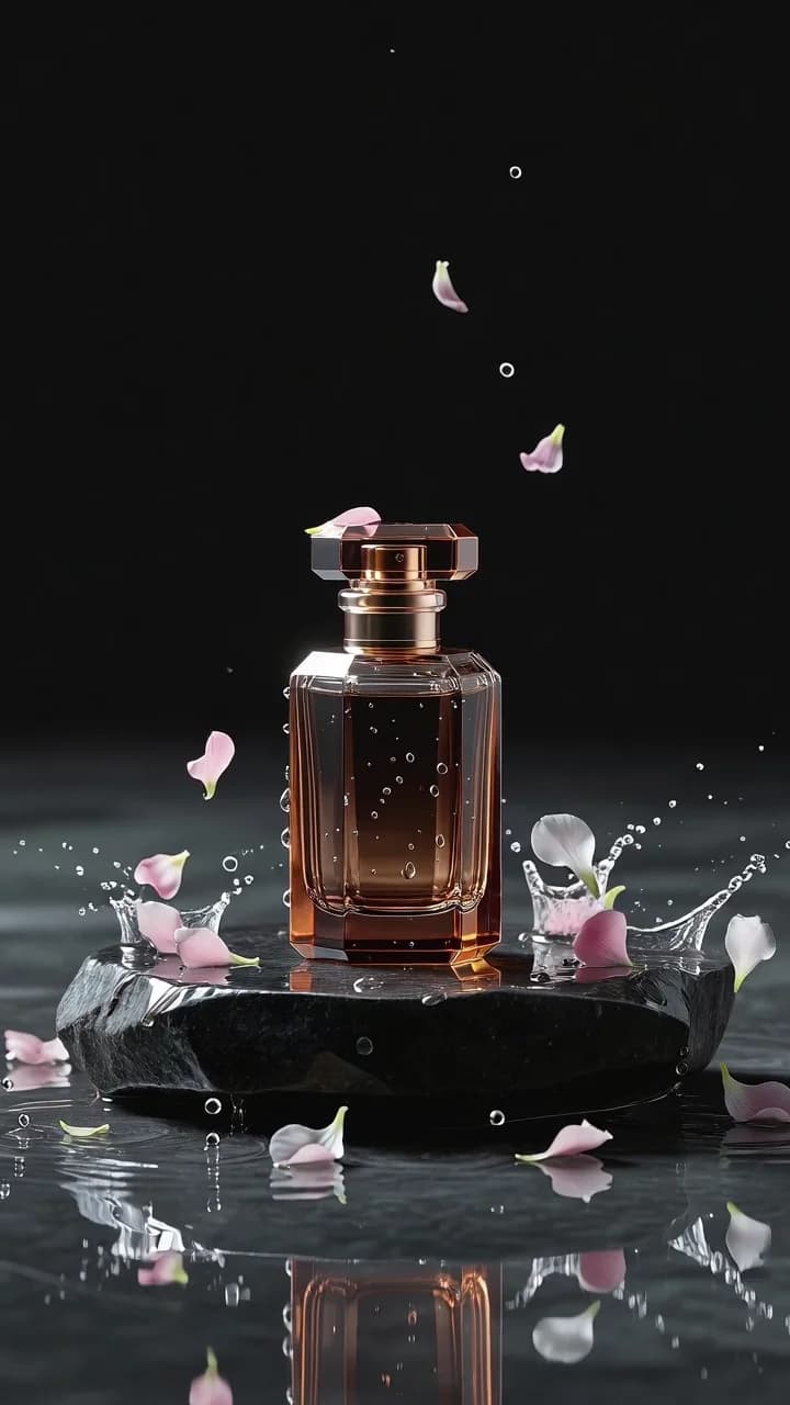
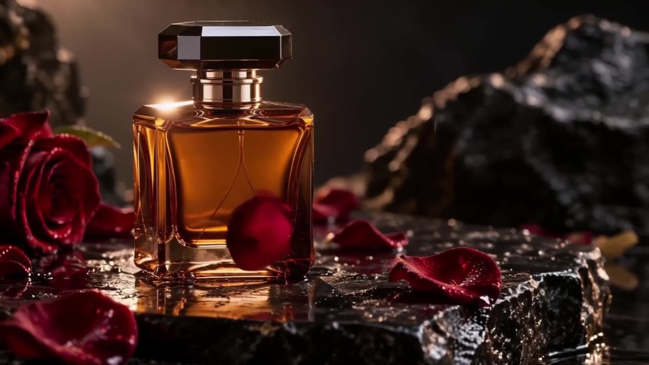
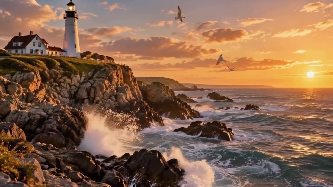
每个模板下面那张图,就是用这条 prompt(方括号填入示例内容后)在 GPT Image 2 上跑出来的真实成图,所见即所得。复制走,直接用。
想先看看 GPT Image 2 本身的能力边界,可以看 GPT Image 2 深度测评;想了解它和已退役上代的实测差异,看 GPT Image 2 对比 GPT Image 1.5。
模板 1 · 电商产品主图
电商详情页、商品橱窗用的干净主图——把任意产品放进影棚级布光和无杂物背景里。
A professional high-end e-commerce product photograph of [产品], shot on an 85mm lens, perfectly centered on a seamless soft-grey gradient backdrop. Three-point studio lighting: a large softbox key light from the top-left creating gentle wraparound highlights, a crisp rim light defining the bottle's edges, a soft fill flattening harsh shadows. A clean realistic reflection mirrors beneath the product on a subtly glossy surface. Razor-sharp focus throughout, true-to-life color, visible glass texture and liquid translucency, tiny condensation droplets on the bottle, no props or clutter, generous symmetrical negative space, 1:1 square, catalog-grade commercial photography.
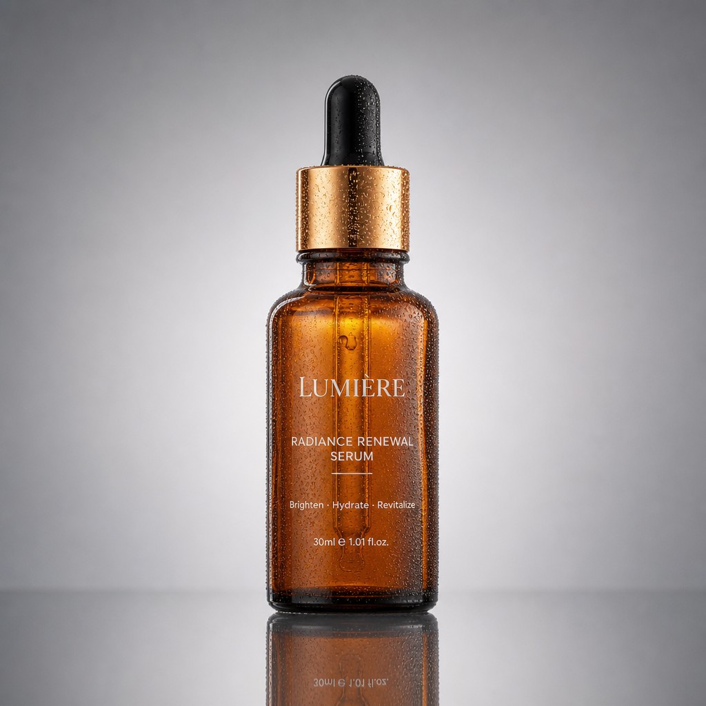
怎么改: 把 [产品] 换成你的商品(如「a frosted skincare serum bottle」「一支哑光口红」)。如果产品不是瓶装,prompt 里 the bottle's edges、condensation droplets on the bottle 这类针对瓶子的描述可以顺手改成对应物体的词;其余光影和背景描述不要动,那是出图干净的关键。
模板 2 · 促销活动海报
带大标题、副标题、价格角标的促销海报,适合上新、打折、活动投放。
A modern high-impact promotional poster, 4:3 landscape. A bold oversized headline "[限时 5 折]" anchored at the top in a clean geometric sans-serif with confident letter-spacing, a smaller refined subheadline "[夏季新品全场]" directly beneath. Central hero subject: [一双纯白色帆布鞋] floating at a slight dynamic angle, casting a soft natural drop shadow, framed by playful overlapping geometric shapes — circles, arcs, triangles — in complementary tones. Bright lemon-yellow background with subtle paper-grain texture. Vibrant flat-design, strong color contrast, deliberate visual hierarchy leading the eye from headline to product, balanced margins, a small circular price badge in one corner, polished advertising layout.
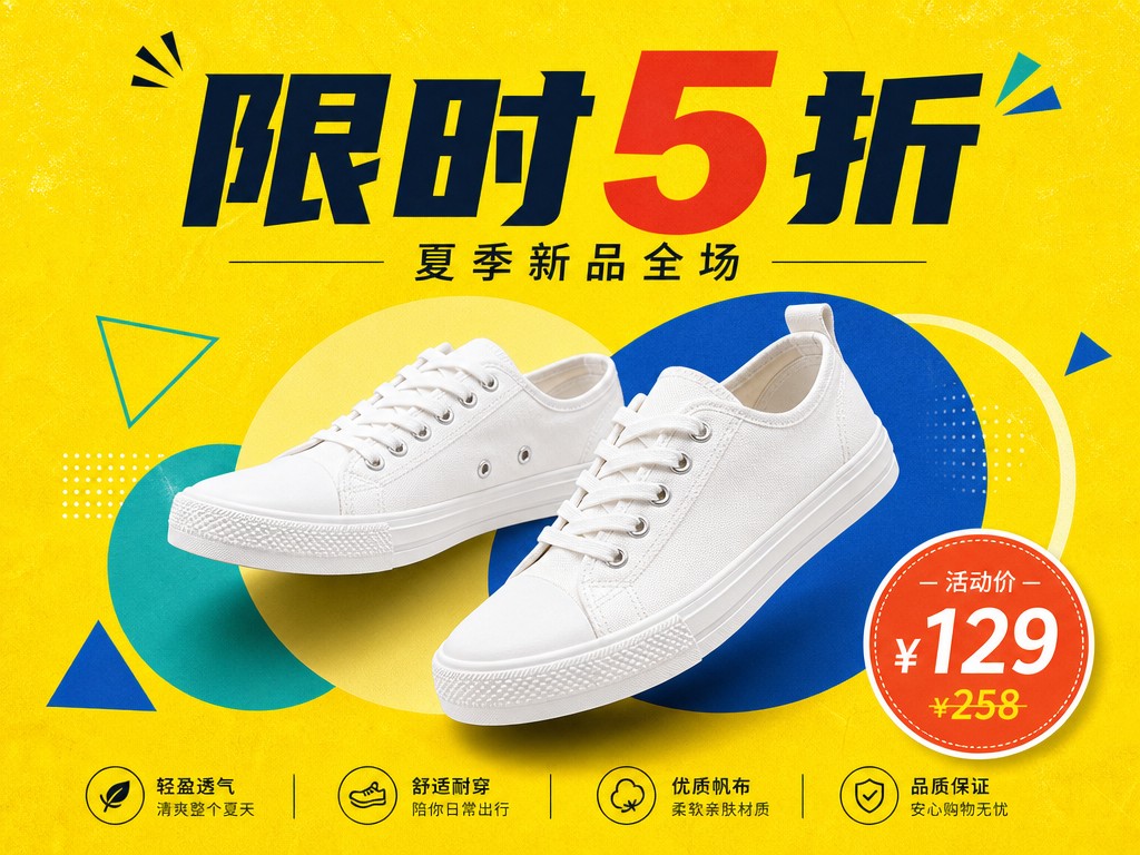
怎么改: 三个方括号分别是主标题、副标题、海报主体。标题直接写你要显示的中文,GPT Image 2 能准确渲染。想换风格就改 Bright lemon-yellow background 的颜色(如 deep navy-blue),其余几何装饰和排版描述保留。
模板 3 · 知识科普卡片
把一个知识点拆成几步、配图标和流程箭头的信息图卡片,适合公众号、课件、社媒科普。
A clean professionally designed educational infographic card, bold heading "[光合作用]" at the top. The body lays out five clearly numbered steps in a logical top-to-bottom flow connected by thin curved arrows; each step pairs a simple two-tone line icon with a concise label and a short caption. Soft pastel palette (mint green, sky blue, warm cream), flat vector illustration with consistent line weights, a faint background grid, abundant white space, tidy margins, gently rounded section corners, soft drop shadows for light depth, modern science-poster aesthetic, perfectly legible typography, 3:4 portrait.
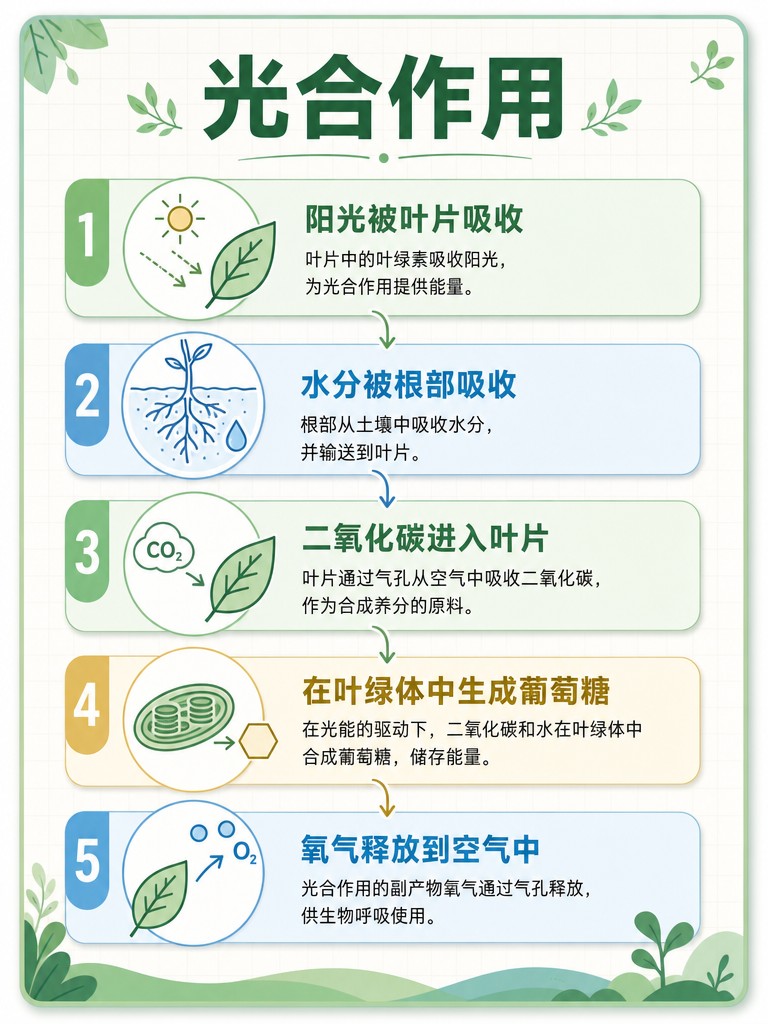
怎么改: 把 [光合作用] 换成你的主题。模板默认排五步(five clearly numbered steps),步数可按内容改成 four 或 six。配色嫌淡可以把 Soft pastel palette 换成更鲜的色组。
模板 4 · 社交媒体封面
小红书、公众号那种「一眼抓住人」的封面图,带醒目标题和氛围插画。
An eye-catching scroll-stopping social media cover, 16:9. A large expressive title "[这3本书改变了我]" set off-center in a stylish bold typeface with one keyword in an accent color. Focal illustration beside the text: [一摞三本书与一杯冒着热气的咖啡], rendered with warm inviting detail. Warm cozy tones (caramel, cream, soft brown), a subtly textured paper background with a faint light vignette, a few small hand-drawn doodles (sparkles, underline strokes) for personality, trendy editorial layout with a strong clear focal hierarchy, comfortable padding around every element, composition designed to stand out in a crowded feed.
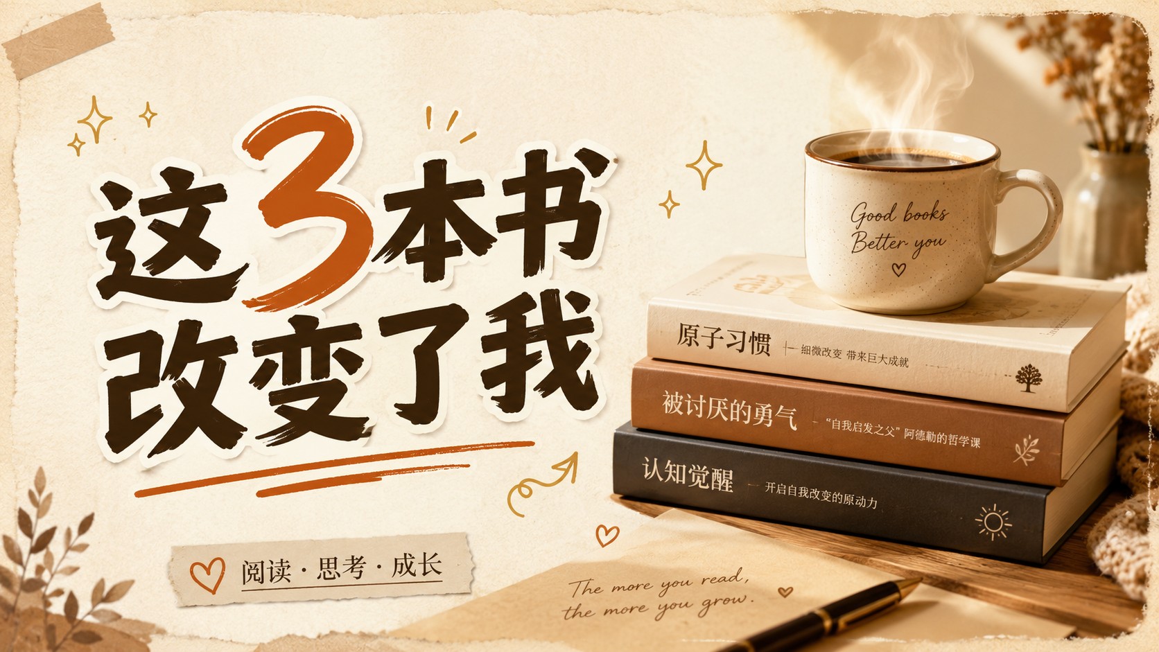
怎么改: 第一个方括号是封面标题,第二个是配图主体(写一句带细节的描述,别只写名词)。比例默认 16:9,发小红书可以把末尾的 16:9 改成 3:4。
模板 5 · 品牌 Logo 概念图
把两个意象融合成一个标识,配字标和标语,做成专业提案展板的样子。
A polished minimalist logo concept on a clean presentation board for [有机咖啡品牌 GreenLeaf]. The primary mark elegantly merges [一片舒展的叶子与一颗咖啡豆] into one cohesive symbol with smooth balanced curves and even negative space. Below it the wordmark "[GreenLeaf]" is set in a refined modern geometric typeface, with a small tagline "[Organic · Roasted Fresh]" beneath. Strict two-color palette of deep forest green and warm cream, flat vector style, crisp edges, scalable construction. The logo is shown once large and once small to imply versatility, plain neutral background, professional brand-identity aesthetic.
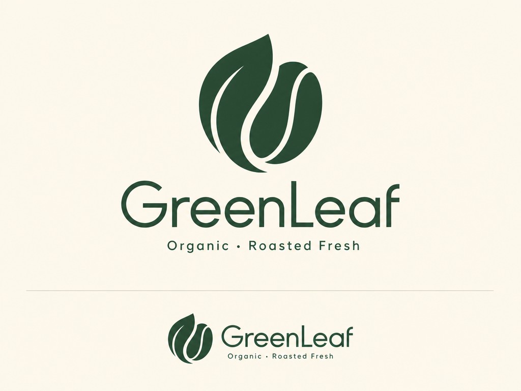
怎么改: 四个方括号分别是品牌定位、要融合的两个意象、品牌字标、标语。意象选两个相关又好融合的元素效果最好。deep forest green and warm cream 这组配色按品牌调性换。
模板 6 · 写实场景摄影
photorealistic 级别的写实成图——美食、产品、静物特写都能用,背景自然虚化。
A photorealistic mouth-watering close-up of [一碗热气腾腾的日式豚骨拉面] on a dark walnut table. Shot on a 50mm lens at a low three-quarter angle, shallow depth of field with creamy bokeh dissolving the background. Soft natural window light rakes in from the left, catching the glossy broth, a soft-boiled egg's runny yolk, springy noodles and delicate wisps of rising steam. Rich fine texture — chopped scallions, nori sheen, chashu marbling — warm appetizing color grade, gentle highlights and soft deep shadows, a few blurred props (chopsticks, a small side dish) behind, professional food photography, 4:3.
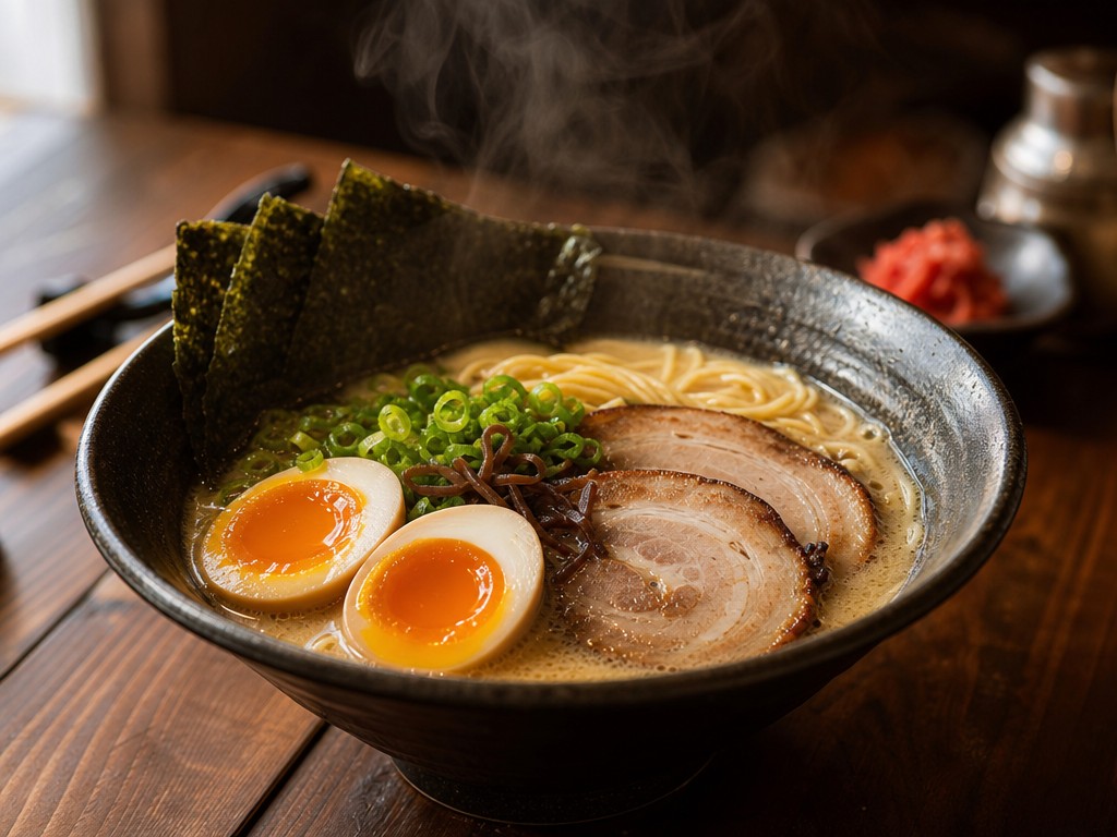
怎么改: 把 [一碗热气腾腾的日式豚骨拉面] 换成你的拍摄主体。如果换成非食物的主体,prompt 中间那串具体食材纹理(chopped scallions, nori sheen...)建议改成对应物体的纹理细节——写实感就来自这些细节词。
模板 7 · 扁平矢量插画
统一风格的扁平插画,适合做配图、海报底图、PPT 素材。
A modern flat vector illustration of [一个人在家中舒适地远程办公]. Scene: [一个人放松地坐在木桌前的椅子上,面前一台打开的笔记本电脑,桌上一杯冒热气的茶和一本书,旁边一盆茂盛绿植,一只猫蜷在脚边地毯上,窗外透进柔和阳光]. Built from clean geometric shapes with consistent rounded corners, a harmonious warm flat-color palette (terracotta, mustard, sage, cream), soft elongated shadows, no gradients, simple two-dot facial features, a subtle grain texture overlay for warmth, balanced composition with comfortable breathing room, friendly inviting mood, modern editorial illustration style, 1:1.
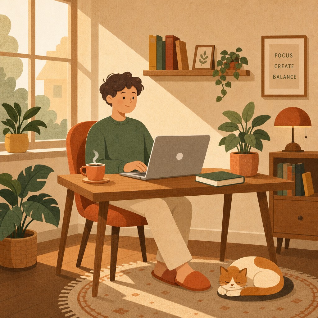
怎么改: 第一个方括号写一句话主题,第二个方括号把画面里要出现的元素逐个列清楚——列得越细,构图越听话。配色组 terracotta, mustard, sage, cream 可整组替换成你的品牌色。
模板 8 · App 图标 / UI 素材
iOS 风格的圆角方图标,蓝色渐变、识别度高,小尺寸也清晰。
A modern polished app icon for [一款天气应用], on the standard rounded-square (squircle) shape. The central symbol — [一朵饱满的白云前方叠加一轮明亮的太阳] — is built from bold simple geometry with clean crisp edges. Background is a smooth diagonal blue gradient (sky blue into deeper azure) with a very subtle inner glow. Flat design with a hint of layered depth: a soft long shadow cast by the cloud, a gentle highlight along its top edge. Vibrant yet tasteful color, perfectly centered with even padding, instantly recognizable and legible at small size, premium iOS-style icon aesthetic, 1:1, shown on a plain neutral background.
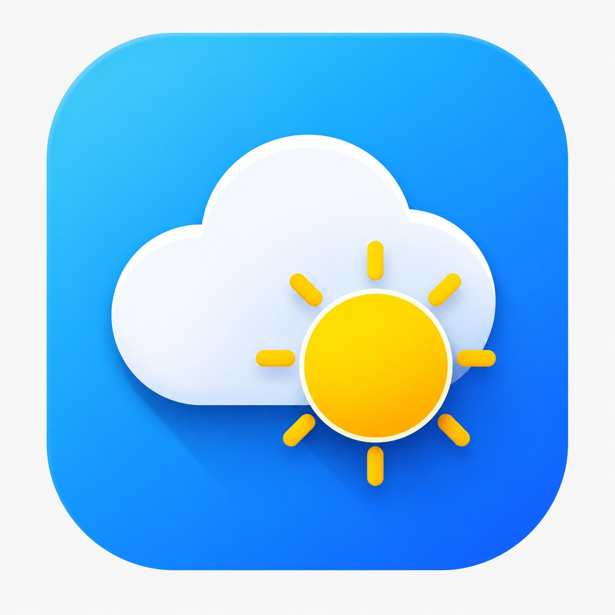
怎么改: 第一个方括号写应用类型,第二个写图标中心符号(用简单几何意象效果最好)。换主题色就改 diagonal blue gradient (sky blue into deeper azure) 这一段。
模板 9 · 复杂多元素场景
一张图里要放很多物件、还要每个都摆对位置——这是检验模型「听不听话」的硬场景。
A detailed warm cozy home-studio interior, polished illustration, every element clearly placed: on the left, [一张木质书桌,上面一台开着的笔记本电脑、一盏亮着暖光的台灯和一个马克杯]; in the center, [一把铺着针织毯的舒适扶手椅]; on the right, [一个顶天立地的木质书架,整齐塞满彩色书籍和几件小摆设]; on the floor, [一块圆形编织地毯,上面一盆高大的龟背竹]. Late-afternoon golden sunlight streams through a tall window, long soft shadows, dust motes drifting in the light beams, warm inviting palette, rich material textures (wood grain, knit, paper), every object distinct and correctly positioned, realistic detailed illustration, 16:9.
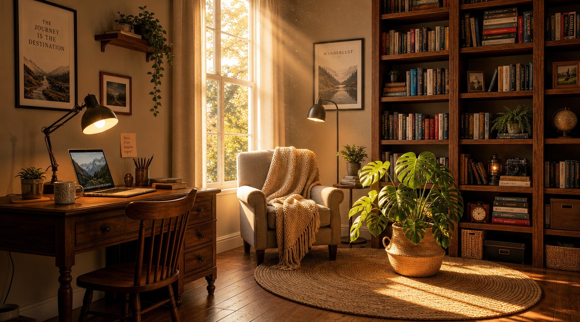
怎么改: 四个方括号分别对应「左 / 中 / 右 / 地面」四个位置的物件。这个模板的价值在于用方位词锁住布局——你换内容时也保留 on the left / in the center / on the right / on the floor 的结构,GPT Image 2 会把元素摆到对应位置。出图实测里书桌、扶手椅、书架、地毯绿植的空间关系全部正确。
模板 10 · 中文文字海报
主打中文标题的海报,笔画准确、版面高级——这也是 GPT Image 2 中文渲染能力的直接体现。
A clean premium poster, 3:4 portrait. A large Chinese title "[匠心手作]" rendered prominently with accurate well-formed strokes near the top in an elegant semi-serif typeface; a smaller Chinese subtitle "[每一件都值得等待]" below it in a lighter weight with comfortable spacing. Central visual: [一双制作中的手工皮鞋,旁边散放着皮料、缝线和工匠工具], lit by warm directional workshop lighting that highlights the leather grain and casts gentle shadows. Refined earthy palette (tan, cognac, charcoal, cream), minimalist balanced layout with generous negative space, a thin decorative divider line, subtle paper texture, high-end artisanal brand aesthetic.
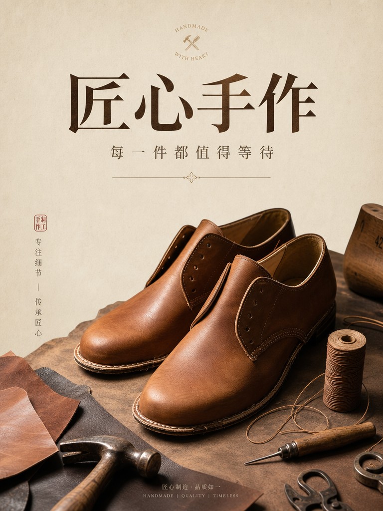
怎么改: 前两个方括号是中文主标题和副标题,直接写你要的字;第三个是画面主体。中文标题建议控制在 4-8 个字,太长容易挤版。
通用技巧:模板用得更顺的几个要点
10 个模板覆盖了大部分高频需求,但同一个模板也能玩出很多变化。掌握下面几点,改占位会更得心应手。
占位怎么改:写「描述」别写「名词」
方括号里写得越具体,出图越准。对比一下:
- ❌ 偷懒写法:
[一只猫] - ✅ 推荐写法:
[一只橘色短毛猫,蜷成一团趴着,半闭着眼]
GPT Image 2 对细节的响应很强,你给的信息越多,它越不需要「自己猜」。涉及人物、场景、多元素的模板(如模板 7、模板 9)尤其要把元素、动作、状态都交代清楚。
画面比例怎么调
每个 prompt 末尾都写了画面比例(1:1 4:3 16:9 3:4),直接改这个词就能换比例。按用途选:
- 1:1:电商主图、社媒方图、App 图标
- 4:3 / 16:9:横版海报、网站 Banner、视频封面
- 3:4:竖版海报、信息图、手机端配图
配色和风格怎么换
模板里的配色一般写成一组具体颜色(如 terracotta, mustard, sage, cream)。想换风格,整组替换成你的品牌色即可,不要只改一个词——颜色之间是搭配关系,单改一个会破坏和谐。
文字类模板放心写中文
海报、信息图、Logo 这类带文字的模板,要显示的中文直接写进方括号。GPT Image 2 的中文渲染准确率很高,标题、副标题都能正确成字。建议标题别太长,给版面留呼吸空间。
想看更多 GPT Image 2 在真实场景下的表现,可以读 GPT Image 2 为什么成了最火的生图模型。
FAQ
这些模板要在哪里用?
任何能调用 GPT Image 2 的地方都行。在 hiapi 的 GPT Image 2 模型详情页 有 Playground 可以直接试玩,把模板粘进去、改掉方括号就能出图。
出图要花多少钱?
GPT Image 2 在 hiapi 上 $0.03/张起(截至 2026-05)。模板的价值之一就是减少试错——一次跑准,比反复重抽省钱。
为什么模板里的 prompt 是英文的?
英文 prompt 在描述构图、光影这些专业概念时更精确稳定,所以模板主体用英文写。但要显示在图上的文字(标题、字标)可以直接写中文——方括号里的中文 GPT Image 2 能准确渲染,模板 2、3、4、10 都验证过。
改了占位之后出图不理想怎么办?
先确认占位写得够不够具体(参考上面「写描述别写名词」)。如果还是不满意,只微调个别词,别整段重写——模板的结构(光影、构图、比例描述)是出图质量的保证,动它反而容易翻车。
模板里的图是真的吗?
是。每个模板下面那张图,都是用该模板的 prompt(方括号填入示例内容后)在 GPT Image 2 上跑出来的真实成图,没有挑选、没有后期。你用同样的 prompt 能得到风格一致的结果。
这些模板能商用吗?
模板本身是给你自由复制使用的。出的图能不能商用,取决于你最终用途和占位内容是否涉及他人版权素材,这点按你自己的场景判断。
关键结论
- 模板的本质是「把专业活外包给结构」:构图、光影、配色、比例已经写死,你只管换占位,出图风格稳定可复现。
- 占位写得越具体,出图越准——一段带细节的描述远胜一个孤零零的名词。
- 画面比例直接改 prompt 末尾的数字,按用途在 1:1 / 4:3 / 16:9 / 3:4 之间选。
- 带文字的模板放心写中文,GPT Image 2 中文渲染准确,标题副标题都能正确成字。
- 改占位、别动结构——出图不理想时微调个别词,不要整段重写。
10 个模板拿去就能用。打开 GPT Image 2 模型详情页 的 Playground,粘一个模板、改掉方括号,第一张图马上就有了。