The same prompt produced three attractive images, but the details told different stories. We generated product shots and Chinese-language coffee posters through HiAPI, then gave all three models the same product image for a background edit. The clearest differences were object counts, poster styling, and product color after editing.
Here is what stood out: Flare and Sunburst followed the two-stone requirement more closely in the product test. All three rendered the main Chinese poster copy correctly, with differences in layout and extra elements. All three changed the background, but Nano Banana 2 changed the bottle's color more noticeably.
How We Compared Them: Three Models, Three Tasks, Nine Outputs
The models were GPT Image 2.5 Flare, GPT Image 2.5 Sunburst, and Nano Banana 2. For each task, all three received exactly the same prompt. We generated one output per model per task, with no reruns to select a better result.
- Product shot: an English prompt to check materials, text, object counts, and placement.
- Chinese poster: a Chinese prompt to check the headline, subtitle, dates, and visual hierarchy.
- Local edit: the same input image for all three, with instructions to change only the background and preserve the subject.
All nine outputs measured 1024 × 1024. Image 2.5 used high quality, while Nano Banana 2 used 1K; these settings are not equivalent quality tiers. The observations below apply to these nine outputs, rather than long-term success rates. Click any image to open the original.
Product Shot Test: An Extra Stone Makes the Difference
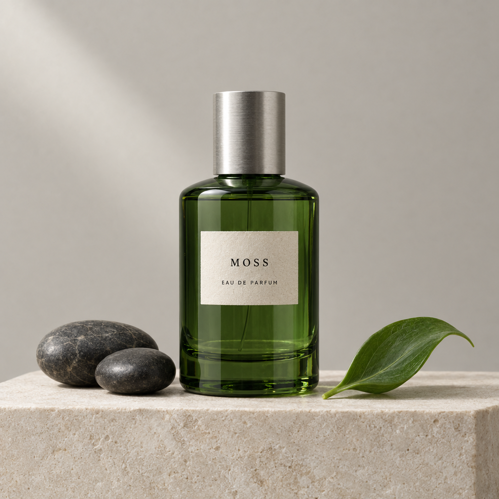
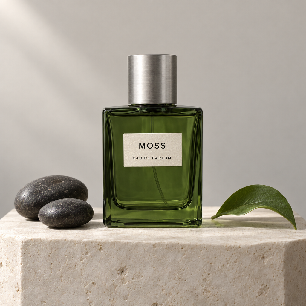
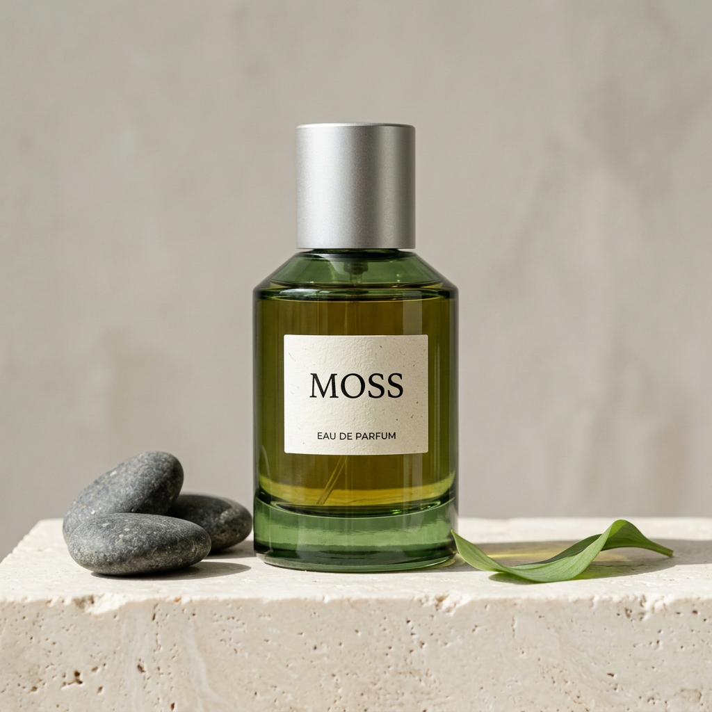
The task was a studio photograph of a green glass perfume bottle labeled “MOSS” and “EAU DE PARFUM.” Two dark stones belonged on the left, one curved green leaf on the right, with a simple background and stone pedestal.
| Image 2.5 Flare | Image 2.5 Sunburst | Nano Banana 2 |
|---|---|---|
 |  |  |
Flare: Rounded Glass and Visible Paper Texture
Flare produced a bottle with rounded corners, translucent green glass, and a visibly textured paper label. The two stones on the left and single leaf on the right matched the requested count and placement. Both lines of English text were readable and correct.
The composition keeps the bottle as the focal point. The leaf and stones support it without competing for attention, giving the product image a clear visual hierarchy.
Sunburst: A Squarer Bottle and a Smaller Label
Sunburst chose a squarer bottle with crisp outlines around the cap and glass. The two stones, one leaf, and label text matched the prompt. Its smaller label left more of the green glass visible.
The difference from Flare is primarily a design choice. The prompt did not specify rounded or square corners, so both bottle shapes are valid interpretations.
Nano Banana 2: A Convincing Product, but One Stone Too Many
Nano Banana 2 also delivered the bottle, label, and leaf, with readable English text. However, it placed three stones on the left, missing the “exactly two” requirement. The color inside the bottle also appeared more yellow-brown than the deeper green of the other two outputs.
Flare and Sunburst followed the object-count instruction more accurately in this round. Nano Banana 2's image still works as a product concept, but a fixed object count would require another edit.
For similar product images, explore HiAPI Image 2.5 Flare and HiAPI Image 2.5 Sunburst, starting with the visual direction you prefer.
Actual Product Shot Prompt
Create a photorealistic square studio product photograph. Center exactly one translucent forest-green glass perfume bottle with a brushed silver cylindrical cap on a pale ivory stone pedestal. A small rectangular cream paper label on the bottle must read exactly "MOSS" in black uppercase letters and "EAU DE PARFUM" beneath it. Place exactly two smooth dark stones on the pedestal to the left of the bottle and one curved green leaf on the right. Pale warm-gray seamless background, soft daylight from the upper left, realistic glass refraction, gentle contact shadows, subtle paper fibers, clean premium editorial photography. Camera at bottle height, straight-on view. No extra bottles, no people, no watermark, no additional text.
Chinese Poster Test: Readable Copy, Missed Details
This task called for a cream-and-dark-green coffee campaign poster with four specified text elements, a white coffee cup, heart-shaped latte art, and a crescent-shaped piece of orange peel.
| Image 2.5 Flare | Image 2.5 Sunburst | Nano Banana 2 |
|---|---|---|
 |  |  |
Text Accuracy: All Three Delivered the Main Copy
The English meanings below are translations for readers. The Chinese text in the first column is what the models were actually asked to render.
| Required Text | English Meaning | Flare | Sunburst | Nano Banana 2 |
|---|---|---|---|---|
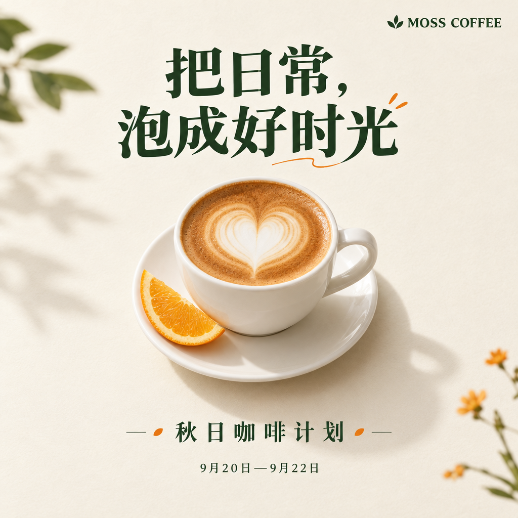
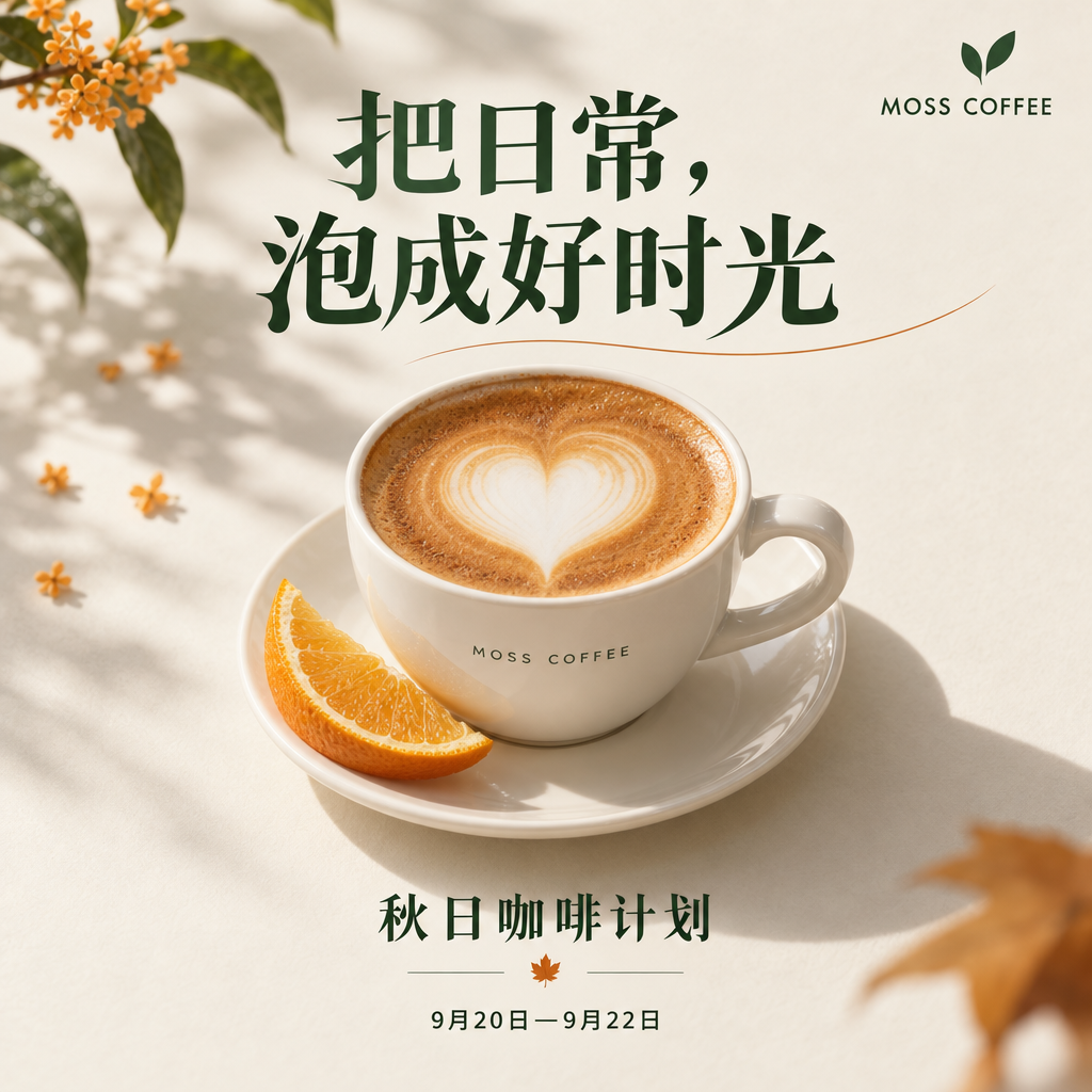
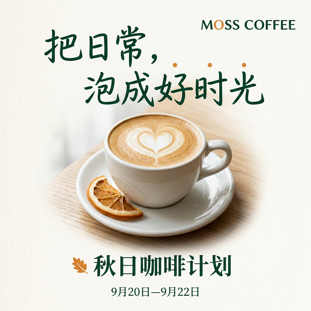
| 把日常,泡成好时光 | Brew everyday moments into good times | Readable, no obvious character errors | Readable, no obvious character errors | Readable, no obvious character errors |
| 秋日咖啡计划 | Autumn Coffee Plan | Correct | Correct | Correct |
| 9月20日—9月22日 | September 20–September 22 | Correct, with wider spacing | Correct | Correct |
| MOSS COFFEE | Brand name, unchanged | Correct | Correct, with an extra instance on the cup | Correct |
None of the headlines in this round required guessing to read. The differences were more about the character of the lettering and the arrangement of the image.
Flare used a heavier headline with a clear hierarchy. The coffee cup sits slightly below the center, with the date and subtitle separated. The result feels close to a conventional branded campaign poster.
Sunburst added more decoration. Flowering stems, leaves, and a larger cup fill more of the frame. It also added “MOSS COFFEE” to the cup, creating a second instance of the brand name. Because the prompt prohibited extra text, that addition counts as a missed instruction.
Nano Banana 2 used a more handwritten-style Chinese headline. It left more open space, with a simpler cup and orange slice, giving the image a relaxed, everyday feel. That is a choice of style, rather than a win on text accuracy.
A Shared Miss: Orange Slices Instead of Orange Peel
The prompt specified “半月形橙皮”—a crescent-shaped piece of orange peel. All three outputs showed visible fruit flesh. Flare and Sunburst looked closer to fresh orange slices, while Nano Banana 2 resembled a dried slice. All three captured the visual pairing of coffee and an orange ingredient, but missed the specific request for peel.
This round does not establish an overall winner for Chinese posters. All three delivered the main copy. After choosing the lettering and composition that suit the brand, the orange peel and any extra decorative details still need attention.
If you prefer the relaxed handwritten look in this example, explore HiAPI Nano Banana 2. For the heavier headline and branded poster composition, try Image 2.5 Flare.
Actual Chinese Poster Prompt
The prompt below is preserved in the original Chinese used for this test.
设计一张1:1方形中文咖啡品牌活动海报。奶油白纸质背景,深绿色文字和少量暖橙色点缀。画面中央是一只白色陶瓷咖啡杯,咖啡形成清晰的心形拉花,杯碟旁放一片半月形橙皮。上方大标题必须逐字准确写“把日常,泡成好时光”,下方副标题必须写“秋日咖啡计划”,底部小字必须写“9月20日—9月22日”,品牌名“MOSS COFFEE”放在右上角。标题、主体、副标题、日期层级清楚,留白充足。成熟的商业平面设计,柔和真实的影棚光影。不要二维码,不要价格,不要多余文字,不要边框。
Background Edit Test: Which Stayed Closer to the Same Input?
All three models received the Flare product shot from the first task as their input. The instruction was identical: change only the warm gray background to muted terracotta orange, preserving the bottle shape, green glass, label, pedestal, stones, leaf, and composition.
The shared input image
The three background edits
| Image 2.5 Flare | Image 2.5 Sunburst | Nano Banana 2 |
|---|---|---|
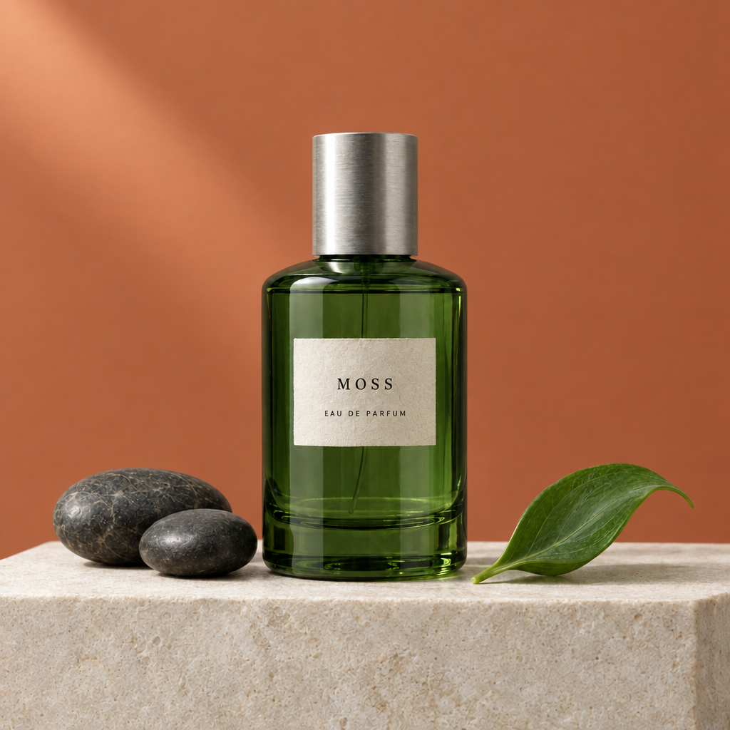 | 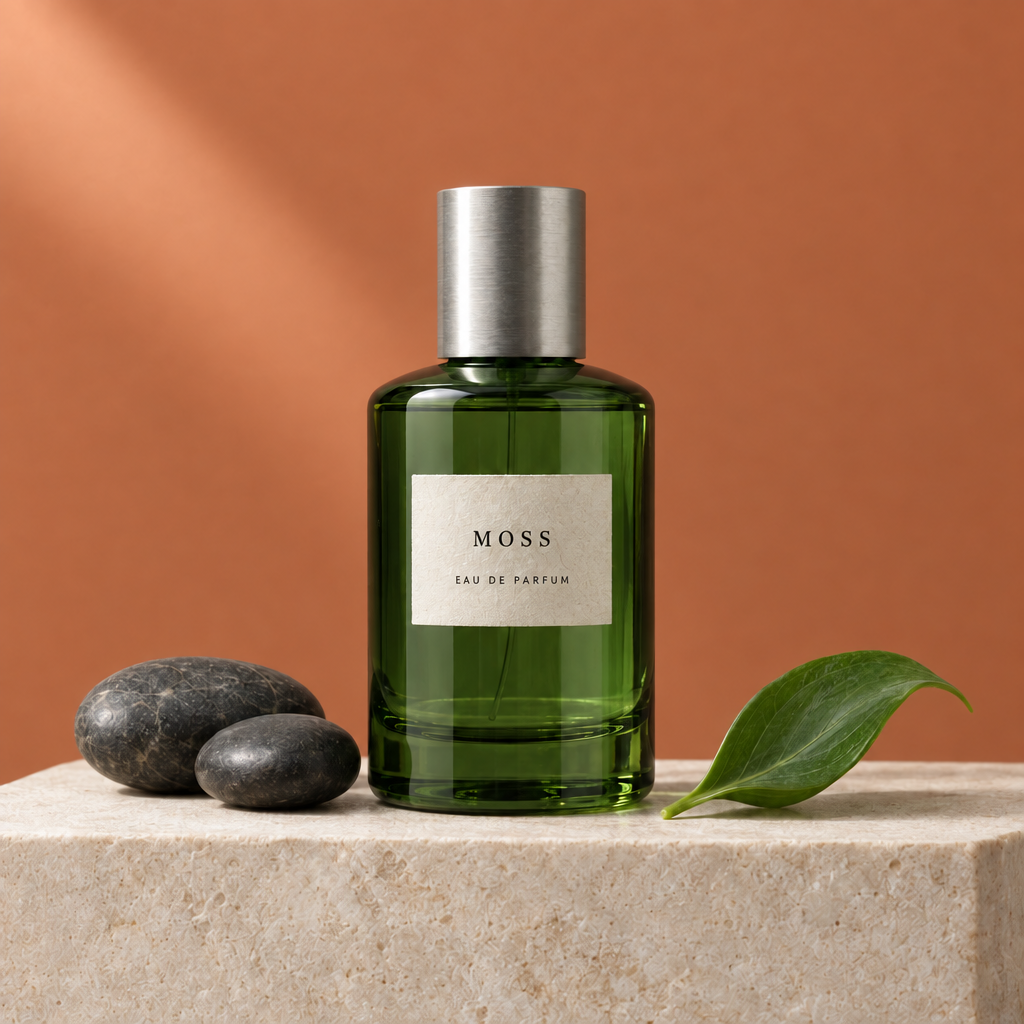 | 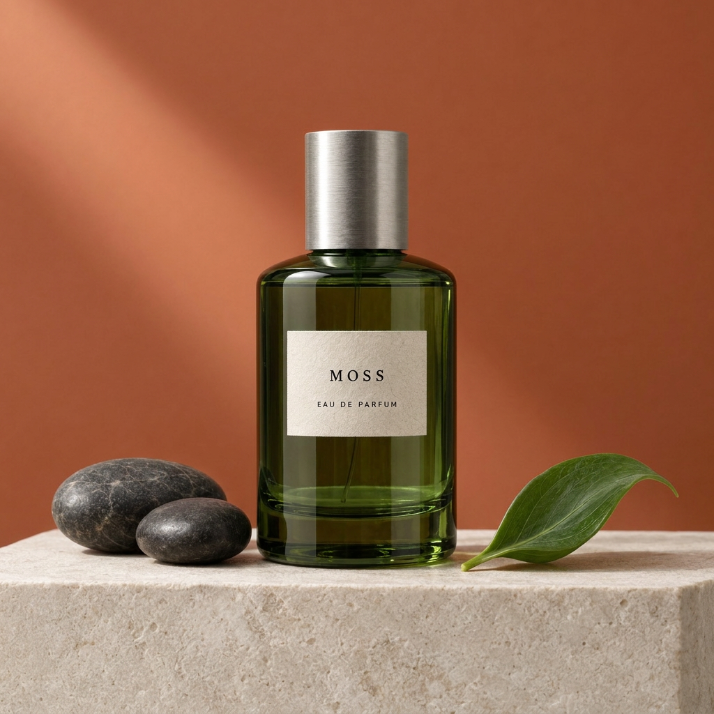 |
All three changed the background to orange. “MOSS” and “EAU DE PARFUM” remained readable, and the bottle, stones, and leaf retained their basic positions. None of the models redesigned the whole product shot.
Flare and Sunburst both stayed fairly close to the input, maintaining the overall appearance of the green glass and paper label. At the displayed size, there is no clear reason to declare one a decisive winner over the other.
Nano Banana 2 completed the background change, but the color inside the bottle became darker brown. The paper label's texture and some local details also changed. That shift may be acceptable in a creative image that allows broader color adjustments. It matters more when the instruction is to keep the product color unchanged.
Flare and Sunburst preserved the product color more closely in this round. A successful background edit needs to preserve the parts that were supposed to stay, as well as change the background correctly.
If you have a finished product photo that only needs a new background, explore the editing capabilities of HiAPI Image 2.5 Sunburst. Flare's result in this round also deserves consideration.
Actual Background Edit Prompt
Edit the supplied product photograph. Change ONLY the seamless background from pale warm gray to muted terracotta orange. Preserve the exact bottle shape and green glass color, the silver cap, the cream label and all its text, the stone pedestal, both dark stones, the curved leaf, the camera angle, framing, and the soft upper-left lighting. Do not add or remove objects. Do not redesign the product. Keep the output square.
GPT Image 2.5 vs Nano Banana 2: What These Results Suggest
| Task | What We Observed | Where to Start |
|---|---|---|
| Product composition with a fixed object count | Flare and Sunburst generated two stones; Nano Banana 2 generated three | Consider the two Image 2.5 models when counts are a strict requirement |
| Chinese coffee poster | All three rendered the main copy correctly, with different lettering and decoration | Choose by brand style, then check the individual elements |
| Background replacement with product preservation | All three completed the edit; Nano Banana 2 changed the bottle's interior color more noticeably | The Image 2.5 results in this group are closer when product color must stay unchanged |
| Flare or Sunburst | Both stayed close to the input in this single background edit | This sample does not establish that Sunburst is always better than Flare |
These results complicate a choice based only on “fast” and “precise” model labels. Flare followed the brief closely in both the product shot and the single edit. Sunburst brought its own compositional style. Nano Banana 2 produced a readable, complete Chinese poster, but object counts and color after editing needed closer inspection.
Start with the task that best matches your next image:
- Product shots and everyday creation: HiAPI GPT Image 2.5 Flare.
- Image editing where details matter: HiAPI GPT Image 2.5 Sunburst.
- Different poster styles and creative directions: HiAPI Nano Banana 2.
Frequently Asked Questions
What Did the Chinese Text Test Show?
It did not establish that GPT Image 2.5 is better than Nano Banana 2 at Chinese text. All three produced readable, correct headlines, subtitles, brand names, and dates in this poster sample. The main differences were lettering, composition, and added content.
Is Sunburst Always More Accurate at Editing Than Flare?
Both stayed fairly close to the input in this single background edit, with no clear gap between them. This set did not test repeated edits, portraits, or complex composites.
Why Is There No Speed Ranking?
The recorded times reflect client waiting and polling observations, including queueing, archiving, and query intervals. They are not pure generation times. This comparison focuses on the actual images rather than turning one observed wait into a long-term model ranking.
Where Can I Inspect the Full Images?
Click any image to open the original. The prompts above are the exact text submitted for these outputs. You can adapt the brand name or product description for your own work.