TL;DR
- Ten copy-paste prompts for Seedream 4.5 on HiAPI: five for text-to-image (posters, banners, packaging, menus, a 4K flat-lay) and five for image-to-image (recolors, three-reference fusion, relighting, character consistency, a 4K detail pass). Every output below is real.
- Both endpoints cost $0.045 per image, at 2K or 4K. A ten-colorway product matrix is $0.45.
- The prompt pattern that worked: quote the exact text, say where it goes and how it's set; for edits, name the one change and then list everything that must stay. Open the text-to-image model page to try one; new accounts get 200 free credits.
The setup
| Text-to-image | Image-to-image | |
|---|---|---|
| Model id | seedream-4.5/text-to-image | seedream-4.5/image-to-image |
| Required | prompt | prompt + image_urls (1–14) |
aspect_ratio | 1:1, 4:3, 3:4, 16:9, 9:16, 2:3, 3:2, 21:9 | same |
resolution | 2K or 4K | same |
| Price | $0.045 | $0.045 |
Live HiAPI prices, checked October 20, 2026. Failed tasks aren't charged.
curl -s -X POST https://api.hiapi.ai/v1/tasks \
  -H "Authorization: Bearer $HIAPI_KEY" \
  -H "Content-Type: application/json" \
  -d '{
    "model": "seedream-4.5/text-to-image",
    "input": {"prompt": "YOUR PROMPT", "aspect_ratio": "2:3", "resolution": "2K"}
  }'
# poll GET https://api.hiapi.ai/v1/tasks/{taskId} until data.status is "success",
# then download data.output[0].url (the link expires after about 7 days)
For image-to-image, change the model and add "image_urls": ["https://..."]. Send aspect_ratio and resolution every time. There's no seed, negative prompt or image count, and any extra field returns a 400. Our text-to-image tasks finished in 61–112 seconds, 2K and 4K alike.
Text-to-image recipes
1. Screen-print gig poster: three strings, one style
A screen-printed gig poster for a fictional jazz festival, the title 'BLUE HOUR JAZZ FESTIVAL' in bold geometric sans-serif capitals stacked across the top half, a double bass player silhouetted against a huge orange evening sun rendered in flat layered inks, date line 'AUGUST 21-23' in a clean slab serif beneath the title, venue line 'RIVERSIDE PARK PAVILION' in small spaced capitals at the bottom edge, limited-palette screen print texture with visible paper grain, burnt orange, midnight blue and cream palette, premium gig-poster finish
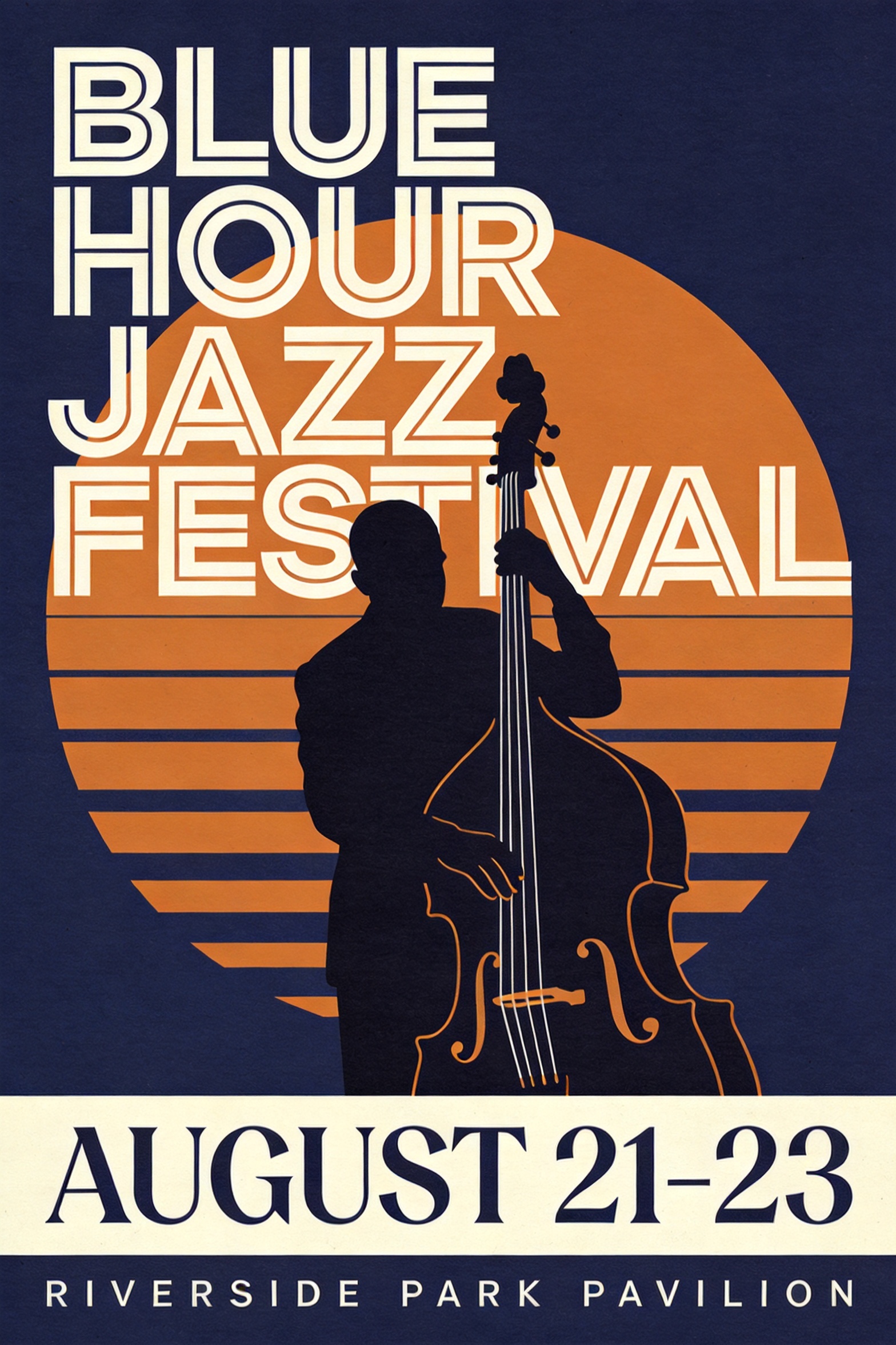
seedream-4.5/text-to-image, 2:3, 2K, $0.045.
Title, date and venue all came out right on the first take. Each string has its own type treatment ("slab serif", "small spaced capitals") and its own position ("beneath the title", "at the bottom edge"). Naming the medium, screen print with flat layered inks, keeps the whole image in one style.
2. Promo hero banner, and why we re-ran it
A wide e-commerce hero banner for a fictional headphone brand's summer sale, a matte black over-ear headphone with completely plain unbranded earcups, no logo or emblem anywhere on the product, floating at the right third with soft studio reflections, headline 'TURN DOWN THE NOISE' in heavy modern sans-serif on the left, subline 'up to 40% off wireless flagships' in light type beneath it, a small pill-shaped button labeled 'SHOP NOW' under the subline, clean gradient background from ice blue to white, soft studio lighting, crisp product edges, premium commercial finish
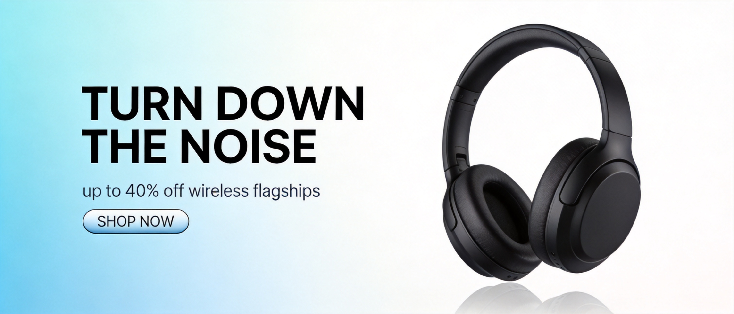
seedream-4.5/text-to-image, 21:9, 2K, $0.045.
The text was right the first time, but the earcup came back with an emblem close to a real audio brand's logo. Adding "completely plain unbranded earcups, no logo or emblem anywhere on the product" fixed it on the retake. Put that clause in every commercial product prompt.
3. Packaging: keeping upper and lower case
A studio product shot of a matte kraft-paper coffee bag standing on a walnut counter, the bag's label reads 'HALFLIGHT ROASTERS' in a stamped serif wordmark with 'single origin - honey process' in small letterpress type beneath it, scattered roasted beans and a brass scoop in the foreground, steam rising from an out-of-frame cup catching the side light, warm morning side light, shallow depth of field, hyper-detailed product photography, premium commercial finish
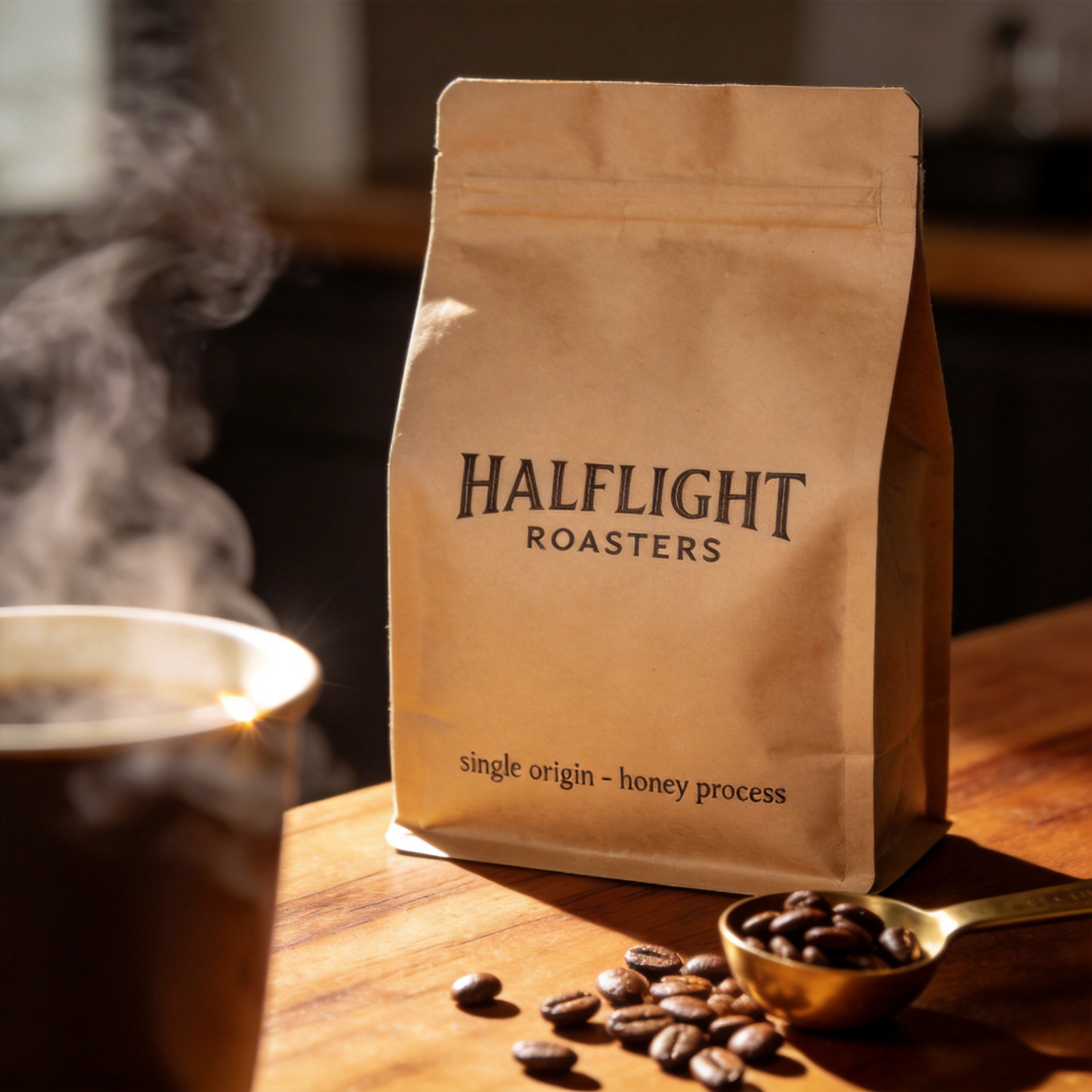
seedream-4.5/text-to-image, 1:1, 2K, $0.045.
The wordmark is in capitals and the sub-label stayed lowercase, both following the curve of the bag. Saying how the type got onto the surface ("stamped", "letterpress") sets the typeface and the print texture at once.
4. Chalkboard menu: four lines of text
A tall rustic cafe chalkboard menu photographed straight-on, hand-lettered chalk type on a black slate board framed in worn oak, the heading 'TODAY'S POUR' in tall chalk capitals with a decorative underline, three menu lines beneath it reading 'FLAT WHITE 4', 'OAT LATTE 5' and 'CASCARA FIZZ 6', small chalk illustrations of a coffee cup and a leaf in the corners, a string of warm cafe lights blurred in the background bokeh, cozy natural light, photorealistic, rich cohesive color grade
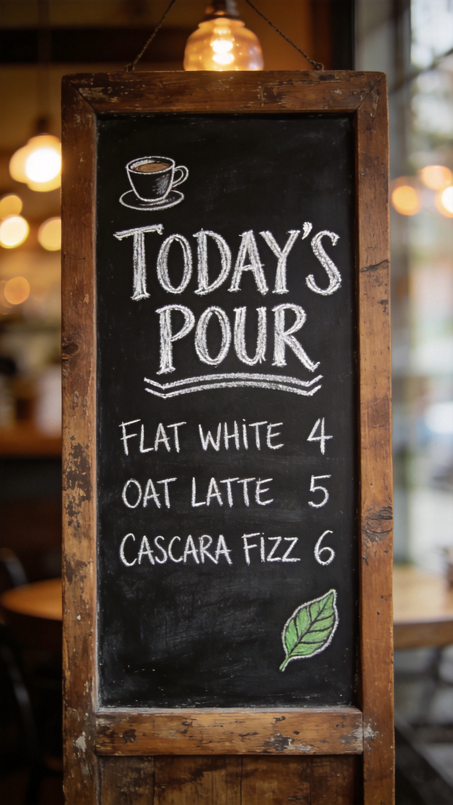
seedream-4.5/text-to-image, 9:16, 2K, $0.045.
All four strings are correct, apostrophe included. State the number of lines ("three menu lines beneath it") and the model treats it as a rule.
5. 4K flat-lay at the same price
An overhead knolling photograph of a vintage film photographer's complete kit arranged in a precise grid on dark green felt: a chrome rangefinder camera, three lenses with engraved focal-length rings, rolls of 35mm film, a handheld light meter, screw-on filters in open leather pouches, a horsehair brush, lens tissues and a weathered field notebook, every engraving and knurled texture sharp, even soft studio light, top-down composition, ultra-detailed, premium editorial finish
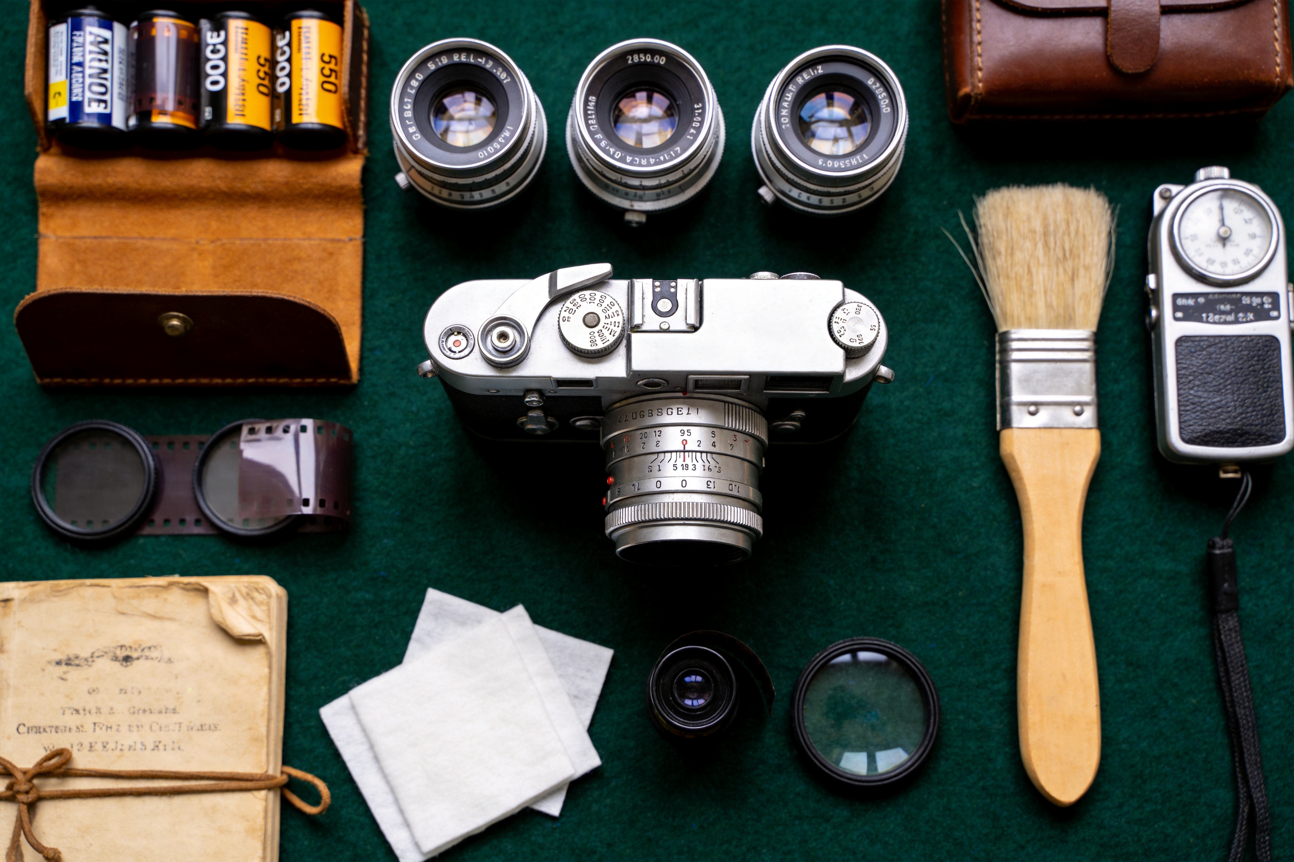
seedream-4.5/text-to-image, 3:2, 4K (4992×3328), $0.045.
Knurling, leather grain and felt hold up at full zoom. The engravings on the lens rings, which the prompt never spelled out, are made-up lettering up close. Text you quote renders; text you don't specify gets invented.
Image-to-image recipes
The source images below were made with Seedream 4.5 text-to-image at 2K, then sent as image_urls.
6. Colorway variants
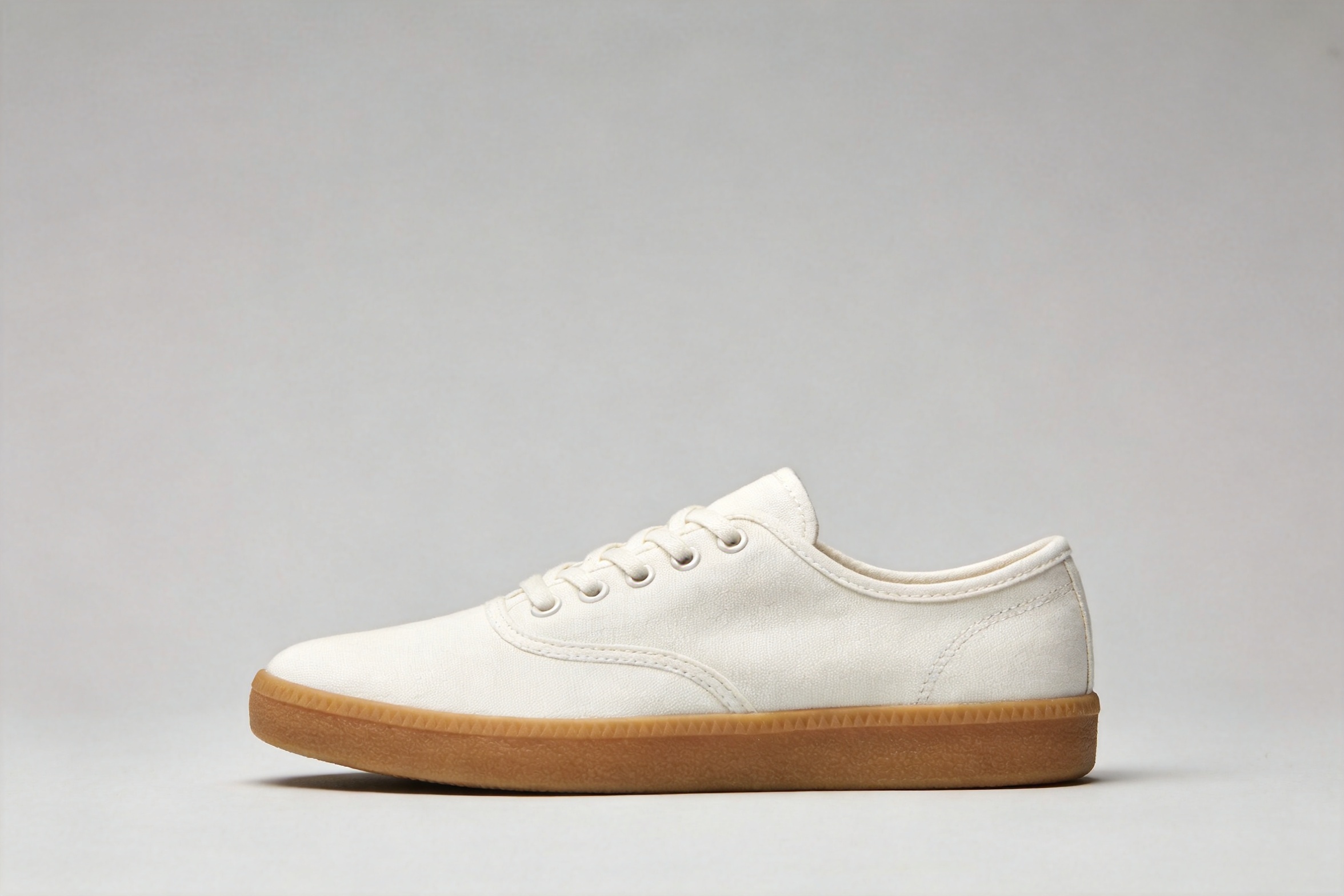
recolor the sneaker to a deep forest green canvas with an off-white sole and matching green laces; keep the exact same shoe shape, stitching, camera angle, lighting, shadow and gray background unchanged
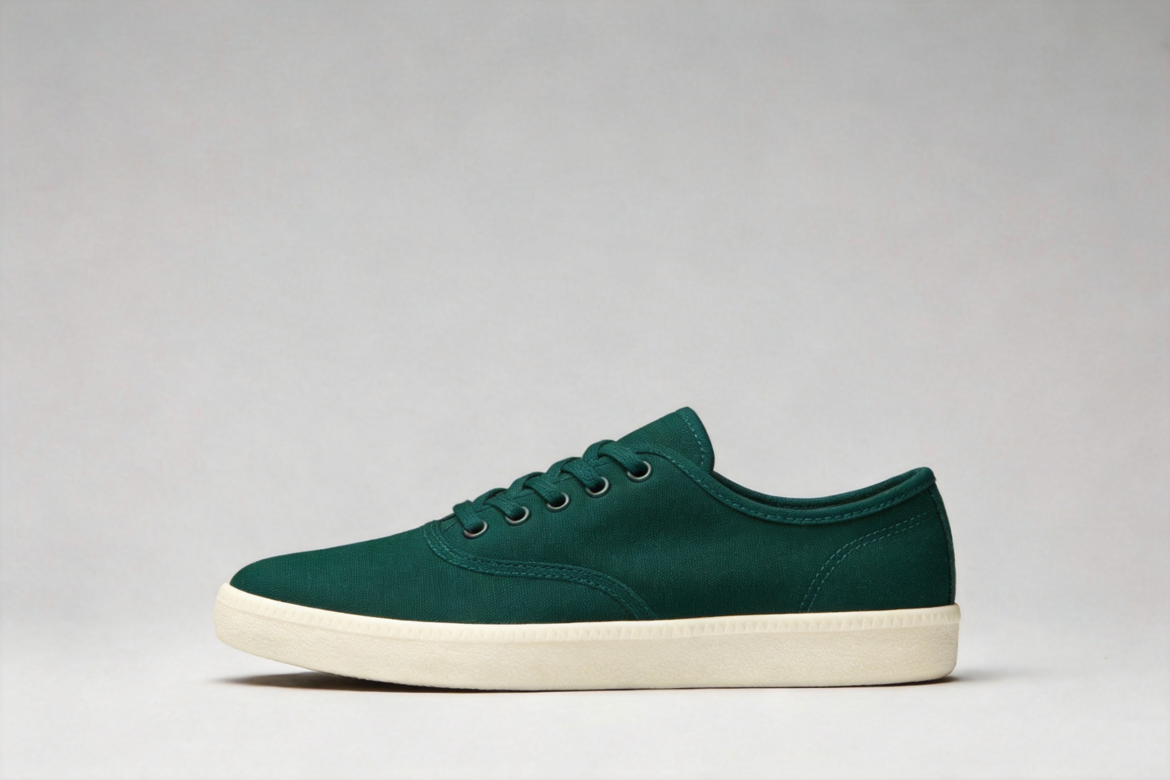
seedream-4.5/image-to-image, 1 reference, $0.045.
The angle, contact shadow and background survived. Name the change once, then spend the rest of the prompt on what must not change.
7. Three references: product, material, scene
The sneaker above plus two more references:
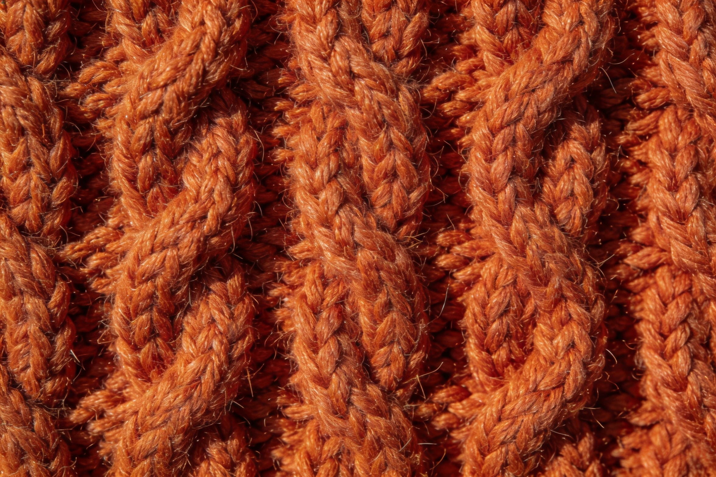
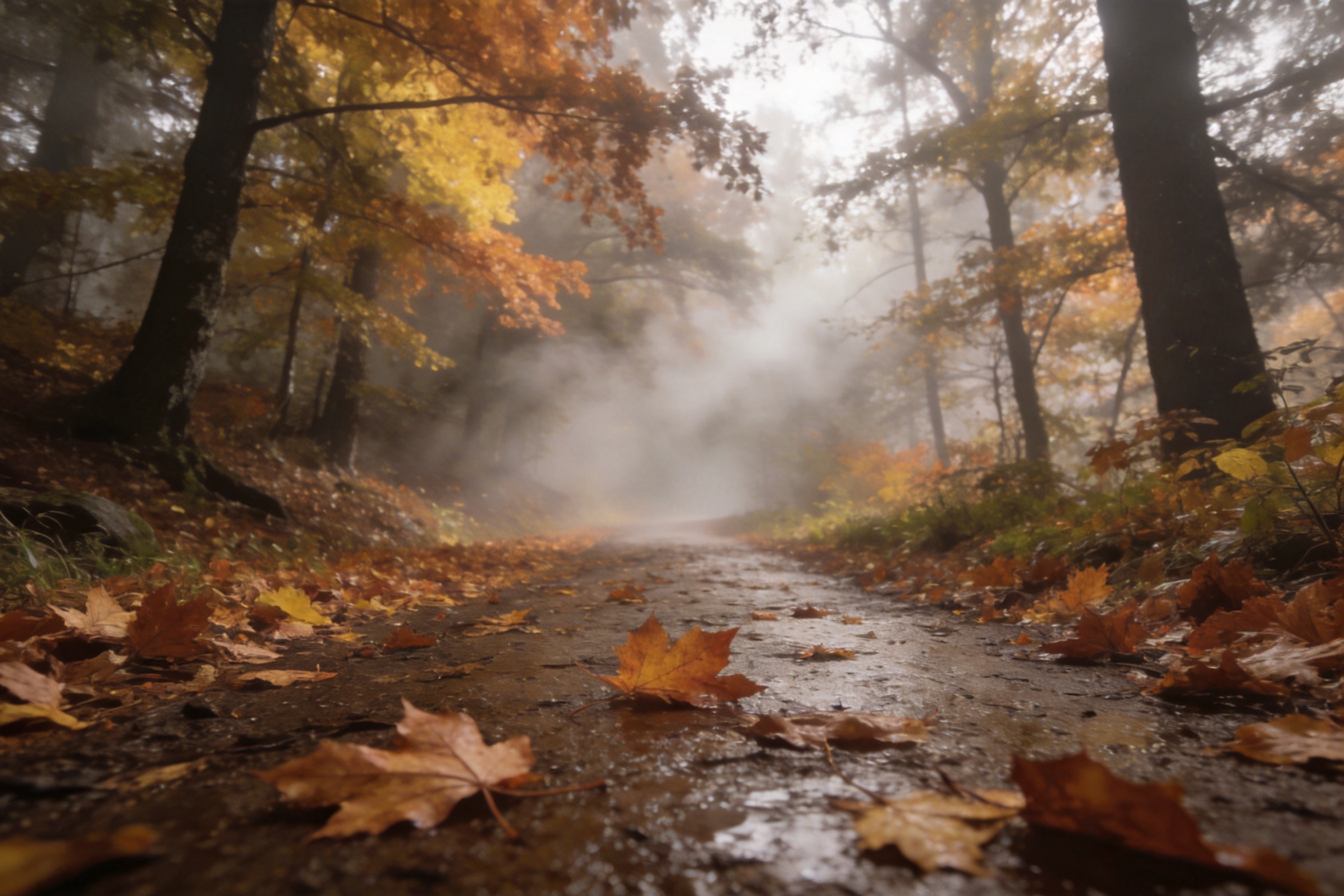
rebuild the sneaker from the first image with its canvas upper made of the burnt-orange cable-knit wool from the second image, then place it as a product hero shot on the wet leaf-covered forest trail from the third image, low camera angle, soft morning fog, keep the shoe's shape and proportions from the first image, photorealistic
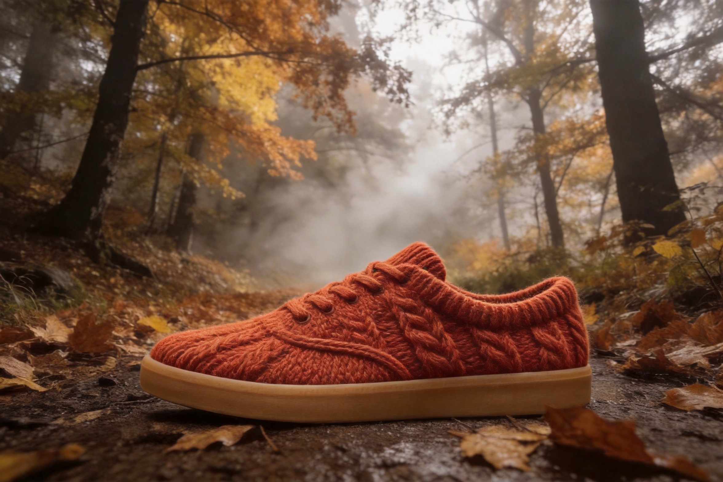
seedream-4.5/image-to-image, 3 references, $0.045.
Shape and sole came from the first image, the knit from the second, the trail and fog from the third. It also knitted the laces, which we didn't ask for. Materials spread to nearby parts unless you fence them off: "keep the laces standard cotton laces". Refer to each image by its position ("from the second image"); that's how the model tells them apart.
8. Phone snapshot to food photo
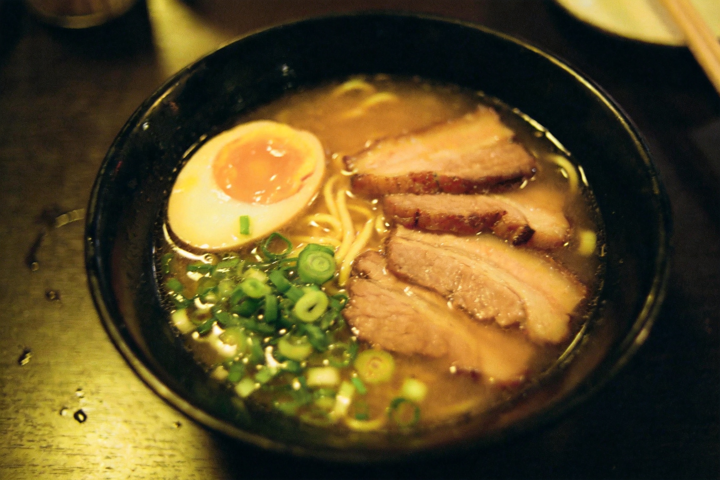
relight this exact bowl of ramen as a bright editorial food photograph: soft window key light from the upper left, clean neutral white balance, gentle steam rising, richer broth and egg color, keep the same bowl, ingredients, table and overhead framing
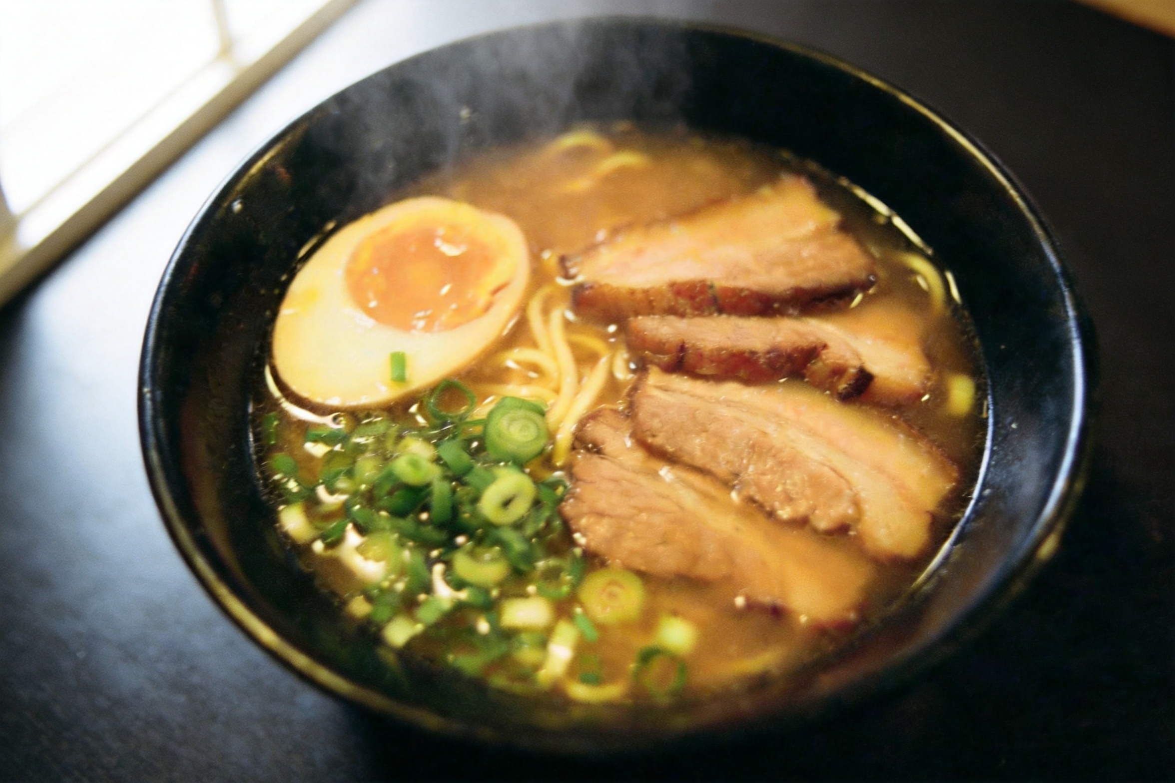
seedream-4.5/image-to-image, 1 reference, $0.045.
White balance and steam are fixed and the layout held. Two things drifted: the camera angle shifted slightly, and five slices of chashu became three. Relighting re-renders the image. If counts matter, state them ("exactly five slices of chashu") and check.
9. Same person, new scene
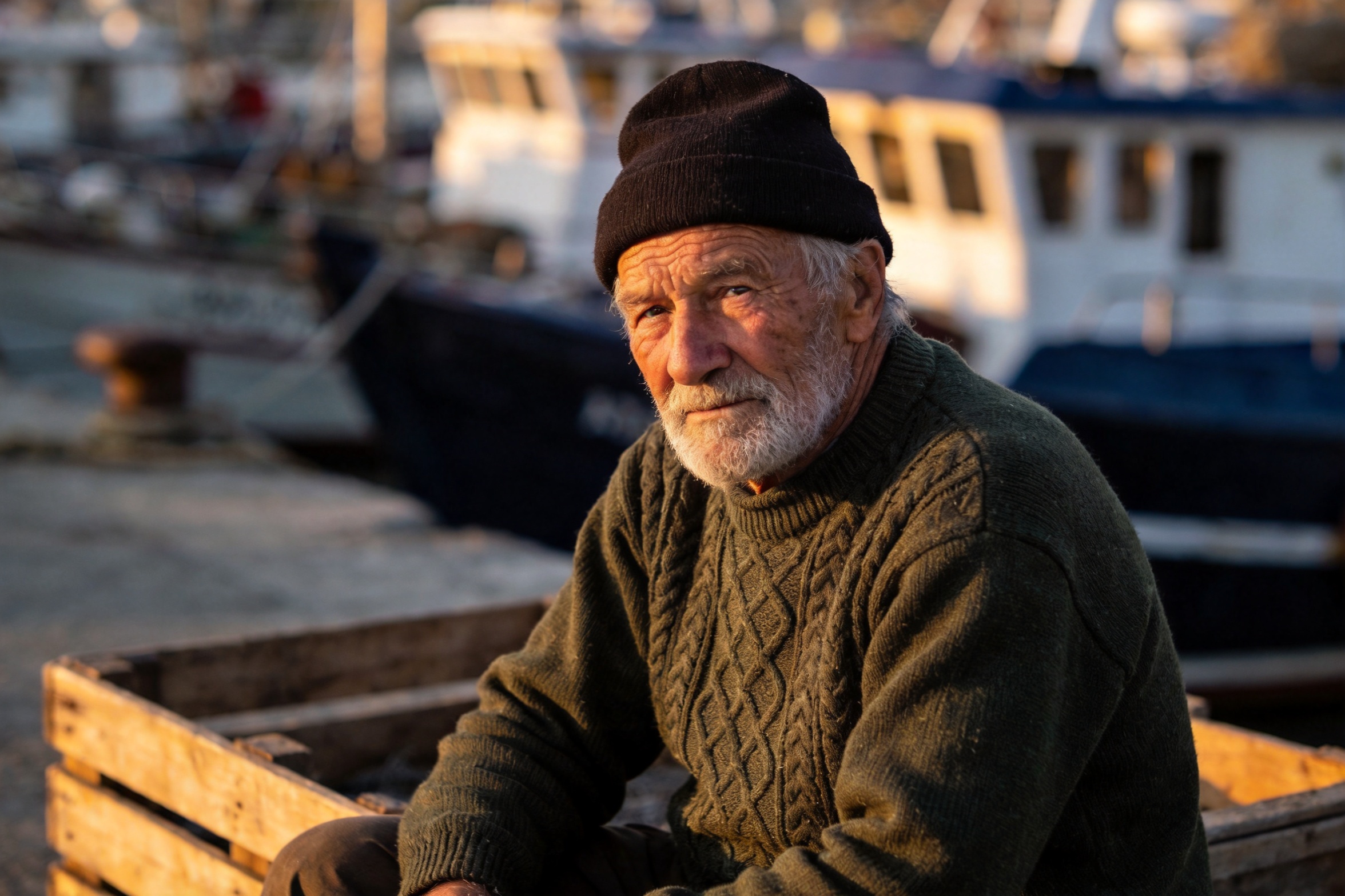
move this same fisherman, with identical face, beard, beanie and green sweater, into the wheelhouse of a small fishing boat at dawn, standing at the wooden helm, cold blue morning light through the windows mixing with warm cabin light, photorealistic
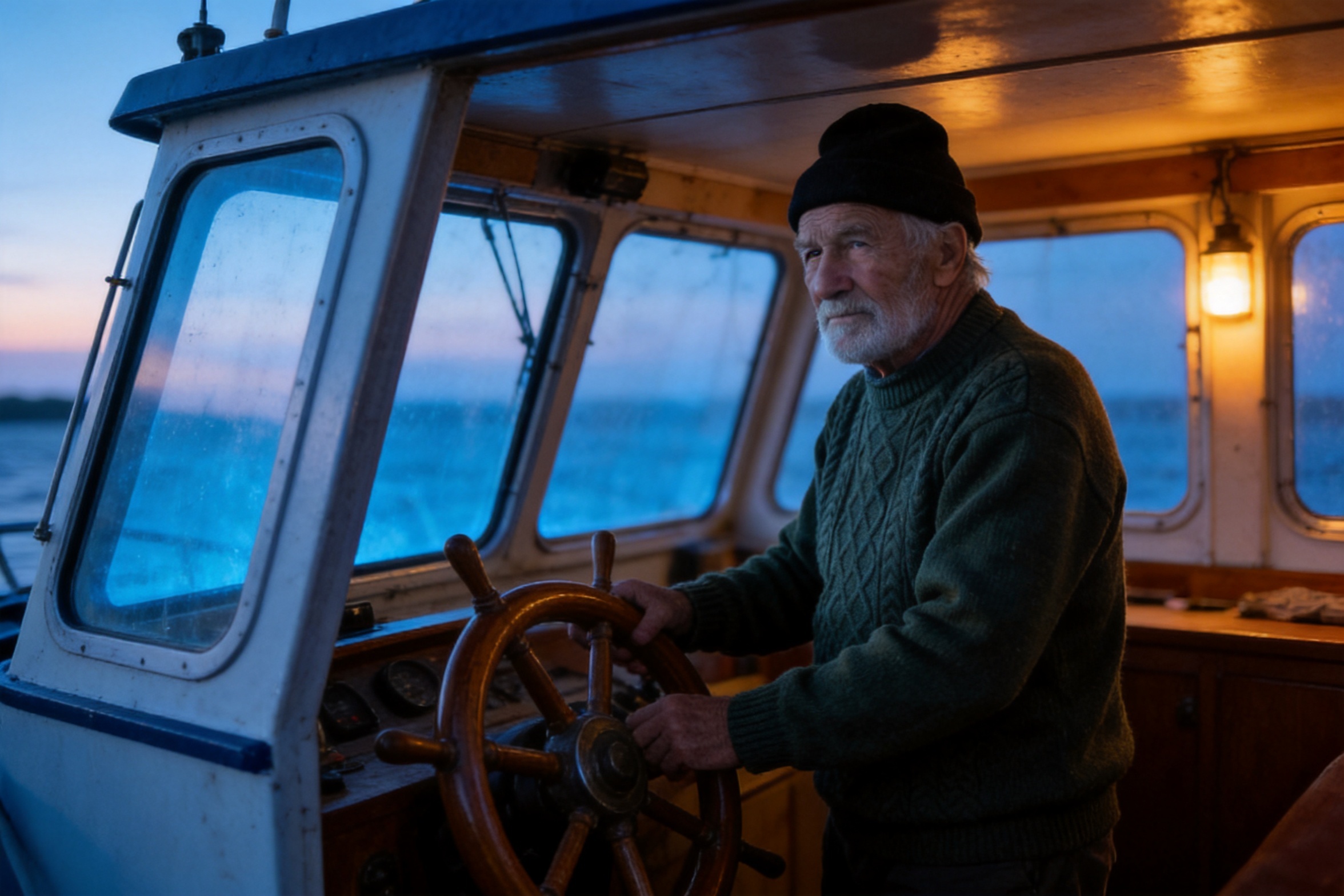
seedream-4.5/image-to-image, 1 reference, $0.045.
Face, beard, beanie and sweater held through a full change of scene and light. "Identical" attached to the features you care about works better than a general "keep the subject consistent".
10. 4K detail pass
Feed a result back in and re-render it at 4K. The input here is the green sneaker from recipe 6.
re-render this product photo at maximum fidelity: keep the composition, colors, lighting and background exactly as they are, sharpen the canvas weave, lace texture and sole details, remove any compression artifacts
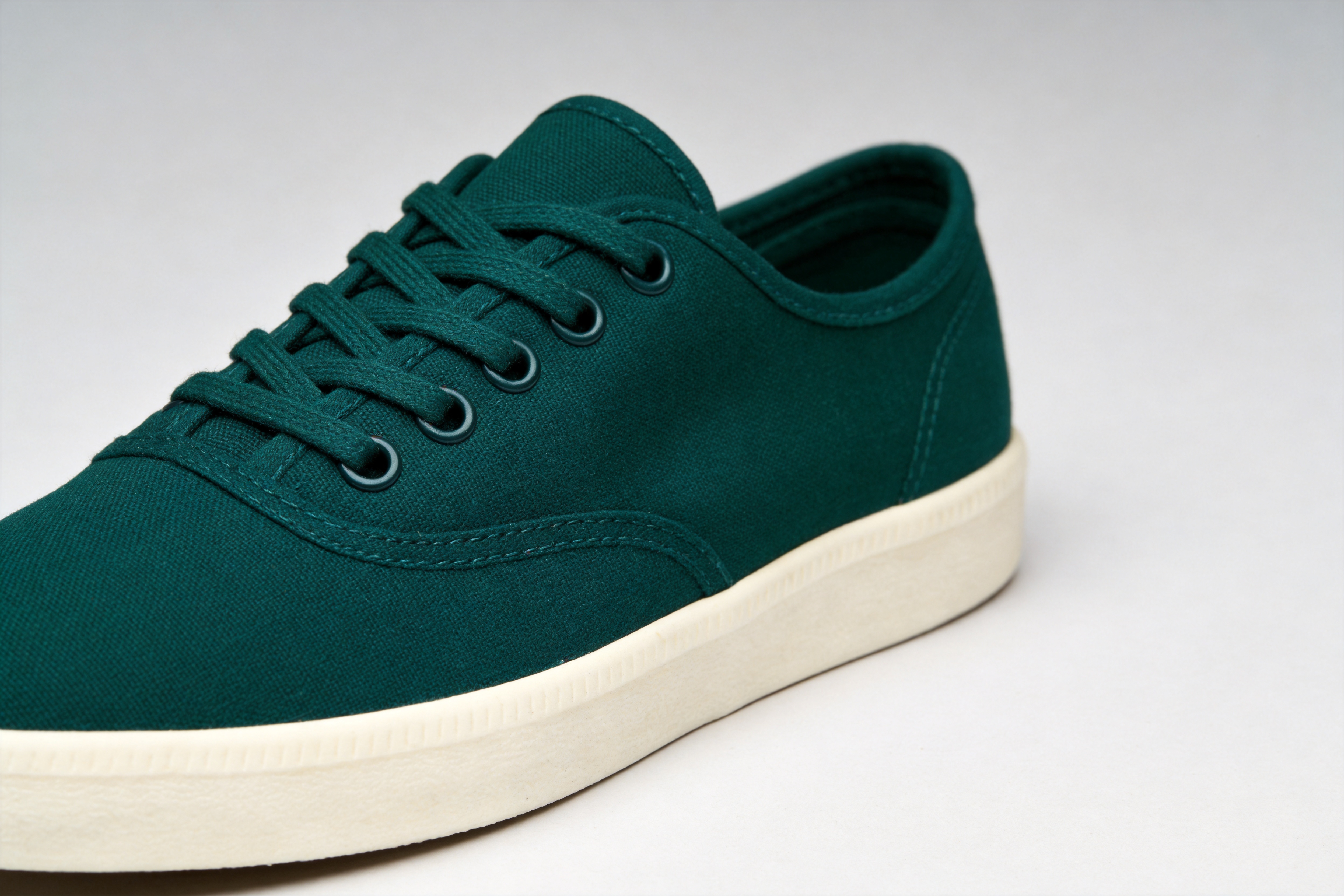
seedream-4.5/image-to-image, 1 reference, 4K, $0.045.
The recolor plus this pass cost $0.09 in total. One edit per call keeps each step checkable, and a failed step costs $0.045.
What the ten have in common
- Quote it, place it, style it. Every string that must appear gets quotes, a position and a type treatment.
- Name the medium. Screen print, letterpress, chalk: one phrase sets the type and the look.
- Ban logos on products. "Unbranded, no logo or emblem" goes in every commercial prompt.
- Count out loud. "Three menu lines", "exactly five slices".
- For edits, list what stays. Most of an edit prompt should be about what must not change.
- One change per call. Recolor, then upscale. Fuse, then restyle.
Seedream 4.5 or 5.0 Pro?
| Seedream 4.5 | Seedream 5.0 Pro | |
|---|---|---|
| Text-to-image | $0.045 at 2K or 4K | $0.05 at 1K, $0.10 at 2K |
| Image-to-image | $0.045 at 2K or 4K | $0.06 at 1K, $0.10 at 2K |
| Largest output | 4K | 2K |
For banners, packaging, signs and product edits headed for the web, start on 4.5. Move to Pro when a 4.5 result has hit its limit on fine type or a hard composite. Pro recipes: Seedream 5.0 Pro text-to-image prompts and the Seedream 5.0 Pro image-to-image guide.
FAQ
How much does Seedream 4.5 cost?
$0.045 per image on both endpoints, at 2K or 4K and any aspect ratio.
How many reference images can I send?
Up to 14 in image_urls. Refer to them by position in the prompt.
Can it output 1K?
No. resolution takes 2K or 4K; anything else returns a 400.
Does it handle long text?
Short quoted strings such as headlines, labels, dates and buttons work reliably. For paragraphs of copy, generate the background and set the text in a design tool.
To try an edit without code, open the image-to-image model page and upload your own image.