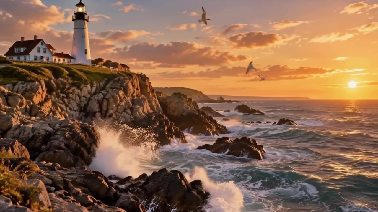
Every image model claims good text rendering now. The difference with Seedream 5.0 Pro is that you can art-direct it like a designer: quote a string, name a type treatment, pin it to a position, and it shows up — spelled correctly, styled the way you asked, where you asked.
This post is six copy-paste prompt recipes for seedream-5.0-pro/text-to-image, one per job the flagship tier is unusually good at. Every image below is the first output the model returned for the exact prompt shown — no reruns, no cherry-picking. Across these images there were 13 separate text strings that had to render correctly (a movie title with tagline and release line, a product label, a magazine masthead with two cover lines, a neon sign in two languages…), and Seedream 5.0 Pro went 13 for 13.
The 30-second setup
Seedream 5.0 Pro runs on hiapi's async task endpoint: create a task, poll it, download the result.
curl -X POST https://api.hiapi.ai/v1/tasks \
  -H "Authorization: Bearer $HIAPI_API_KEY" \
  -H "Content-Type: application/json" \
  -d '{
    "model": "seedream-5.0-pro/text-to-image",
    "input": {
      "prompt": "YOUR PROMPT HERE",
      "aspect_ratio": "2:3",
      "resolution": "2K"
    }
  }'
# → {"data": {"taskId": "..."}}

curl https://api.hiapi.ai/v1/tasks/TASK_ID \
  -H "Authorization: Bearer $HIAPI_API_KEY"
# poll until "status": "success", then download output[0].url
Three things worth knowing before your first call:
resolutionaccepts"1K"or"2K", and it's the price lever. A 1K image costs $0.075, a 2K image $0.15 — flat per image, any aspect ratio (see the pricing table). If you're coming from Lite, note the flip: Lite's text-to-image accepts2K/4K, Pro accepts1K/2K.- The output URL expires. Download the file as soon as the task succeeds; don't hot-link it.
- Submit tasks one at a time. When we fired several tasks in parallel, some died with a transient
TASK_FAILED; the same requests submitted sequentially all succeeded on the first try. A retry-on-fail loop makes batch jobs reliable.
In our runs, 2K generations came back in roughly 2–3.5 minutes end to end, and every aspect ratio we used below — 2:3, 1:1, 3:2, 16:9, 3:4 and 21:9 — was accepted as-is. For the full parameter walkthrough, there's a separate API guide for this model.
Recipe 1: the movie one-sheet — four levels of type
The classic poster test: title, tagline, credits block and release line in one image, each with its own treatment. This is where most models scramble at least one level.
A theatrical one-sheet movie poster for a fictional neo-noir film, the
title 'PAPER TIGERS' in tall condensed serif capitals across the upper
third, tagline 'every debt comes due' in small italic type directly
beneath the title, a lone figure in a rain-soaked alley lit by a single
sodium street lamp with his long shadow stretching toward the camera,
reflections in the wet asphalt, a compressed movie-credits block near
the bottom edge, release line 'IN THEATERS DECEMBER 12' at the very
bottom, muted amber and slate-blue palette, heavy film grain, premium
key-art finish
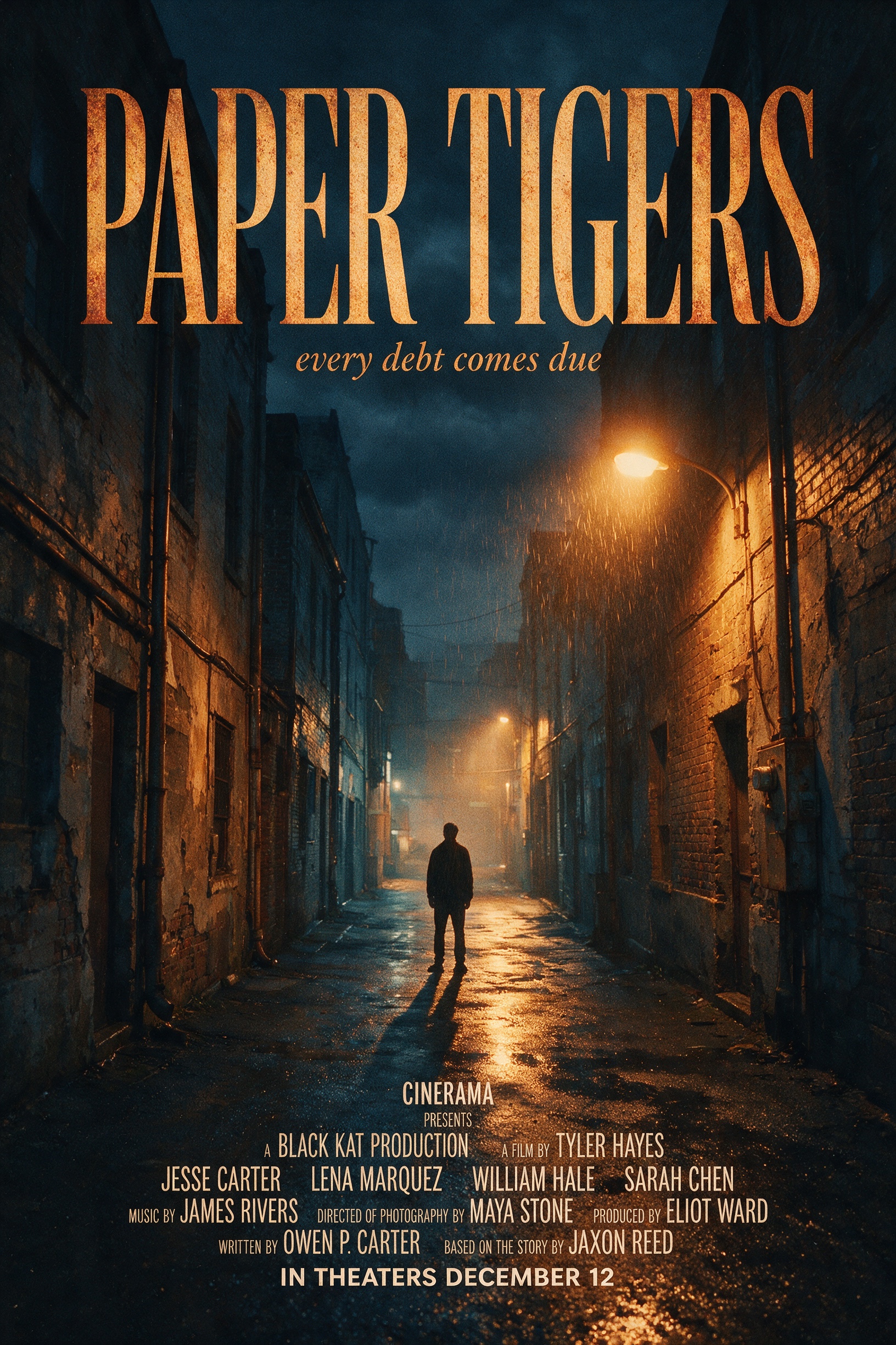
All three quoted strings landed on the first take — and the credits block at the bottom is real, legible compressed poster type, not glyph soup. The pattern to steal: every string is quoted, given a type treatment ("tall condensed serif capitals", "small italic type") and anchored to a position ("across the upper third", "directly beneath the title", "at the very bottom"). Ran at 2:3, 2K.
Recipe 2: the product ad — label text on curved glass
Two different text surfaces in one frame: a printed label wrapping a frosted-glass bottle, and a floating typographic headline. Label text on curved, translucent surfaces is much harder than flat signage.
A premium studio advertisement for a fictional skincare brand, a
frosted glass serum bottle standing on a wet black stone slab, the
bottle label reads 'MERIDIAN' in a minimal sans-serif with 'vitamin
sea serum' in smaller lowercase letters beneath it, a thin arc of
water frozen mid-splash behind the bottle, headline 'DEPTH FOR YOUR
SKIN' floating in the upper left in elegant thin typography, soft top
light with a crisp rim light, deep teal and charcoal palette,
hyper-detailed product photography, premium commercial finish
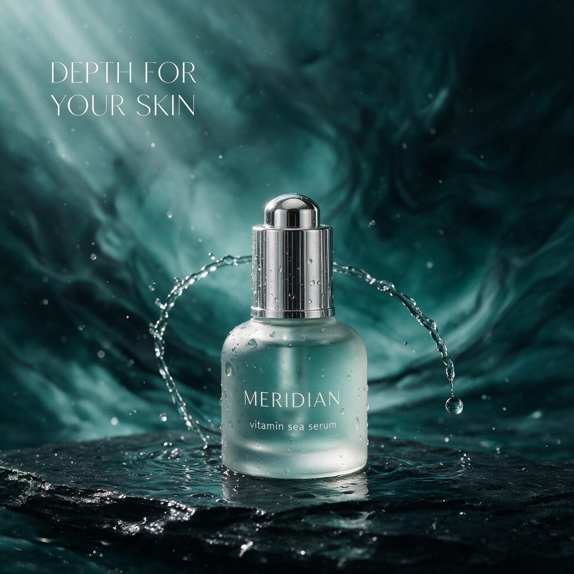
Label, sub-label and headline: 3/3, first take, with the label type correctly distorted around the bottle's curve. Specifying case explicitly ("smaller lowercase letters") is what keeps the sub-label from being shouted in caps. Ran at 1:1, 2K.
Recipe 3: the photoreal portrait — what "flagship quality" buys
No text in this one. It's the fidelity check: skin texture, individual hair strands, believable golden-hour optics — the stuff that separates a flagship tier from a fast tier.
A candid environmental portrait of a middle-aged ceramic artist in her
sunlit studio, clay dust on her forearms, she inspects a freshly
thrown bowl held at eye level, golden-hour light raking through a
dusty window, shelves of unglazed pottery softly blurred behind her,
visible skin texture and individual flyaway hair strands, natural
color grade, shot on a fast 85mm prime lens, photorealistic, high
dynamic range
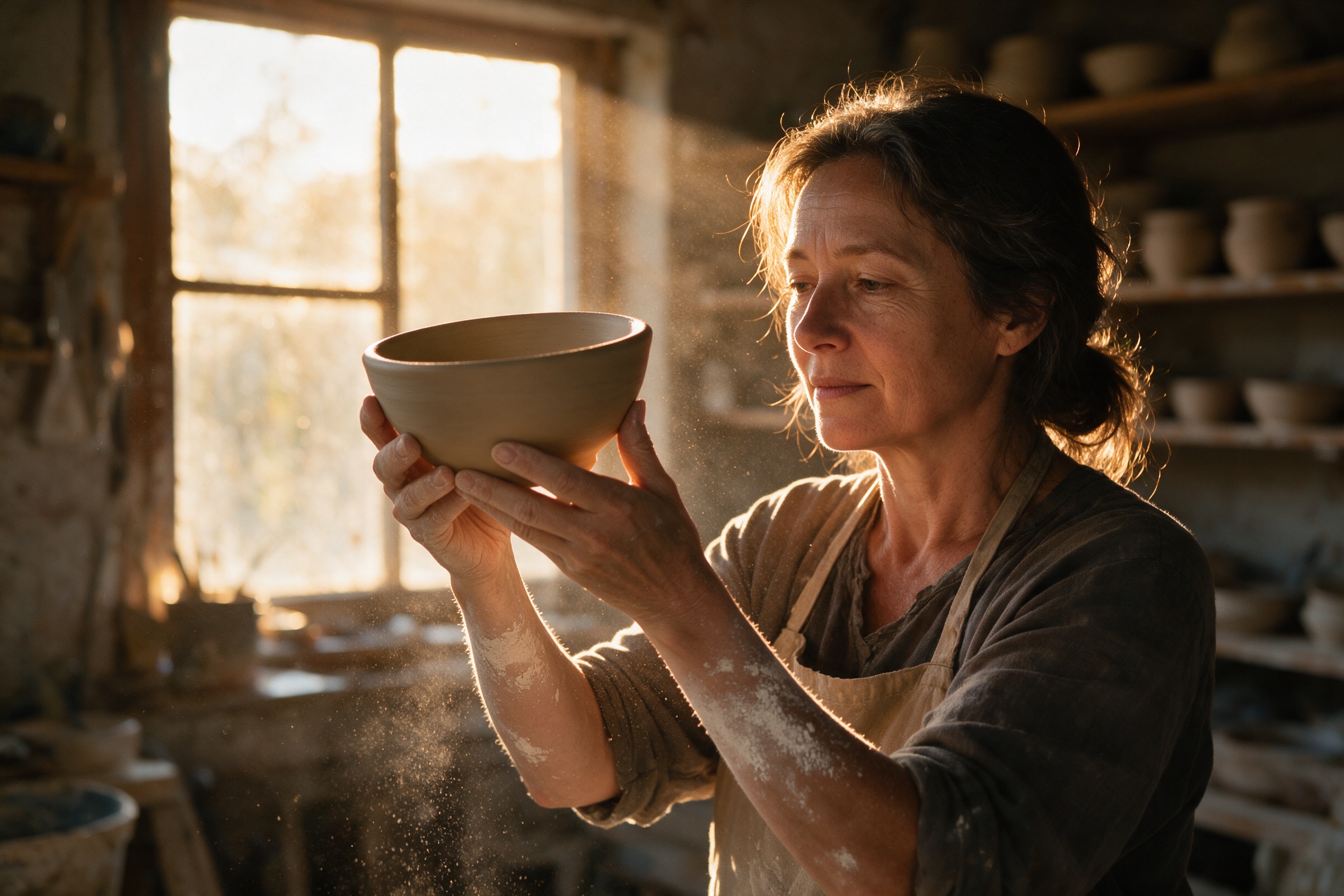
The recipe's trick is naming the evidence of realism instead of the word "realistic" alone: "clay dust on her forearms", "individual flyaway hair strands", "dusty window". Concrete imperfections are what the model turns into photographic credibility. Ran at 3:2, 2K.
Recipe 4: the bilingual neon sign — two scripts, two styles
Latin cursive in pink neon plus vertical katakana in yellow — each script with its own color, orientation and fixture, embedded in a wet scene full of reflections that all have to agree with the signage.
A rainy blue-hour street corner in a dense Asian metropolis, a small
ramen shop with a neon sign above the door reading 'MIDNIGHT NOODLE
CLUB' in glowing pink cursive, a vertical secondary sign with the
katakana 'ラーメン' in warm yellow neon, wet asphalt mirroring every
light source, steam drifting from a kitchen vent, a cyclist in a rain
poncho blurred in motion passing the storefront, cinematic
composition, rich cohesive color grade, ultra-detailed, high dynamic
range
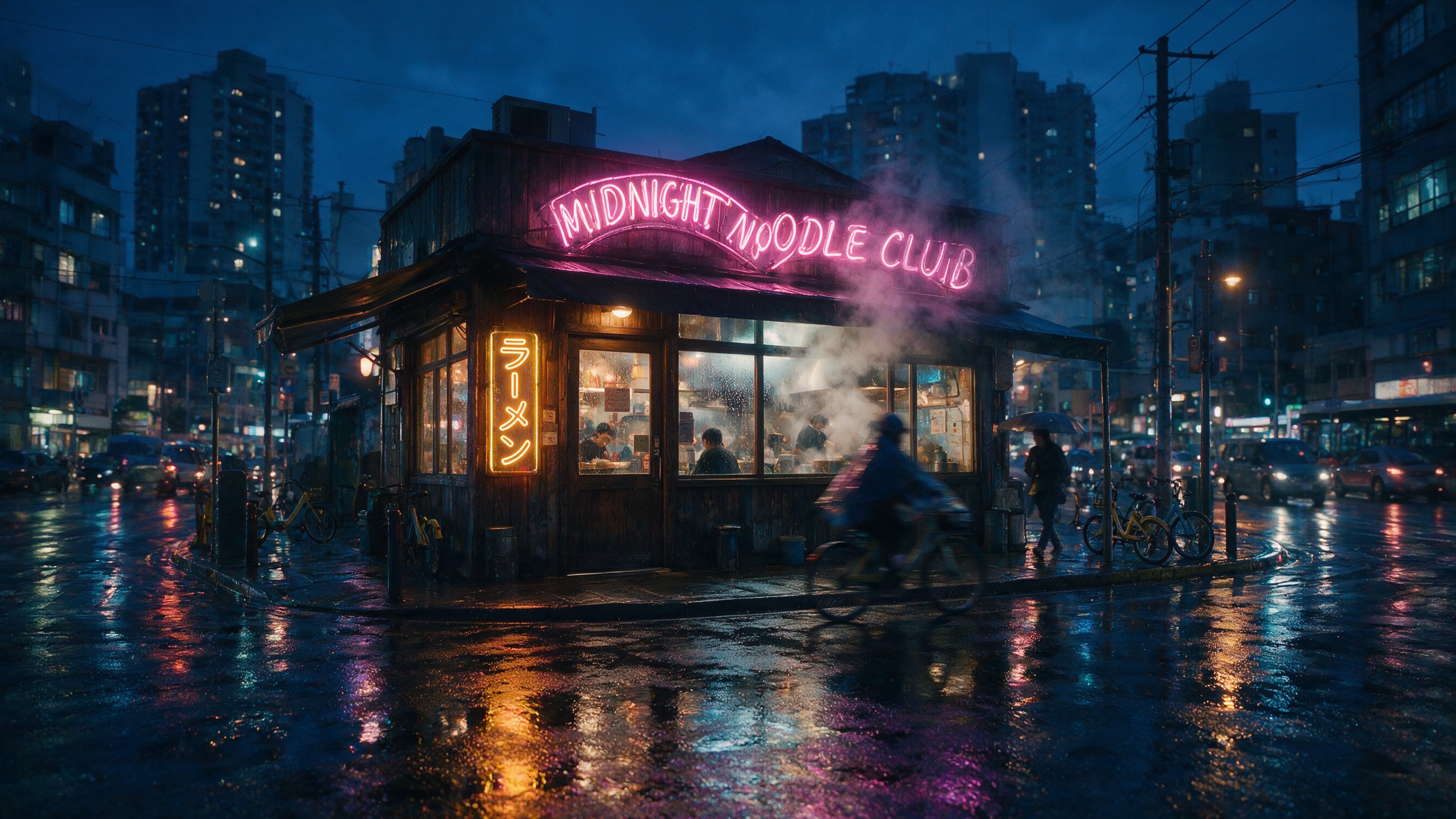
Both strings rendered correctly — including the katakana, glyph by glyph, set vertically as asked — and the wet-asphalt reflections pick up the right colors from each sign. If you write CJK or kana into a prompt, give it its own clause with its own styling; don't bundle it into the English sentence. Ran at 16:9, 2K.
Recipe 5: the magazine cover — editorial layout as a prompt
Masthead, two stacked cover lines, a barcode: a layout brief disguised as an image prompt.
A high-fashion magazine cover, the masthead 'APERTURE' in tall white
serif capitals across the top, a model in a sculptural cobalt-blue
coat photographed against a warm-grey seamless studio backdrop, two
cover lines stacked on the left side reading 'The New Minimalism' and
'Fall Issue No. 48', a small barcode in the bottom-right corner,
studio strobe lighting, ultra-sharp fabric texture, editorial color
grade, premium print finish
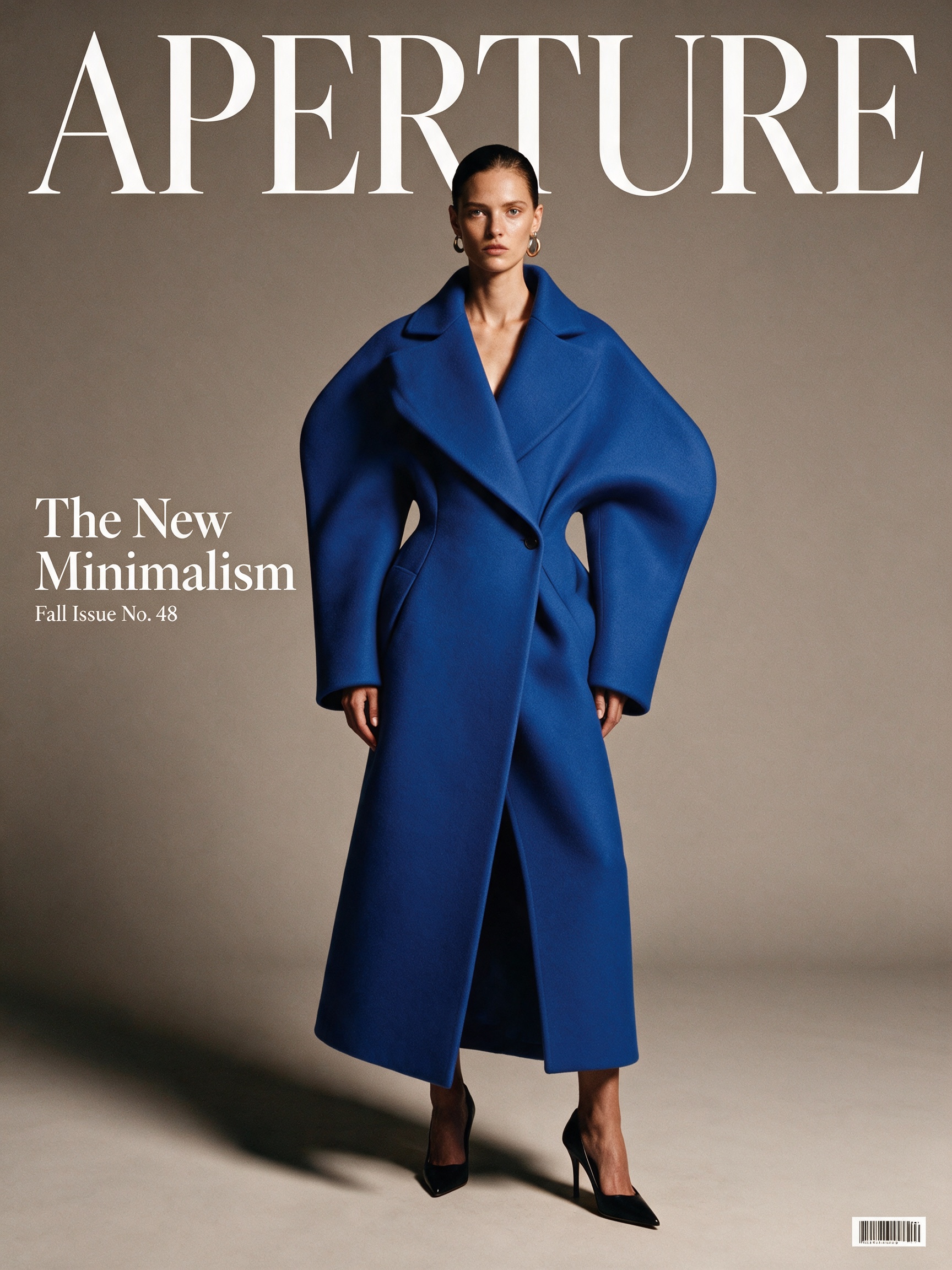
Masthead, both cover lines and the barcode all placed and spelled correctly, first take — with the model's coat partially overlapping the masthead the way real covers are set. Counting matters here: "two cover lines stacked on the left side" is a hard constraint, and Pro treats it as one. Ran at 3:4, 2K.
Recipe 6: the 21:9 establishing shot — when 1K is enough
This one ran at 1K ($0.075) on purpose. Scene-scale concept art viewed at web width doesn't need 2K; save the 2K budget for images where type has to survive zooming.
An ultra-wide establishing shot of a solar research station built into
terraced desert cliffs at dawn, arrays of mirrored heliostats catching
the first orange light, a maglev supply train crossing a slender
bridge between two mesas, tiny figures in white suits standing on an
observation deck for scale, layered atmospheric haze between the
ridgelines, cinematic anamorphic framing, concept-art level of detail,
rich cohesive color grade, high dynamic range
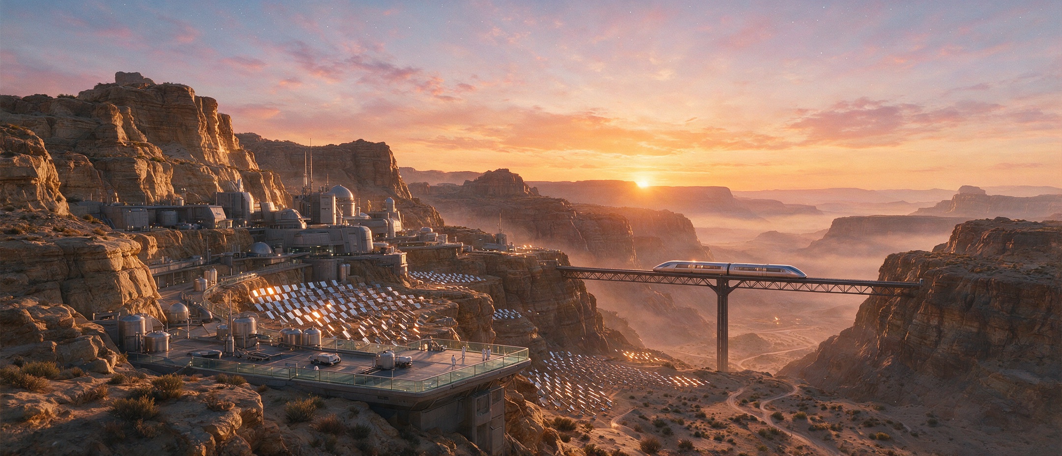
Heliostat field, train on the bridge, white-suited figures for scale, layered haze — every enumerated element is present. Ultra-wide ratios reward this kind of list-of-landmarks prompting: give the frame three or four anchors at different depths and let the model fill the connective tissue. Ran at 21:9, 1K.
The pattern behind all six prompts
Five rules cover everything above:
- Quote every string, anchor every string.
'PAPER TIGERS' … across the upper third. Unquoted text is a suggestion; quoted-and-anchored text is a spec. - Give each string a type treatment. Condensed serif capitals, small italic, minimal sans-serif, lowercase — Pro actually typesets; tell it how.
- One lighting statement per image. A single named source ("a single sodium street lamp", "soft top light with a crisp rim light") keeps the scene coherent.
- Lock the palette. "Muted amber and slate-blue", "deep teal and charcoal" — two or three named colors read as art direction, not decoration.
- Close with finish keywords. "Premium key-art finish", "editorial color grade", "concept-art level of detail" set the overall rendering register.
Pro or Lite?
Both Seedream 5.0 tiers render text well; the split is quality ceiling versus unit cost. Pro ($0.075–$0.15) is the pick when type is the hero of the image — posters, packaging, covers — or when you need photoreal fidelity that holds up at full size. Lite ($0.035) prices text-rendering work at general-purpose rates and is the volume play; it has its own recipe collection. And if you're editing existing images instead of generating from scratch, the Pro image-to-image endpoint has a separate set of recipes.
FAQ
How much does seedream-5.0-pro/text-to-image cost? $0.075 per image at 1K resolution, $0.15 at 2K — flat per image, independent of aspect ratio. Six of the seven images in this post (cover included) ran at 2K and one at 1K, for about $1.00 total.
How long does a generation take? In our runs, roughly 2–3.5 minutes per image end to end on the task endpoint, 1K and 2K alike.
Which aspect ratios can I use?
We used 2:3, 1:1, 3:2, 16:9, 3:4 and 21:9 in this post — all accepted without remapping. Set aspect_ratio in the task input.
Do I need different prompts for image-to-image? Yes — i2i prompts are edit instructions, not scene descriptions. See the seedream-5.0-pro/image-to-image recipes for that pattern.
The fastest way to make these recipes yours: swap the quoted strings, keep the anchors and type treatments, and fire it at the Seedream 5.0 Pro model page — one task call and you'll have your own first take back in a few minutes.