Qwen Image 2.1 Pro (qwen-image-2.1-pro) costs $0.05 per image on hiapi. That is 2.5× the price of Qwen Image 2.1 Turbo, so you should know what you are paying for. On 2026-11-02 we ran seven English-text prompts on Pro: a chalkboard menu, a nutrition label, a conference poster, a flow infographic, a perfume bottle, an app screen and a book cover. We re-ran four of them on Turbo with the same seed. Every prompt below is the exact string we sent, and every image is the unedited output.
The short version:
- English text was accurate on both tiers. Pro rendered 12 menu lines, a 10-row nutrition panel, a 9-string poster and an accented brand name (SOLÈNE) with no spelling errors. Turbo matched it on every paired test.
- One failure repeated on every run: camelCase identifiers.
taskIdcame out as "tasCId" or "tasEId" on two Pro seeds and on Turbo. Writing it astask IDfixed it. - Where Pro differed was the photo, not the text. Pro framed scenes more like real photographs, with angled boards, background props and harder light. It also added objects we did not ask for.
If you have not called a Qwen 2.1 model before, the Qwen Image 2.1 Turbo API guide covers auth, polling and the input schema. Pro uses the same schema, so you only change the model id.
The request every recipe uses
curl -s -X POST https://api.hiapi.ai/v1/tasks \
  -H "Authorization: Bearer $HIAPI_KEY" \
  -H "Content-Type: application/json" \
  -d '{
    "model": "qwen-image-2.1-pro",
    "input": {
      "prompt": "<recipe prompt>",
      "aspect_ratio": "16:9",
      "seed": 42
    }
  }'
Poll GET /v1/tasks/<taskId> until data.status is success, then download data.output[0].url straight away, because it is a temporary link. All runs used seed: 42 (one extra run used seed: 7) and left prompt_extend unset. Output sizes we measured on Pro:
| aspect_ratio | Output |
|---|---|
1:1 | 2048×2048 PNG |
16:9 | 2688×1536 PNG |
3:4 | 1728×2368 PNG |
9:16 | 1536×2688 PNG |
We submitted the batch concurrently. Pro tasks took between 42 seconds and about 5.5 minutes from submit to download; Turbo took 52–114 seconds. One Pro task (the book cover) ended TASK_FAILED with the message "task result could not be confirmed". Resubmitting the identical body succeeded in 65 seconds, so build a retry for failed tasks into your pipeline.
Recipe 1: Two-column chalkboard menu (16:9)
Photo of a wall-mounted cafe chalkboard menu in a cozy coffee shop. At the top in large hand-lettered chalk capitals: "BREW & CO.". Below it two columns. Left column heading "COFFEE" with four lines: "Espresso $3.20", "Flat White $4.50", "Oat Latte $5.00", "Cold Brew $4.80". Right column heading "BAKERY" with four lines: "Butter Croissant $3.60", "Almond Danish $4.20", "Banana Bread $3.90", "Cinnamon Roll $4.40". Along the bottom in small chalk: "Open daily 7am - 5pm". Each line is left-aligned with the price at the end of the line. Visible chalk dust, wooden frame, warm morning light. No other text.
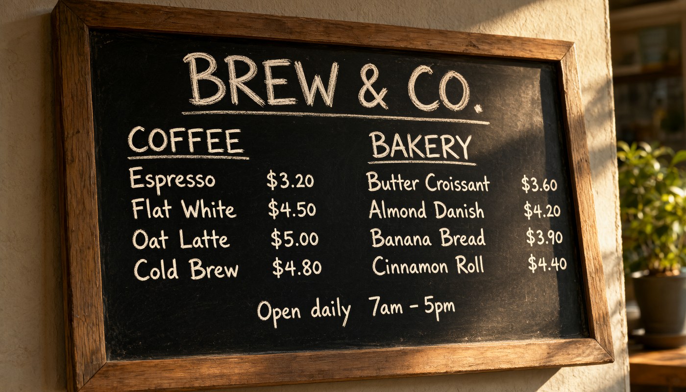
All 12 lines are correct: the title, two column headings, eight items with their prices, and the opening hours. The prices line up in a column and the & and the period in "BREW & CO." both survived. Three things in the prompt did the work. Every string is in double quotes, the prompt states the column structure before listing items, and "No other text" closes the prompt.
Turbo vs Pro, same prompt and seed:
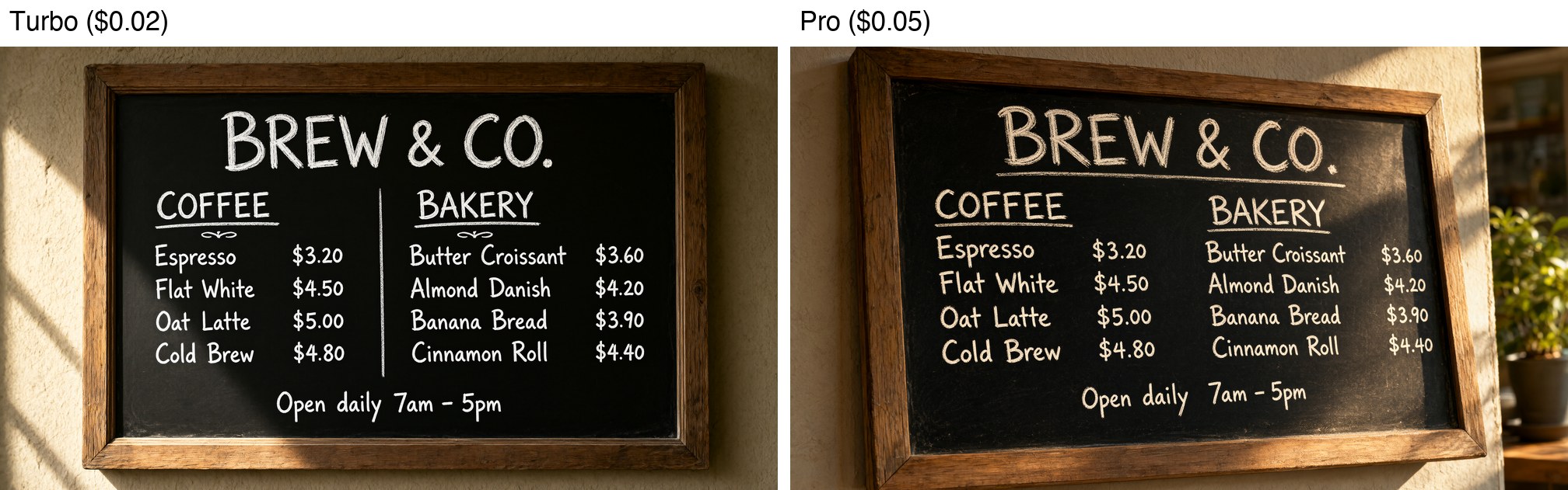
Turbo also got all 12 lines right. It shot the board straight-on and added a vertical divider and two small flourishes under the headings, none of which we asked for. Pro angled the board, added a plant and window light at the edge, and gave the letters a chalkier texture. If you only need a readable menu graphic, Turbo is enough. If the image has to pass as a photo of a real café wall, Pro's framing is closer.
Recipe 2: Nutrition facts panel on packaging (3:4)
Studio product photo of the back of a kraft paper granola pouch standing on a light oak table. On the pouch is a printed black-and-white nutrition label with a bold heading "Nutrition Facts". Under it: "Serving size 40g", then a thick rule, then "Calories 180" in large bold type, then rows: "Total Fat 7g", "Saturated Fat 1g", "Sodium 45mg", "Total Carbohydrate 26g", "Dietary Fiber 4g", "Total Sugars 8g", "Protein 5g". Each row separated by a thin rule. Sharp focus on the label, soft daylight from the left, shallow depth of field, photorealistic.
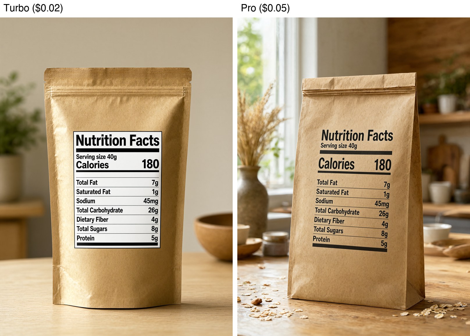
This is the densest text test: ten strings, each label paired with a right-aligned value, and rules between rows. Both tiers rendered every string and every number correctly, and both kept "Calories 180" as the largest line.
The two tiers handled the label differently. Turbo placed the panel on a white sticker with a border, which looks like a flat packaging mockup. Pro printed it straight onto a kraft paper bag. The text follows the bag's slight curve, and Pro added a dried-grass vase, oats on the table and a window, so the result reads as a lifestyle photo. For a spec mockup you will overlay or edit, Turbo's version is cleaner. For a hero shot, Pro's is more convincing. Neither tier is a substitute for a real regulatory label, so proofread any values you publish.
Recipe 3: Swiss-grid conference poster (3:4)
Swiss-style conference poster, off-white background, strict grid layout, black and signal-red type only. Top left in huge bold sans-serif: "BUILD WEEK 2026". Below in red: "Nov 18-20 · Lisbon". A thin black rule. Then a three-row speaker list, each row a name in bold and a talk title in regular weight: "Maya Chen - Shipping Agents to Production", "Leo Ortiz - Evals That Catch Regressions", "Ana Silva - Cheap Inference at Scale". Bottom right corner small text: "buildweek.dev". A single large red circle partly cropped off the right edge as the only graphic. No other text.
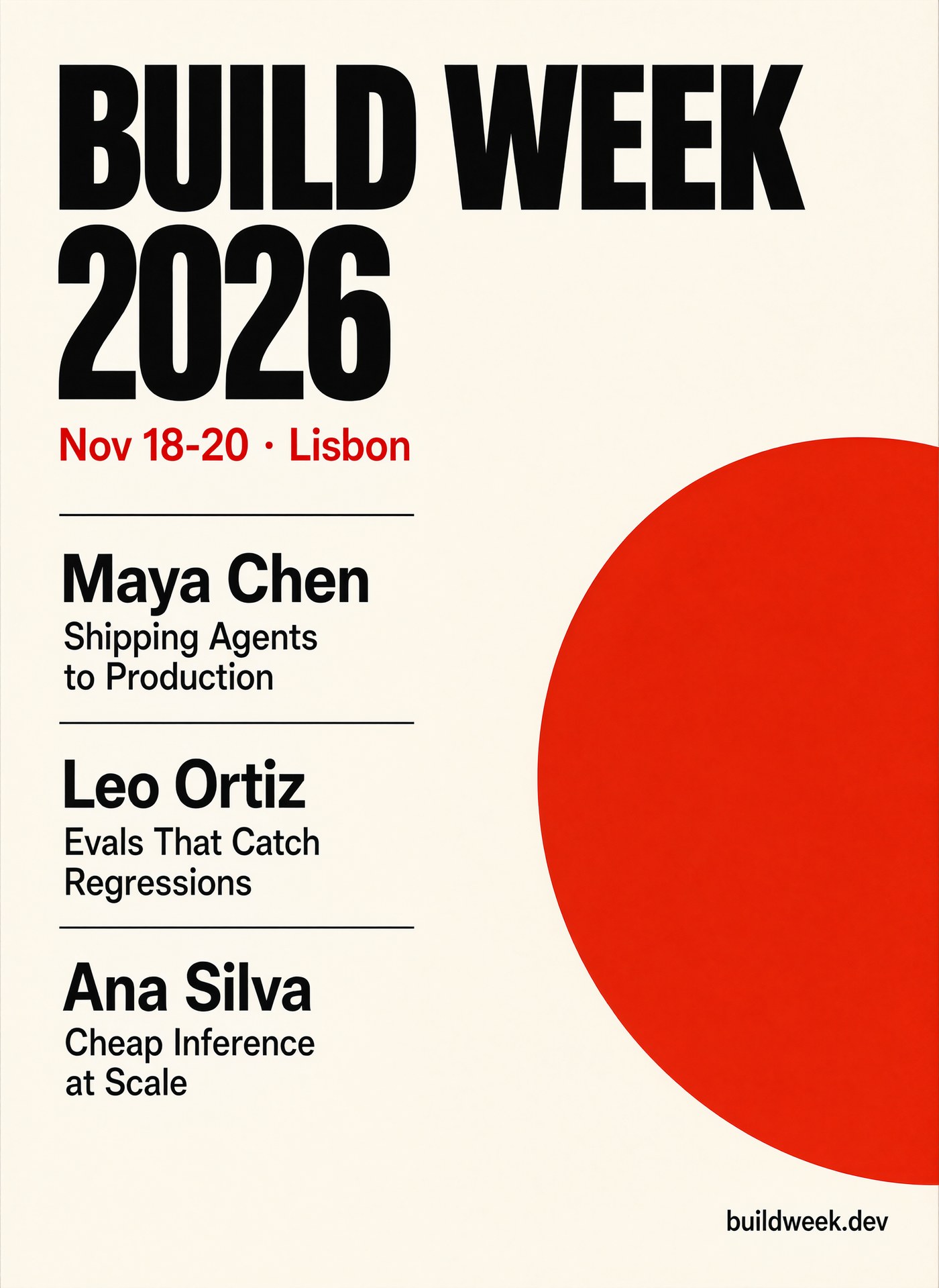
All nine strings are correct, including the · separator in "Nov 18-20 · Lisbon" and the domain in the corner. Two things changed from the prompt. Pro dropped the - between each name and talk title and put the title on its own line under the name instead. That is a reasonable layout choice, but if you need the dash you will not get it from this prompt. The red circle is cropped off the right edge as asked and does not overlap any text.
For a typographic poster, describe the grid ("strict grid layout"), limit the palette ("black and signal-red type only") and name the one graphic element. That stopped Pro from adding decoration.
Recipe 4: Flow infographic, and the camelCase problem (16:9)
This is the prompt we sent first:
Clean flat infographic on a white background titled "How a task request works" in dark navy bold sans-serif at the top. Below, four rounded cards in a horizontal row connected by arrows, each card with a large number, a simple line icon and a one-line caption: "1 Submit" with caption "POST /v1/tasks", "2 Queue" with caption "Get a taskId", "3 Poll" with caption "GET until success", "4 Download" with caption "Save the output URL". Teal accent color, generous spacing, all text horizontal and legible, no other text.
The title, all four step names, POST /v1/tasks and the other captions came out right. One token failed: taskId. We re-ran it twice to see whether that was bad luck:
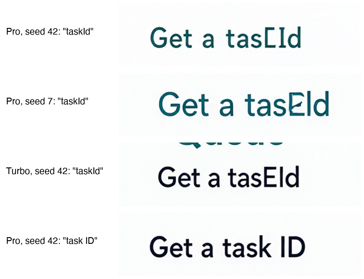
All three runs with taskId failed: "tasCId" on Pro seed 42, "tasEId" on Pro seed 7 and "tasEId" on Turbo. The model seems to merge the lowercase k and the capital I into one glyph. Changing only that caption to "Get a task ID", with the same seed, fixed it:
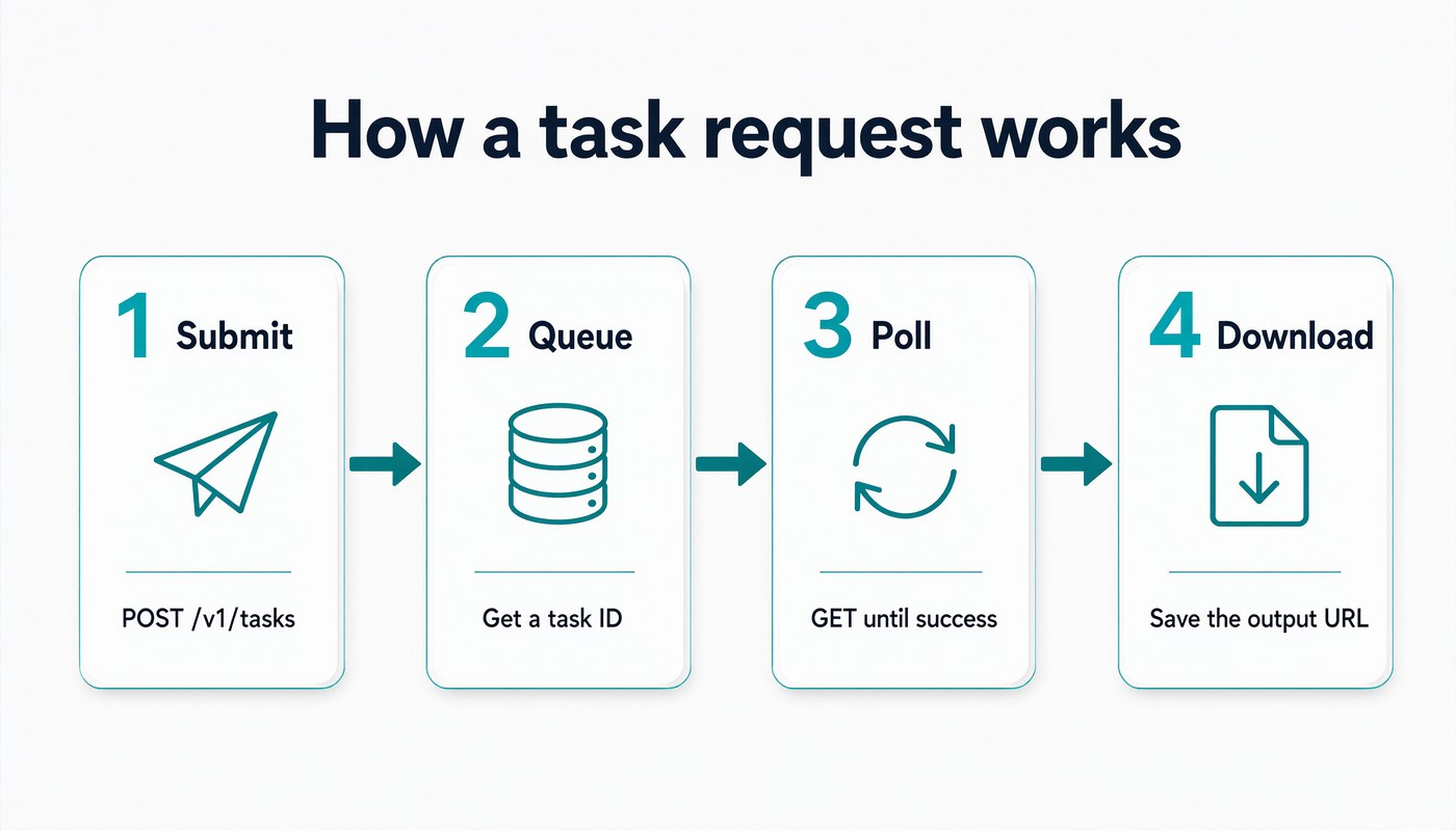
The layout changed too: number and title share a row, and the icons are different. A one-word change to a seeded prompt can reshuffle the whole composition. Recipe rule: in diagrams, write code identifiers as separate words (task ID, not taskId) or plan to add them in post. Path-style strings with slashes, like /v1/tasks, rendered correctly in all four runs.
Recipe 5: Luxury product shot with small text (1:1)
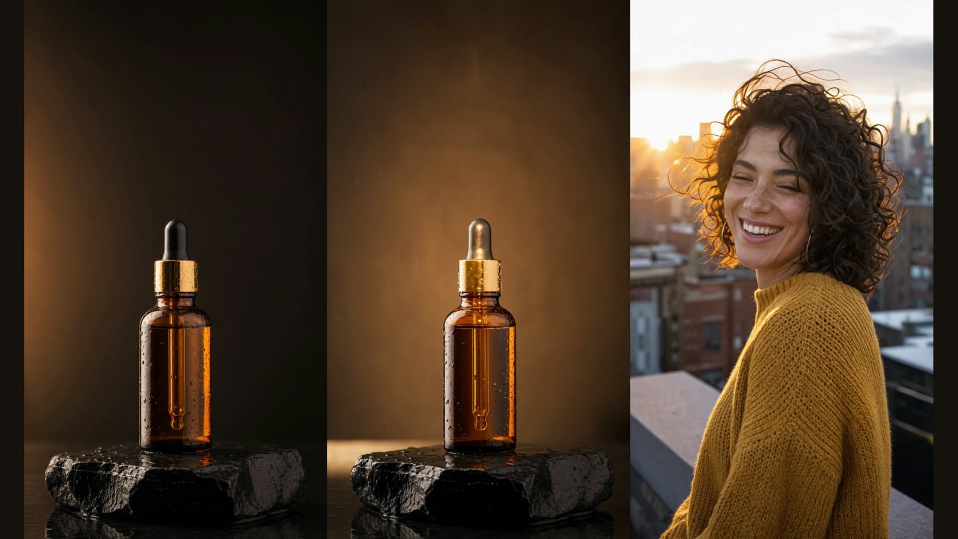
Luxury product photograph of a square clear glass perfume bottle with a heavy brushed-gold cap, standing on white Carrara marble. The word "SOLÈNE" is etched in thin serif capitals on the front of the glass, with "Eau de Parfum 50 ml" in smaller letters below. Amber liquid, a single hard light from behind creating a caustic golden reflection on the marble, a sprig of dried lavender lying beside the bottle, black background falloff, 100mm macro lens, photorealistic.
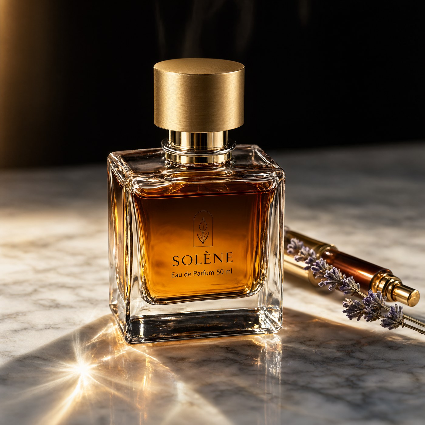
The brand name renders with the grave accent (È) intact, and the smaller "Eau de Parfum 50 ml" line is correct. Pro produced a square bottle, amber liquid and a strong caustic flare on the marble. It also added two things we did not ask for: an arched leaf emblem above the name and a second gold spray vial lying behind the lavender. The text is printed on the glass rather than etched.
Turbo vs Pro:
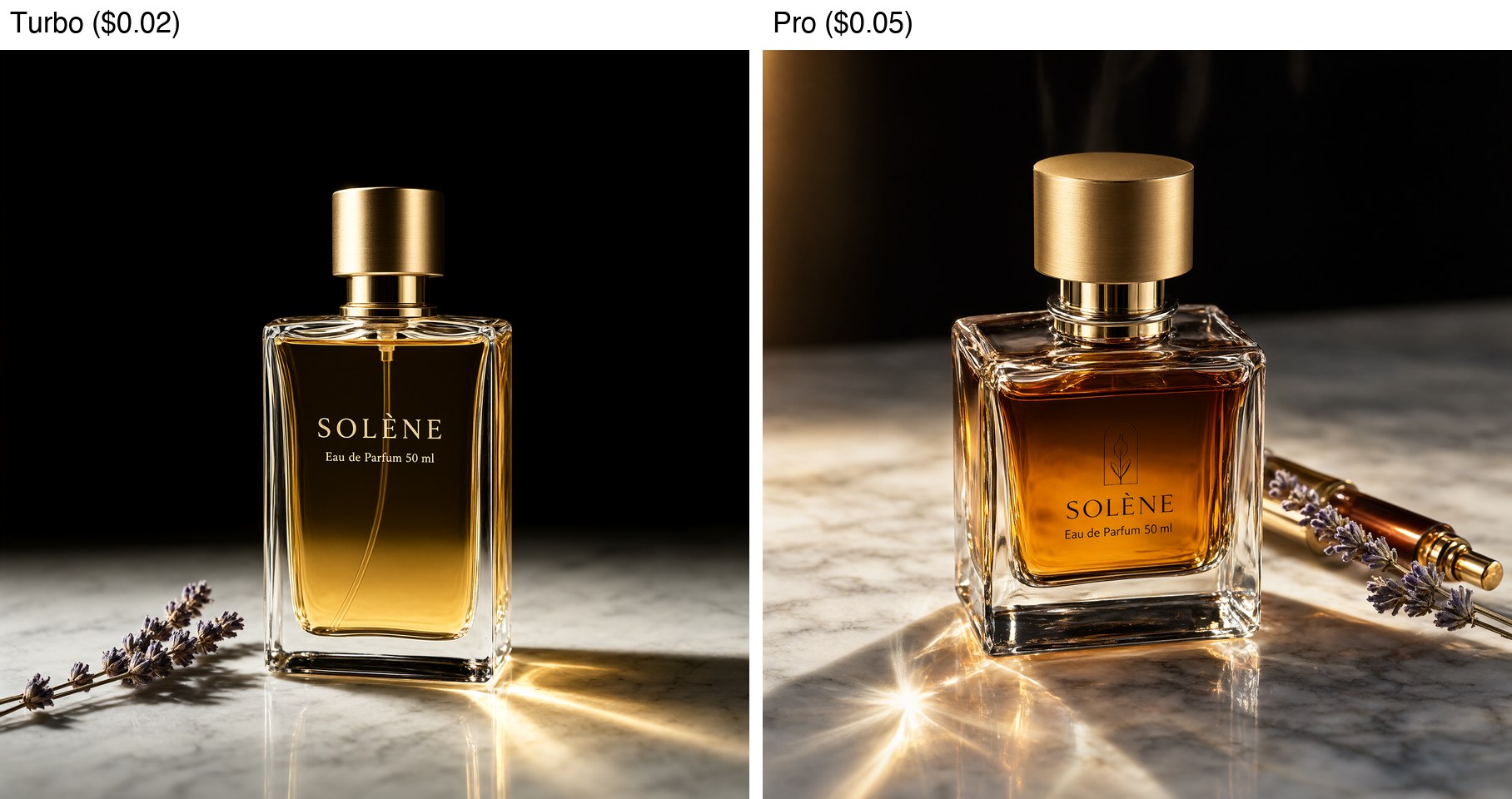
Turbo also spelled SOLÈNE and the volume line correctly and added no extra objects. Its bottle is taller than square, though, and it shows the dip tube inside the glass. Pro's frame has more drama and texture. Turbo stayed closer to the prompt's contents. If you need an exact product composition, add "no other objects" to the Pro prompt. We did not run that variant, so test it first.
Recipe 6: Mobile app screen mockup (9:16)
High-fidelity mobile app screen mockup, flat UI, light theme, no phone frame. Top bar title "Today". A large card showing "8,432 steps" in big bold numbers with a green progress ring labelled "84% of goal". Below, three list rows each with a small icon on the left: "Sleep 7h 20m", "Water 1.6 L", "Heart rate 68 bpm". At the bottom a tab bar with four labels: "Home", "Activity", "Plans", "Profile". Inter-style sans-serif font, 8px grid spacing, soft shadows, all text crisp and legible, no other text.
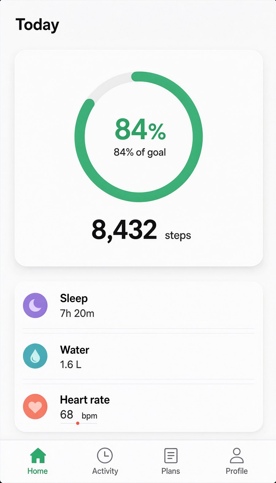
Every requested string is present and correct: 8,432, 84% of goal, the three metric rows with units, and the four tab labels. The thousands comma survived. Pro added a large "84%" inside the ring on top of the "84% of goal" label we asked for, plus a small red dot under "bpm". "No phone frame" held, and the 8px grid shows in the even spacing of the rows. This works for wireframe-grade mockups and pitch slides. For pixel-exact UI, you still need a design tool.
Recipe 7: Book cover with four text tiers (3:4)
Paperback book cover, photographed flat from directly above on a dark linen surface. Cover art: a lone lighthouse on a cliff at dusk painted in muted blue and orange gouache. At the top in large cream serif capitals: "THE LAST KEEPER". Under the title in smaller italic: "A Novel". At the bottom in spaced-out sans-serif capitals: "ELENA MARSH". Small text at the very top edge: "Winner of the Harbor Prize". Subtle paper texture and a slight curl at the corner.
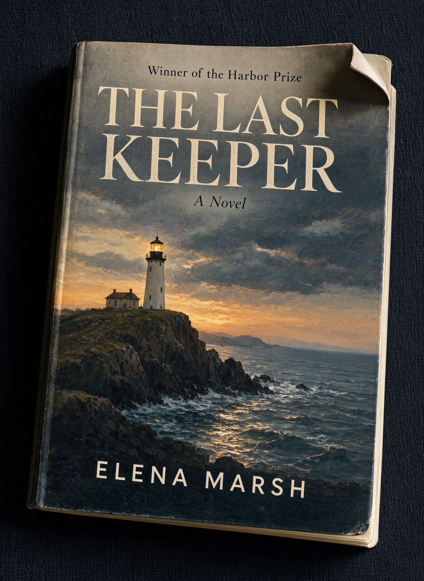
All four text tiers are correct and in the order we gave: the award line, the title split over two lines, the italic "A Novel" and the letter-spaced author name. The painting is closer to an oil painting than to gouache, and the corner curl is stronger than "slight". This is the output of the resubmitted task. The first submission is the one that failed with TASK_FAILED, as described above.
Prompt rules that held across these runs
- Quote every exact string and say where it goes: top, column, row, corner. Across the seven Pro recipes that was over 50 quoted strings, and the only misspelling was
taskId. - End with "No other text." None of the Pro outputs added stray signage or fake lettering. The only extra text was a duplicated "84%" on the app screen.
- Avoid camelCase and mixed-case identifiers. That was the only consistent spelling failure: 0 of 3 runs rendered
taskId. Split identifiers into separate words. - Expect extra props in photographic prompts. Pro added a vial, an emblem, a plant and kitchen props. Name the props you want and exclude the rest.
- Don't count on a seed to keep the layout. A one-word prompt change under the same seed produced a different layout.
Pro or Turbo for text-heavy images?
From the four paired runs (one seed each, so treat this as a small sample):
| Test | Turbo ($0.02) | Pro ($0.05) |
|---|---|---|
| 12-line chalkboard menu | All correct, flat front-on board | All correct, more photographic |
| 10-row nutrition panel | All correct, sticker-style label | All correct, printed on bag in a styled scene |
| Perfume bottle with accented name | Correct, no extra objects | Correct, added emblem and second vial |
taskId caption | Failed | Failed (2 seeds) |
On text accuracy we found no difference between the tiers. Pro's extra $0.03 bought more photographic scenes with more props. Use Turbo for menus, labels, diagrams and mockups where only legibility matters, and run the same prompt on Pro when the image has to look like a real photograph. Prices are from the hiapi pricing page as of November 2026.
For the previous generation's prompts, see the qwen-image-2.0 prompt recipes. For the newer model family, see the Qwen Image 3.0 text-to-image recipes.
FAQ
How much does Qwen Image 2.1 Pro cost on hiapi?
$0.05 per image on the pricing page as of November 2026. Qwen Image 2.1 Turbo was $0.02. The price does not change with aspect ratio.
Can Qwen Image 2.1 Pro render English text accurately?
In our runs, yes, with one exception. It spelled every quoted word, price and number correctly across a menu, a nutrition panel, a poster, an app screen and a book cover. The exception was the camelCase identifier taskId, which failed every time. Proofread every output anyway: we ran one or two seeds per prompt.
Does Pro render text better than Turbo?
Not in our paired tests. Both tiers were fully correct on the menu, the nutrition panel and the perfume label, and both failed the same camelCase caption. The visible difference was photographic style and added props.
What output size does Qwen Image 2.1 Pro return?
There is no resolution field. Output size is fixed per aspect ratio: 2048×2048 for 1:1, 2688×1536 for 16:9, 1728×2368 for 3:4 and 1536×2688 for 9:16, all PNG.
What should I do if a task fails with TASK_FAILED?
Resubmit the same request. In our batch, one of eleven Pro tasks returned "task result could not be confirmed", and the identical resubmission succeeded in about a minute.
Try it
Copy any prompt above into the Qwen Image 2.1 Pro model page to run it, or send it through the API with the request shown at the top. The docs cover the full task polling loop.