The product image looks polished, but there is nowhere to put the headline. That is a common problem in promotional creative. Put the same lamp into a bedroom and the differences become clear: Flare fits a right-side product with copy space on the left, Seedream feels more lived-in, and FLUX creates a convincing warm room while moving the lamp left and adding a cable.
All of these images were made in HiAPI. The main difference is where the product lands and how busy the background becomes.
One Lamp, Three E-commerce Directions
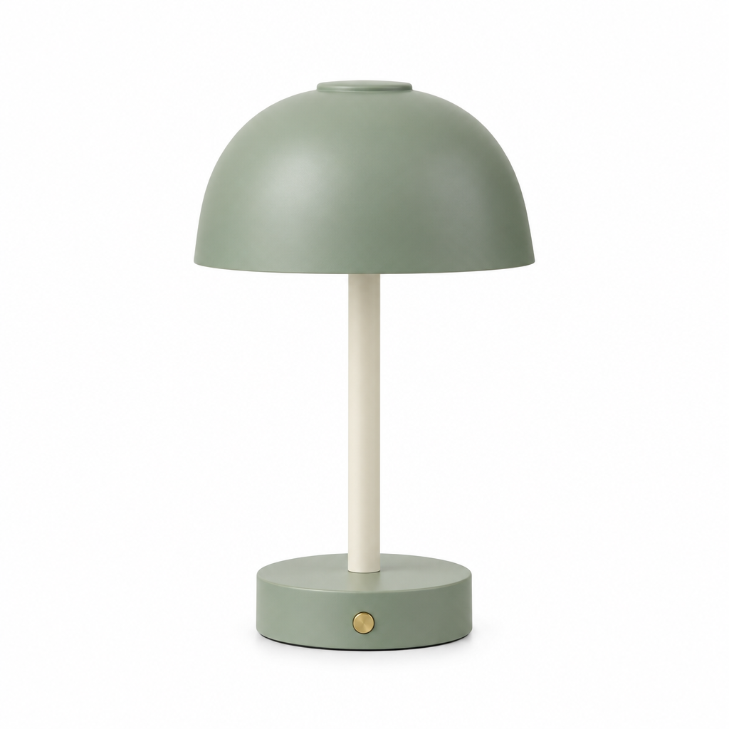
The lamp has a sage-green shade and round base, a cream stem, and one brass button on the front. It is switched off and has no cable. This lamp was designed as a concept product to show the visual differences. The original image and bedroom images make product position, atmosphere, and copy space easy to compare.
| Flare | Seedream 5.0 Pro | FLUX.2 |
|---|---|---|
 |  |  |
Flare: The Easiest Starting Point for a Campaign Layout
Flare placed the lamp on the right and left a relatively quiet wall on the left. The pillow and bed keep the image lived-in without taking over the copy area. The shade, stem, base, and button remain recognizable, and no cable appears.
For a banner or campaign cover with a headline on the left and the product on the right, this is the most usable starting point here. You still need to place your real type at its final size: open space does not automatically make every headline readable. Try your own product in HiAPI GPT Image 2.5 Flare and watch where the product lands within your existing layout.
Seedream: More Lifestyle Feeling, Busier Copy Space
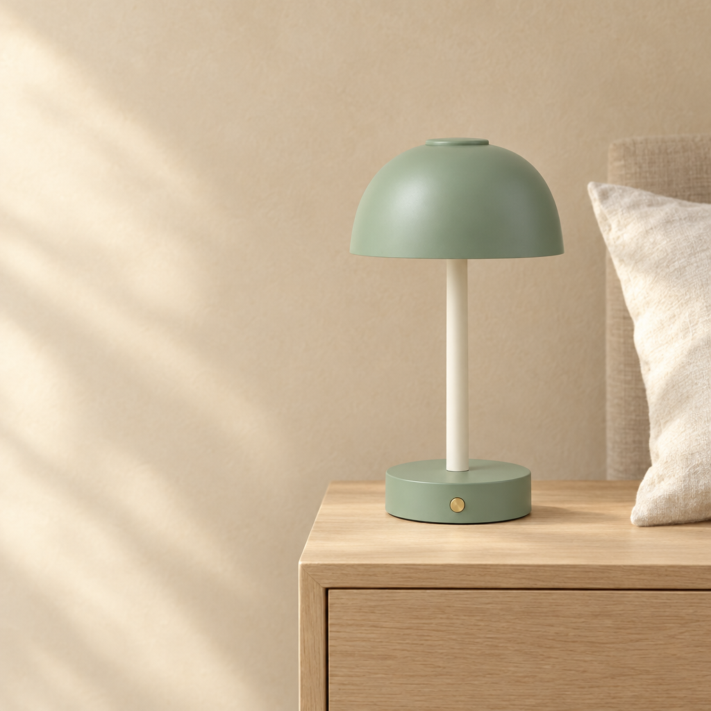
Seedream also keeps the lamp toward the right and preserves the continuity of its shade, stem, and button. A bed and a large pillow fill more of the left side, making the result feel like a real bedroom rather than a staged backdrop. That can work well when the product story is about everyday living.
The tradeoff is a less uniform copy area, with more changes in brightness and shape. A large headline or price block may need a different position or a quieter background treatment. To place your product in a more lived-in bedroom, use HiAPI Seedream 5.0 Pro to create a new scene and decide whether the added room context is worth the layout work.
FLUX: Warm Atmosphere, but Correct the Wireless Product Details
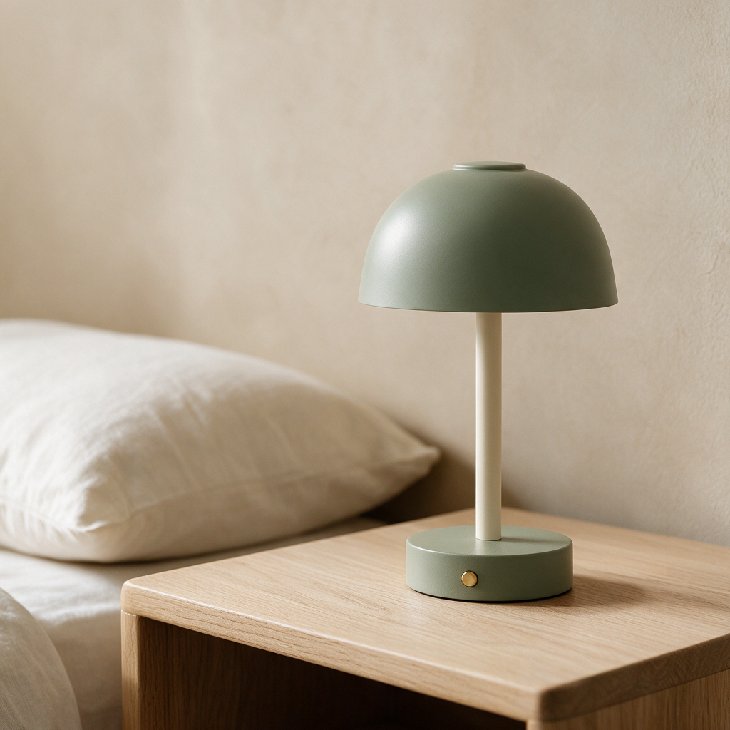
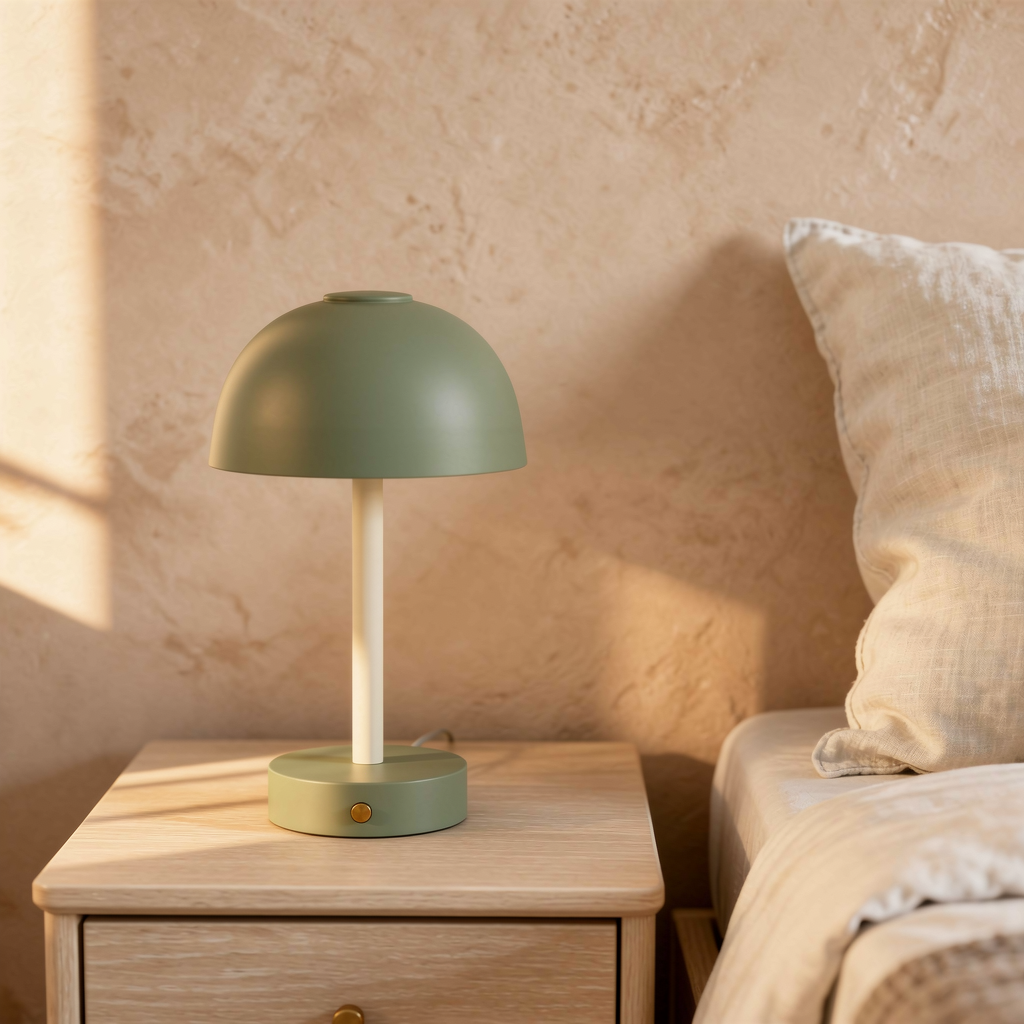
FLUX builds a coherent bedroom with warm light, a wooden cabinet, and a textured wall. If your goal is a home-interior mood image, that yellow-green warmth can be appealing.
The lamp sits on the left, so the intended headline area is gone. A short cable also appears behind the base even though the example lamp is wireless. The shade and base look more yellow-green under the warm light as well. If color is part of the sale, compare the result with the real item before publishing.
You can use HiAPI FLUX.2 to create a new product scene to explore this direction, but treat this image as a warm home-atmosphere starting point; the wireless-lamp details still need correction.
A Beautiful Scene Does Not Automatically Make a Usable Poster
When the same lamp becomes a campaign poster, the decision shifts from bedroom atmosphere to typography and brand layout. All three posters place the lamp on the right, leave copy space on the left, and retain the sage-green shade, cream stem, round base, and brass button. None shows a cable.
| Flare | Seedream 5.0 Pro | FLUX.2 |
|---|---|---|
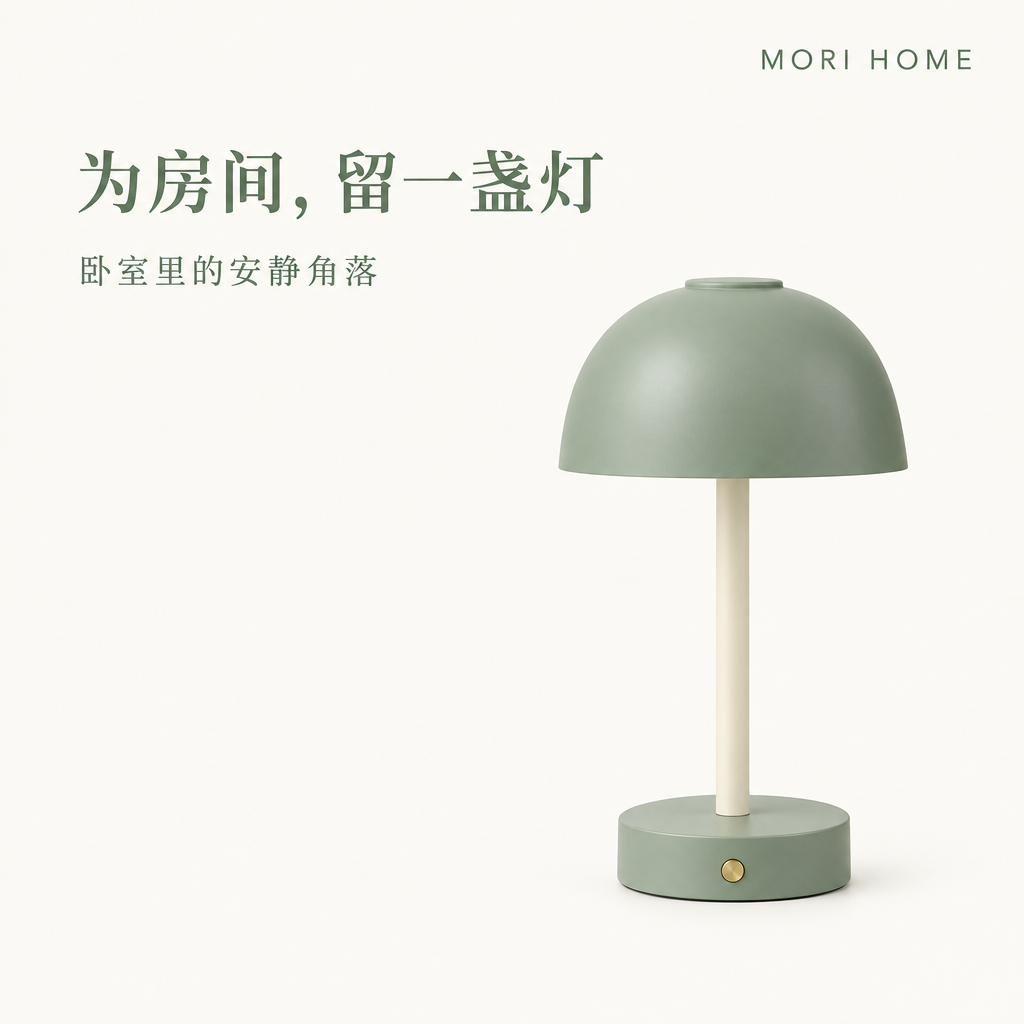 |  |  |
Flare uses an ivory background and a relatively heavy green serif headline. The Chinese title “为房间,留一盏灯” is easy to find, with “卧室里的安静角落” below it. MORI HOME sits in the upper right with generous letter spacing. The product and copy areas are clearly separated, making this practical for a new-product announcement.
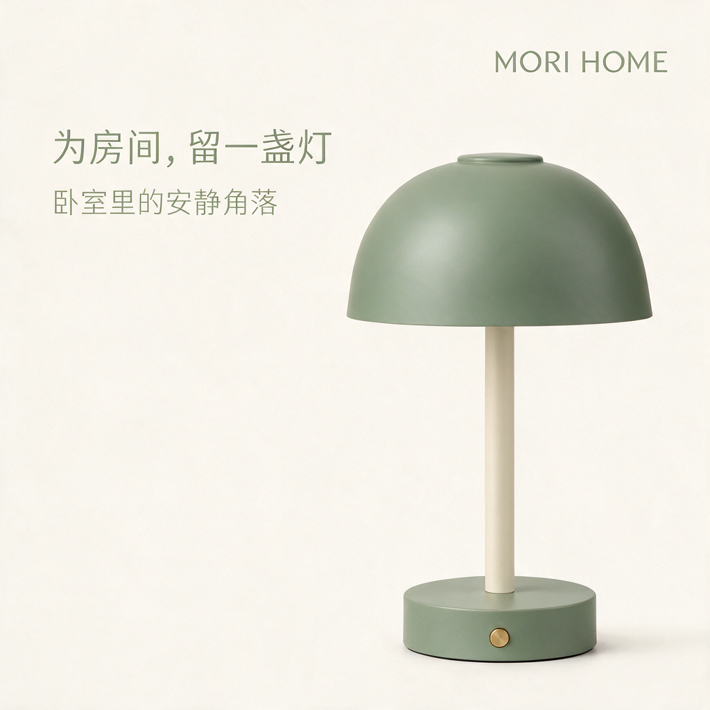
Seedream uses finer, lighter lettering and a more visible paper texture. The lamp shade occupies more of the frame. It keeps the same title, subtitle, and brand name, but feels more like a quiet, tactile lifestyle poster. The lighter copy may need a real-size check, and the larger lamp changes the balance between product and headline. This suits a calm, handmade brand mood when the text does not need to shout.
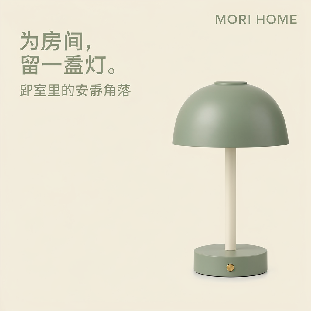
FLUX uses a heavier sans-serif headline split across two lines. MORI HOME is readable and the lamp remains on the right, but the headline adds a full stop after the requested phrase. The first character of the Chinese subtitle is visibly malformed, so the full subtitle should not be treated as finished copy. This poster’s bold headline catches attention, but its subtitle needs the glyph corrected before formal use.
The distinction is simple: a bedroom scene is judged by placement, light, and whether the setting supports the sale. A poster also has to earn trust through hierarchy, letterforms, brand recognition, and small-copy reliability. A beautiful Chinese-language image still needs careful reading before public use. For prices, dates, or discounts that change often, leave room for a final layout pass.
From New Product to Campaign, Give Each Image a Job
A new-product page can lead with the original or a clear product view so shoppers understand what the lamp is. The bedroom scene belongs where the page answers “what would it feel like beside my bed?” It helps the customer imagine the table, wall, and lamp together. The poster belongs on a homepage campaign slot, social share, or store announcement because its job is to communicate one message quickly.
For a launch, Flare’s copy space and headline hierarchy are the easiest to continue designing. Seedream’s paper grain and larger shade can support a softer brand identity, but the text needs enough contrast. This FLUX poster’s bold headline catches attention, but its subtitle needs correction before formal use. For everyday content, Seedream’s bedroom image may feel more natural than a poster; for a warm home mood, FLUX has room to explore, with its cable and product color still checked.
Do not ask one image to be the product listing, lifestyle scene, and promotion at the same time. The listing answers “what is it?”, the scene answers “where would it go?”, and the poster answers “what should I do now?” Separating those questions makes later changes to a headline, date, or background much easier to manage. For material and accessory detail, continue with our watch and linen-bag comparison.
Choose for the Use, Not the Thumbnail
For a product listing, protect the shape, color, and parts first. For a lifestyle image, judge whether the scene feels natural. For a campaign graphic, placement, headline hierarchy, and copy space may matter more than a richer background. With the lamp on the right and copy on the left, Flare is easiest to continue designing; Seedream suits a lived-in bedroom or paper texture; FLUX offers warm atmosphere and a bolder headline, but its text and product details need checking.
The same model can behave differently with another product. Put your item into the final ad size before making more images and decide whether your priority is texture or space.
Frequently Asked Questions
Can I use this approach without a real product image?
Yes, for concept and mood exploration. A fictional lamp should not be presented as an accurate picture of an item you sell. Replace it with a reliable photo or design asset before listing the product.
Which model should I try first?
For a left-side headline, start with HiAPI Flare. To place your product in a more lived-in bedroom, try HiAPI Seedream 5.0 Pro to create a new scene. For warm home atmosphere, explore HiAPI FLUX.2 to create a new product scene. Choose the product image you most want to make, then try it in HiAPI to see which scene suits it.