A product image is useful when its detail lands on the right part of the product. For watches, accessories, and bags, shoppers zoom in on the dial, glass, leather grain, weave, and labels. A beautiful highlight that changes a key component still creates rework.
These images put the same kinds of material-focused ideas through GPT Image 2.5 Sunburst and FLUX.2 Pro. They show how the emphasis shifts: sometimes you need a clearer close-up, while other product images benefit from a stronger studio reflection or wider composition.
Watches: Clear Dial Detail or Stronger Glass Reflection?
| Sunburst | FLUX.2 Pro |
|---|---|
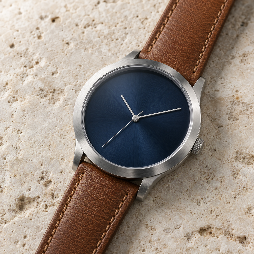 |  |
Sunburst keeps the radial texture on the deep-blue dial easy to read. Its glass reflection is restrained, so the dial, leather grain, and stitching remain visible. That makes it a practical starting point for a detail page or any product image where customers need to inspect color and finish first.
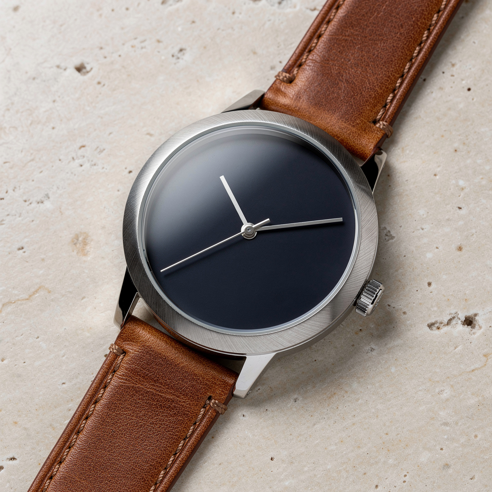
FLUX.2 Pro adds a stronger soft reflection across the upper-left of the glass. The fine bezel texture also reads clearly, giving the image a more convincing studio-shoot feel. The tradeoff is that the reflection covers part of the dial. If the dial design is the selling point, Sunburst may need less cleanup; if the atmosphere of a polished product shoot matters more, FLUX is worth trying.
You can see how your own metal, leather, or jewelry behaves by starting with the HiAPI Sunburst model, then comparing it with HiAPI FLUX.2 Pro. A single representative product is enough to reveal which lighting direction helps your page.
Linen Bags: Texture Is Only Half the Product Story
| Sunburst | FLUX.2 Pro |
|---|---|
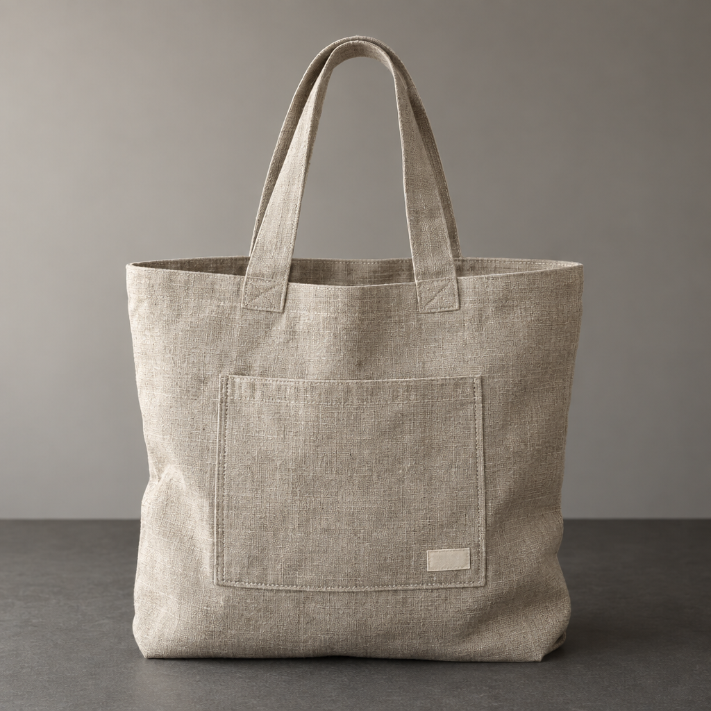 |  |
Sunburst makes the bag larger in frame, with visible fibers, pocket edges, and lower folds. The small label sits within the pocket's lower-right area, so the pocket, seams, and label read as one construction. That is useful for a launch page or catalog image focused on make and finish.
FLUX.2 Pro leaves more space around the bag and preserves an easy-to-read overall silhouette. Its weave has visible horizontal and vertical irregularity. The label, however, lands on the bag below the pocket. If a real bag carries its label there, moving it during an edit means the image needs a correction no matter how good the photograph looks.
For a bag launch, accessory catalog, or textile page, use HiAPI Sunburst to create a material concept image first. If you want a looser composition, create another reference with HiAPI FLUX.2 Pro.
Different Page Positions Need Different Kinds of Clarity
The first image on a product page usually needs to establish the whole silhouette before asking shoppers to study a detail. A watch can use a complete product view as the lead image, then bring the dial and strap close-up into the section about finish. A linen bag can show its proportions first, then use a tighter crop to explain the weave, pocket, and label. That sequence keeps a shopper from seeing a beautiful texture without understanding the product around it.
For search cards or social thumbnails, a larger subject often reads faster. A banner, collection page, or brand story needs more breathing room for a headline or neighboring products. The Sunburst watch image concentrates attention on the detail, which suits a craftsmanship section; the wider FLUX bag framing is useful as a layout reference, provided the label is corrected. Put the images into the actual page before deciding. Two square thumbnails rarely tell you how much work the finished placement will need.
Give Metal, Leather, and Fabric Different Jobs
Metal sells through sheen and finish. A watch with too little reflection can look flat, while a bright reflection can cover the dial. When the dial color, hands, or glass are the reason to buy, protect that readable area first. If the brand wants a polished studio mood, a soft highlight can carry more of the image, as long as it does not hide the detail shoppers came to inspect.
Leather depends on the combination of grain, edges, and stitching. A close texture alone does not tell a customer whether the strap feels well made; the connection to the case and the edge finish matter too. Linen has a different visual job. Even fibers suggest a refined fabric, while irregular weave and soft bottom folds suggest a relaxed everyday bag. A detail-page sequence can use one close view to explain texture and one full view to show proportion and capacity.
Products in one collection do not need identical lighting, but they benefit from a shared background temperature, subject distance, and approach to negative space. If one watch is tightly cropped while the bag beside it sits in a broad tabletop scene, the brand page can feel like several unrelated shoots. Set a simple rule—close views for craftsmanship, wider views for collection pages—then adjust reflections and shadows for each material.
How to Arrange These Images on a Product Page
Imagine you are launching a watch. The first question is “what does the whole product look like?”, so lead with a complete view showing the case, strap, and proportions. The next question is “can I read the dial?”, which is where a clearer Sunburst close-up can explain the color, hands, and glass. The final question is “does the finish justify the price?” Bring the leather grain, edges, and stitching closer for that section. FLUX’s stronger glass reflection can belong in a brand-story or mood section, as long as it does not cover the detail you are trying to explain.
This order follows the shopper’s questions: recognize the silhouette, inspect the important component, then judge the material and workmanship. If a highly reflective close-up appears first, the page may feel premium while leaving the watch’s size unclear. Reduce the image to its mobile placement and check whether the dial still reads.
Now imagine a linen-bag brand page. Use the full silhouette first to show height, handles, and pocket placement. Follow with a closer view of the fabric and pocket so shoppers can see the fiber density, seams, and label. A third image can sit beside styling copy with more surrounding space. Sunburst’s bag is a natural reference for the second, detail-focused position. FLUX’s wider framing can inspire the third, but the label still needs to match the real design.
These images do not need identical distances. What should stay consistent is the background mood, color judgment, and product construction. A close-up answers “what does it feel like?”, a full view answers “how would I use it?”, and a styled frame answers “how could it fit into my life?” If your shop sells watches, bags, and accessories, make those three questions the rhythm of the collection page, then adjust sheen, folds, and negative space for each material. For another example of a product placed into a usable setting, read our e-commerce product-image guide.
When space is limited, keep the one close-up that answers a real shopper question instead of stacking several similar texture images. The job of each image is to reduce uncertainty, not add more scrolling.
Frequently Asked Questions
Should a detail page lead with a full product view or a close-up?
Usually let shoppers recognize the product first, then use a close-up to answer how the material and construction feel. If the dial, weave, or leather edge is the main reason to buy, bring that detail earlier without removing the full silhouette.
Why can a beautiful watch reflection still call for a different image?
Reflection adds a convincing glass surface, but it can also cover the dial color, hands, or other selling detail. Inspect the area shoppers need to see before choosing the lighting treatment.
Can I use the linen-bag image if the label is in the wrong place?
It can work as a composition or fabric reference for a concept. For a real product detail image, the label, pocket, and seams are part of the design, so the placement needs correction before use. You can keep the framing and lighting as inspiration for another image.
Where should I start?
Create one material concept image with HiAPI Sunburst, then place it in your actual product page or ad layout.