How should you choose between GPT Image 2.5 Flare and Sunburst? Start with the setting you need for the product. In this blue-kettle series, both models preserve the blue body, black handle, metal spout, and AER lettering. The useful comparison here is between two kitchen product images and two branded posters.
If you are choosing a kitchen product image, try your own material in HiAPI Flare and compare the space, props, and light. For a branded poster, look at headline weight, product placement, and how much everyday detail the image carries. Instead of asking which model is “stronger,” ask whether you need a clear product scene or a poster that carries a specific brand mood.
One Shared Reference: A Blue Concept Product
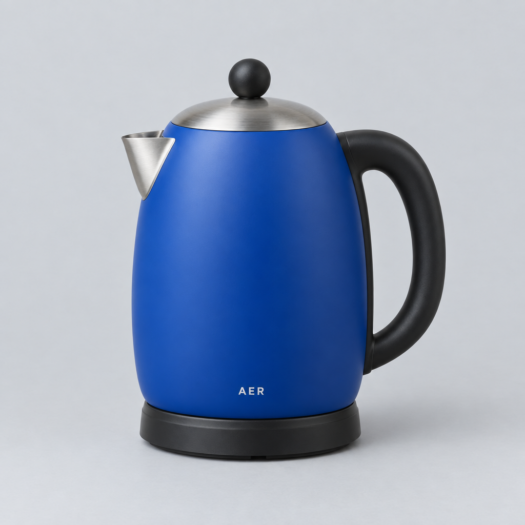
The blue kettle below is a concept product designed to show the visual result. It has a blue body, a black handle and base, a metal spout and lid, and white AER lettering. Those details make it easy to see what stays familiar when the surrounding image changes.
Put It in a Kitchen: The Product Starts to Tell a Story
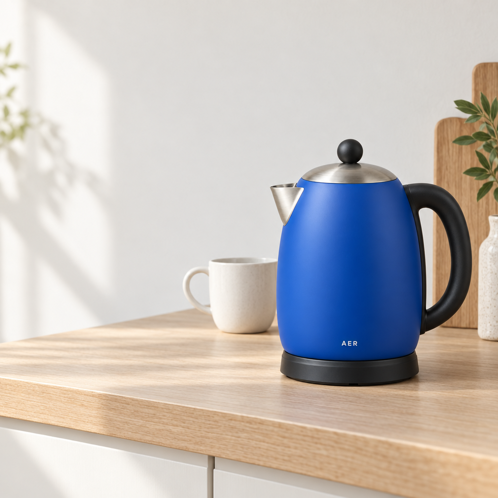
Once the product leaves a neutral background, the picture answers a different question. It is no longer only “What is this?” It also suggests “What might my day look like with it?” Both images below place the blue kettle on a pale wood counter, with the kettle on the right, a white cup behind it, and a quiet wall on the left. The mood comes from the light, props, and small changes in position.
| Flare | Sunburst |
|---|---|
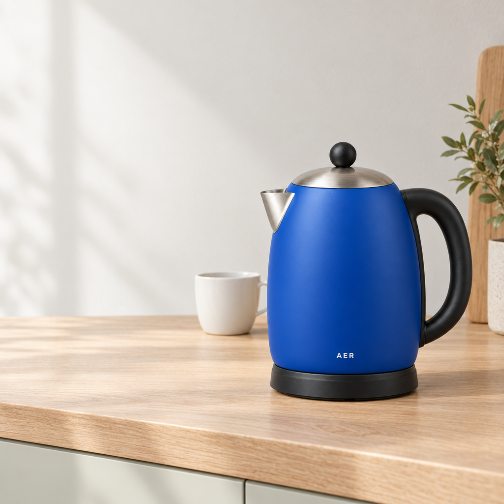 |  |
In the Flare image, the kettle is larger and sits farther to the right. The white cup stays behind it, while the left side remains a broad, quiet area of wall. That makes the product easy to recognize and leaves the picture feeling calm. It can work as a detail-page opening image, a brand homepage visual, or a lifestyle image where a short line of copy may sit in the empty area.
Sunburst keeps the kettle’s blue color, shape, and AER lettering, but changes the feeling around it. A little more plant detail and window shadow appear in the upper left. The wood counter and soft light make the image feel closer to a real morning kitchen. If you want the product to feel used and lived with rather than simply displayed, this is the more atmospheric direction in this pair.
The kitchen images are overall close. The Flare image leaves more quiet space around the larger kettle; the Sunburst version brings a little more plant detail and window shadow. Choose according to the amount of copy space and everyday feeling your page needs.
Add Words: From Product Photo to Brand Poster
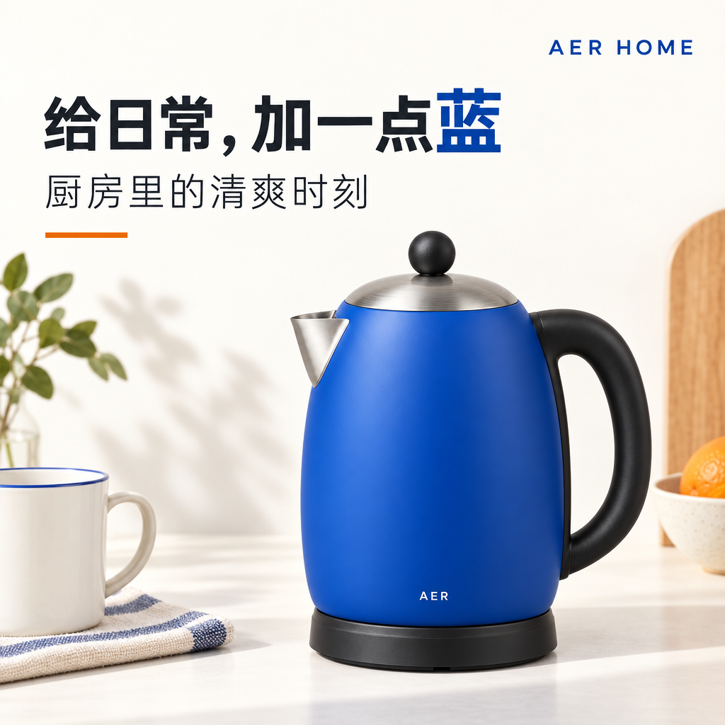
A poster has another job. It must look coherent while making the brand name and message easy to read. Both images below render “给日常,加一点蓝,” “厨房里的清爽时刻,” “AER HOME,” and the AER mark on the kettle clearly. The difference is the relationship between typography, product, and surrounding objects.
| Flare | Sunburst |
|---|---|
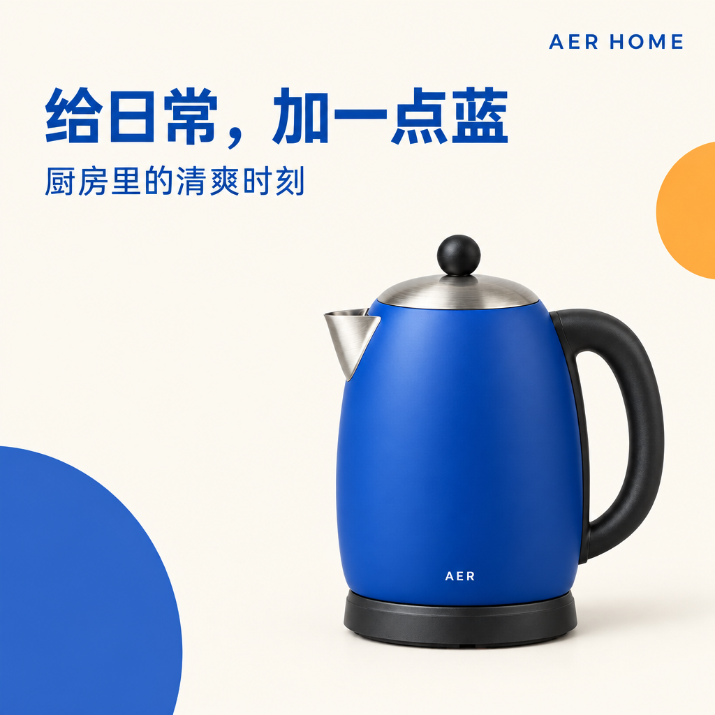 |  |
Flare uses a large blue headline, clean blue and orange geometric circles, and a quiet cream background. The kettle sits at the lower right while the words occupy the open upper-left area. It feels like a clear product advertisement: the color is memorable, the brand name is easy to place, and the message arrives before the viewer studies the objects. That direction suits a new-product announcement, a small shop window poster, or an activity image that needs to be understood quickly.
Sunburst keeps the headline mostly black and turns only the character “蓝” blue. A thinner subtitle and a short orange line sit above a scene with a white-and-blue cup, striped cloth, plant, and an orange on the right. The kettle becomes part of a kitchen moment instead of standing alone on a graphic background. This feels closer to a lifestyle brand poster for a social feed, a home-and-living feature, or a campaign that wants “freshness” to feel like part of daily life. To try this direction with your own brand material, use HiAPI Sunburst.
The difference is not that one model can make posters and the other cannot. With the same blue product, Flare moves toward a graphic brand poster while Sunburst moves toward a poster with kitchen details. Choose the first when customers should remember the color and name. Choose the second when they should remember a morning light, a cup, and a feeling around the product.
Product Display and Brand Promotion: How to Choose
For a lifestyle scene, decide how much imagination the customer should supply. A counter, cup, plant, and window shadow can make an item feel warmer, but they also compete for attention. The Flare image keeps a larger quiet area; the Sunburst image has a little more environmental detail. These are two ways to tell the story, not permanent model roles.
For a poster with text, think about where people will see it. A new-product notice, shop window, or event reminder benefits from the Flare poster’s bold headline and geometric shapes. A brand account, home-living feature, or seasonal mood post can give the Sunburst poster’s kitchen details more room. Bring your product photo, brand colors, and real copy into both models and choose the direction that fits the page.
Frequently Asked Questions
Which model is better for product images?
The kitchen images are overall close. Look at product size, quiet space, and the amount of everyday feeling you want. The clearer difference appears in the AER HOME posters: one is a clean blue geometric advertisement, while the other is a black-and-blue headline over a kitchen scene.
I already have a product photo. Do I need to redesign everything?
No. You can keep the product’s color, shape, and lettering while changing the counter, lighting, headline area, or nearby objects. That lets an existing product fit a new lifestyle setting or brand poster while still feeling connected to the images your shop already uses.
Should a poster feel graphic or lived-in?
If the customer needs to see the event name, brand, or main color first, the Flare poster’s graphic layout is clearer. If the brand sells home, everyday routines, or a mood, the Sunburst poster’s lifestyle details can do more work. For another product-and-poster comparison, read our Flare vs Seedream 5.0 Pro comparison. To choose for your own product, compare HiAPI Flare and HiAPI Sunburst.