For product images, look at the object and materials first. For posters, look at the copy and mood. This earbud and bakery-poster comparison shows two ways to make a usable image. GPT Image 2.5 Flare puts the product and message forward. Seedream 5.0 Pro brings photographic depth, paper texture, and atmosphere.
If you want a clear product view, start with HiAPI Flare. If your brand leans toward side-on photography, reflected light, or a softer visual mood, keep Seedream 5.0 Pro in the running. Ask whether customers should recognize the product first or feel the world around it first.
Earbud Product Images: Clear First or Atmospheric First?
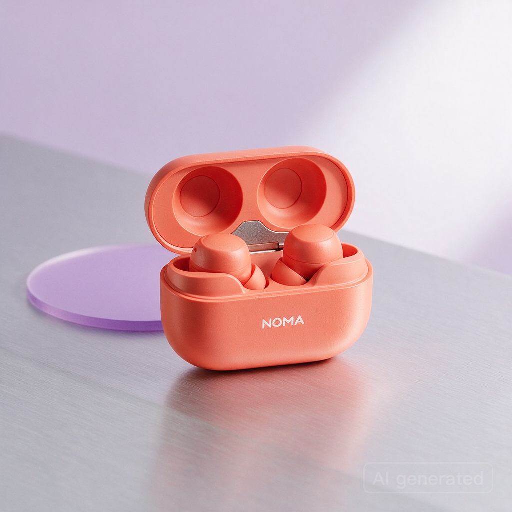
Both images show a coral-orange earbud case, exactly two earbuds, and the NOMA wordmark. The difference is where the object sits in the viewer’s attention. Flare makes the case taller and more frontal, so the product reads immediately. Seedream lowers the camera and widens the composition, turning the same idea into more of a lifestyle photograph.
| Flare | Seedream 5.0 Pro |
|---|---|
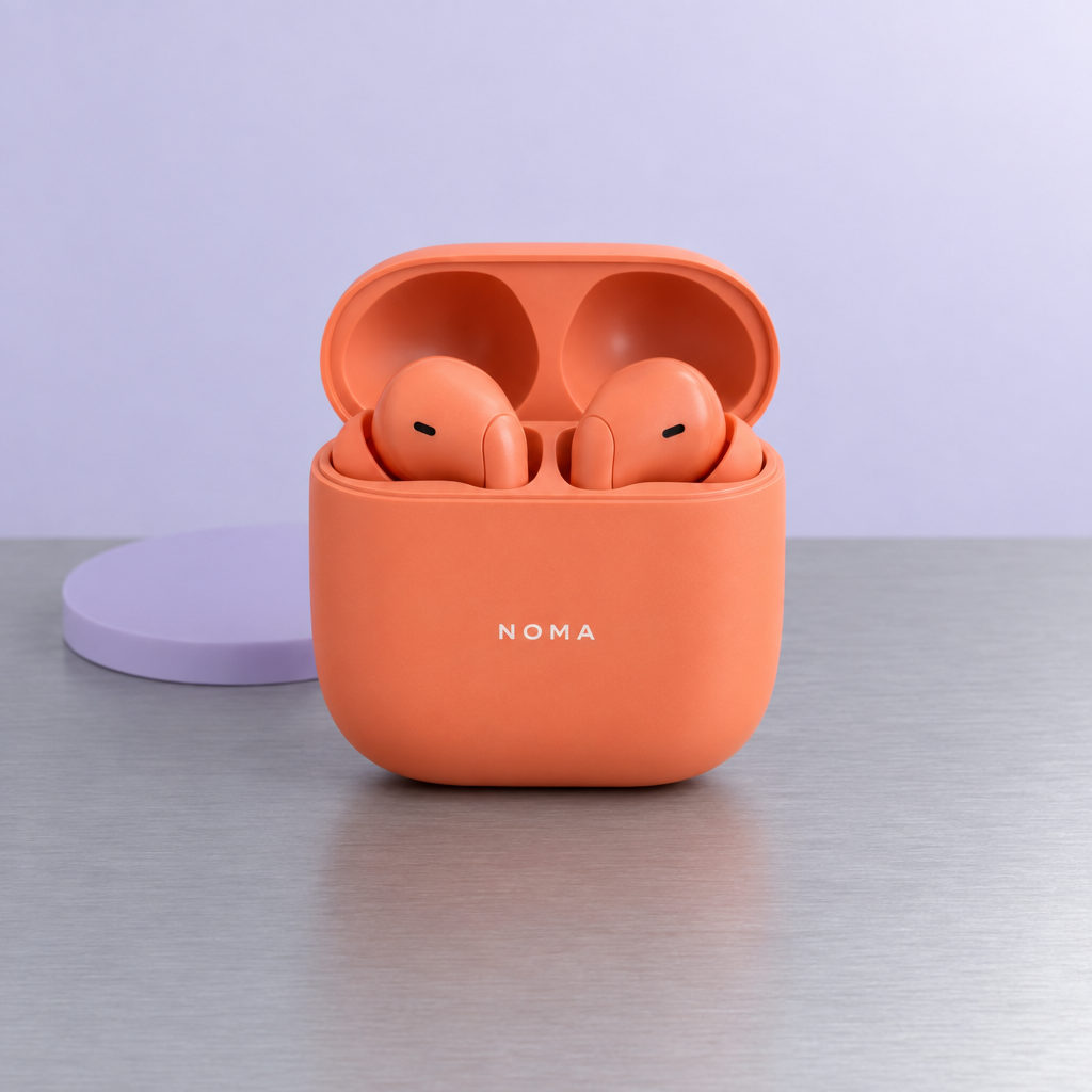 |  |
Flare’s strength is concentration. The orange matte plastic separates clearly from the gray metal tabletop, the NOMA lettering is easy to find, and the open case remains the obvious subject. That is useful for a product-page image, a social post where recognition matters, or a concept image whose job is simply to show the product details. For a small brand without a large library of visual assets, that clarity can be more valuable than a busier scene.
Seedream chooses a lower, wider three-quarter view. The hinge, inner construction, tabletop reflection, and diagonal light become part of the story, while the lavender disc reads as a complete prop on the left. The image suggests the desk, light, and everyday setting the product belongs to, which suits an established lifestyle brand or a new-product mood page.
An “AI generated” mark remains visible in the lower right. When turning the image into a formal promotional asset, keep that mark in mind as well. If you like this side-on photographic direction, try your own product in Seedream 5.0 Pro. These are two earbud concept images; for a real product launch, replace them with photos of your own product. The choice here is whether the eye should land on the product first or on the scene around it.
Bakery Posters: Street-Side Clarity or Softer Brand Mood?
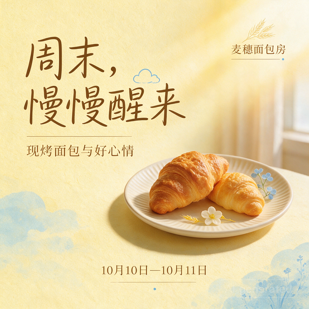
Both Chinese-language posters get the main copy right: “周末,慢慢醒来,” “现烤面包与好心情,” the October 10–11 date, and “麦穗面包房.” Each white plate holds two croissants. The main difference is not whether the words appear, but how much visual weight the type, food, and decoration receive.
| Flare | Seedream 5.0 Pro |
|---|---|
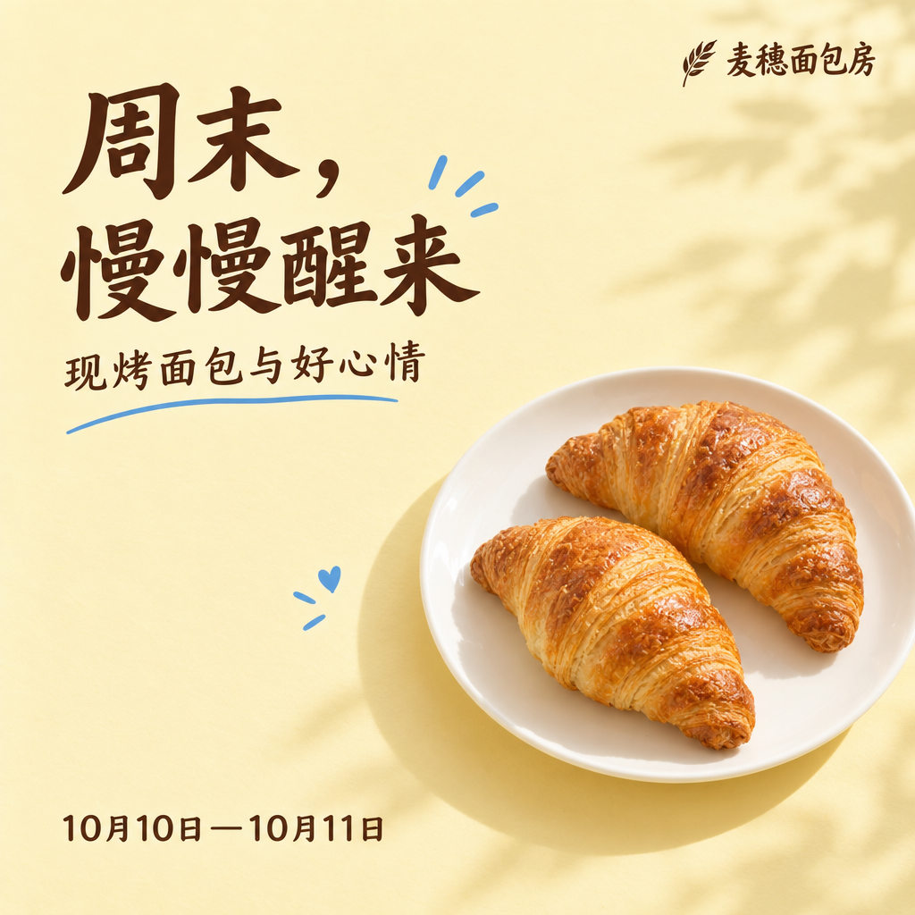 |  |
Flare uses a heavier headline and a clearer hierarchy. It feels like a notice on a shopfront: someone passing by can spot the weekend event without studying the whole composition. The dark type against the pale yellow background gives the date and message a direct role, while the croissants in the lower corner quickly signal “bakery.” This direction suits an in-store sign, a window poster, a counter card, or a social image that needs to communicate an event at a glance.
The food is part of the information rather than a separate still-life study. The two croissants support the message without asking the viewer to decode a complicated scene. That is useful when the main job is to tell people when to visit. If the bakery wants to communicate slow mornings, hand-made craft, or a neighborhood feeling, this bold hierarchy may feel more functional than emotional.
Seedream uses finer strokes, paper grain, watercolor accents, and blue botanical details. The result feels like a neighborhood bakery with a settled visual identity. It could sit naturally among a series of brand posts, an in-store wall display, or a weekend announcement where atmosphere matters as much as the date. The softer treatment gives “慢慢醒来” a visual feeling instead of treating it as only a headline.
Seedream also added a flower to the plate. That addition is a brand decision. A minimalist bakery may find the flower distracting; a shop that likes botanicals, paper, and natural textures may see them as a useful direction. Both models rendered the main Chinese copy correctly, but these four images do not establish a permanent “Chinese poster style” for either model. Change the brand, palette, or event and the balance can change too.
The Right Choice Depends on Where the Shop Is Now
For a new product with no settled visual language, begin by asking whether people need to understand the object before they understand the brand mood. Flare’s centered treatment can help a small team see whether the color, shape, and wordmark are strong enough on their own. Seedream’s side angle and environmental detail can help explore what kind of everyday life the product might belong to. This is a direction to consider, not a promise that every new product will behave the same way.
For an established product, the need may be simpler: a new detail-page image, a social post, or a seasonal asset that still feels like the same shop. Start from the colors and photographs you already use, then decide whether the next image should stay clean or add a tabletop, paper texture, plant, or reflected light. With an earbud that needs its open case and components to remain easy to understand, Flare is the more direct direction in this pair. With a brand that already has a lifestyle vocabulary, Seedream’s angle may connect more naturally to existing content.
For a holiday or weekend promotion, think about how far the message has to travel. A storefront or community notice needs the date to land quickly, which makes Flare’s heavier headline useful. A brand social feed can let mood build across several images, where Seedream’s paper texture may sit more comfortably. These are suggestions for choosing a direction, not extra results from this four-image comparison.
Bring Your Own Product and Brand Into the Picture
Start with what you already know. Your product photo, package colors, usual type style, and event date tell you how direct the image should be. You do not need to invent a complicated style vocabulary first. Say what the object is, what the viewer should notice, and what kind of light or setting feels right. That gives the image a job beyond “make it look premium.”
For earbuds, cups, skincare, or packaged food, decide which detail deserves attention: the front wordmark, the surface material, the open-and-closed structure, or the relationship between the item and the table. A Flare-like direction can put one detail forward. A Seedream-like direction can place that detail inside a fuller scene. Both can start from your own product photo; the better choice is the one that sits naturally beside the images you already use.
For a poster, write down the few words a customer must see, then decide how much atmosphere they need around them. The date and event name carry the first message. The shop’s personality carries the second. Flowers, plants, plates, and paper grain should support that personality, not compete with it. Bring your own product or event idea into both models and choose the image that fits its use.
Frequently Asked Questions
I only have an ordinary product photo. Which direction should I try first?
If the photo’s main job is to show what the product looks like, begin with the more frontal, concentrated direction seen in Flare. It makes color and construction easier to read. If you already know the brand should feel like a lifestyle publication, try the side-on light and setting associated with Seedream. Either direction can begin with a photo of your own product.
Does an extra decoration make Seedream more creative?
Not automatically. Creativity has to serve the brand. Flowers can make a bakery image memorable when botanicals belong to the shop’s identity, but they can make a minimalist poster feel cluttered. An added element is useful when it helps people understand the shop or the event.
Do these models have fixed jobs for product images and posters?
There is no need to remember them that way. In these four images, Flare is more concentrated and Seedream is more atmospheric, while the posters offer bold and soft directions. With your own product, palette, and event, the better choice may change. To see another product-background example, read our Flare vs Sunburst kettle-background comparison.
If clarity and fast recognition matter, try Flare. If you want a more photographic or paper-led mood, try Seedream 5.0 Pro.